Office Building
-
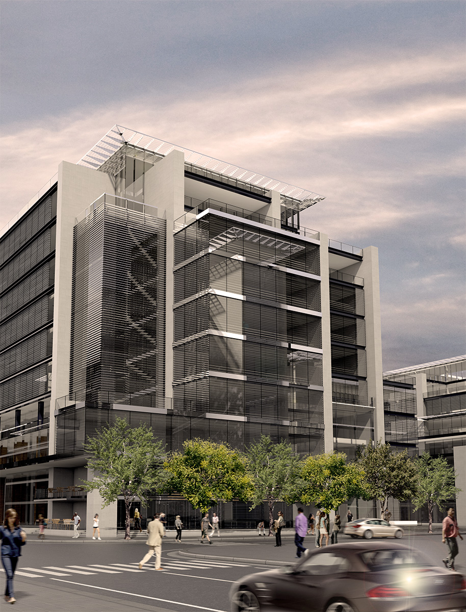
While I'm now fairly confident with Sketchup and Vray I feel I'm being let down by my photoshop skills. Adding people, trees & cars and generally improving the ambiance of a render seems beyond me. I'm still sifting through online tutorials but most of them are pretty basic. Ny advice on this would be hugely appreciated.
Sketchup 7, Vray for Sketchup 7, PS CS3.

-
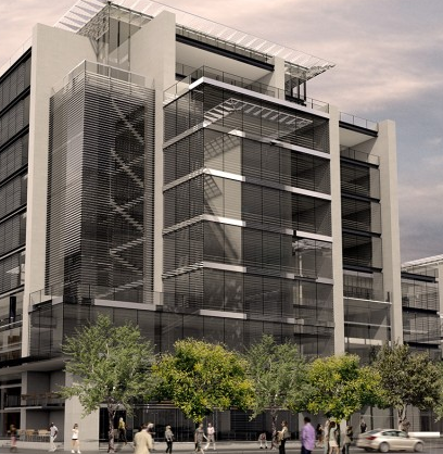
Closer cropping looks good to me but I'm only a Sunday driver.

-
The building and the landscape in front of the building are quite good.
Very nice stlye, I like it. Some sugestions that I feel will improve the overall scene:- The clouds are to bright, I night remove then. They draw the eyes way from the subject or point of interest , the building. The other sugestions list below should be removed for the same reason, distracting.
- Remove the car in the foreground.
- Remove the two women in the foreground (on the right and left) and
the other people in the street, distracting. - Remove the girl in the t-shirt and shorts, distracting
- Remove the gray car and tone down the white strip in front of that
car, distracting. - Reduce the amount of foreground and sky by half to help direct your eye to the "subject or point of interest" which is the building.
If the building to thr right in the scene is part of the subject building; creating another image in a landscape format including that part of the building night prove interesting.
leave the remaining people on the sidewalk to provide a reference scale for the building.
Hope this helps, Bob
-
Thanks Bob,
Some very useful advice to bear in mind.Nice job Chris,
The cropping does help alot. Now to just improve my PS skills with those tricky people.
Hello! It looks like you're interested in this conversation, but you don't have an account yet.
Getting fed up of having to scroll through the same posts each visit? When you register for an account, you'll always come back to exactly where you were before, and choose to be notified of new replies (either via email, or push notification). You'll also be able to save bookmarks and upvote posts to show your appreciation to other community members.
With your input, this post could be even better 💗
Register LoginAdvertisement


