Huge Living
-
Hi to all,
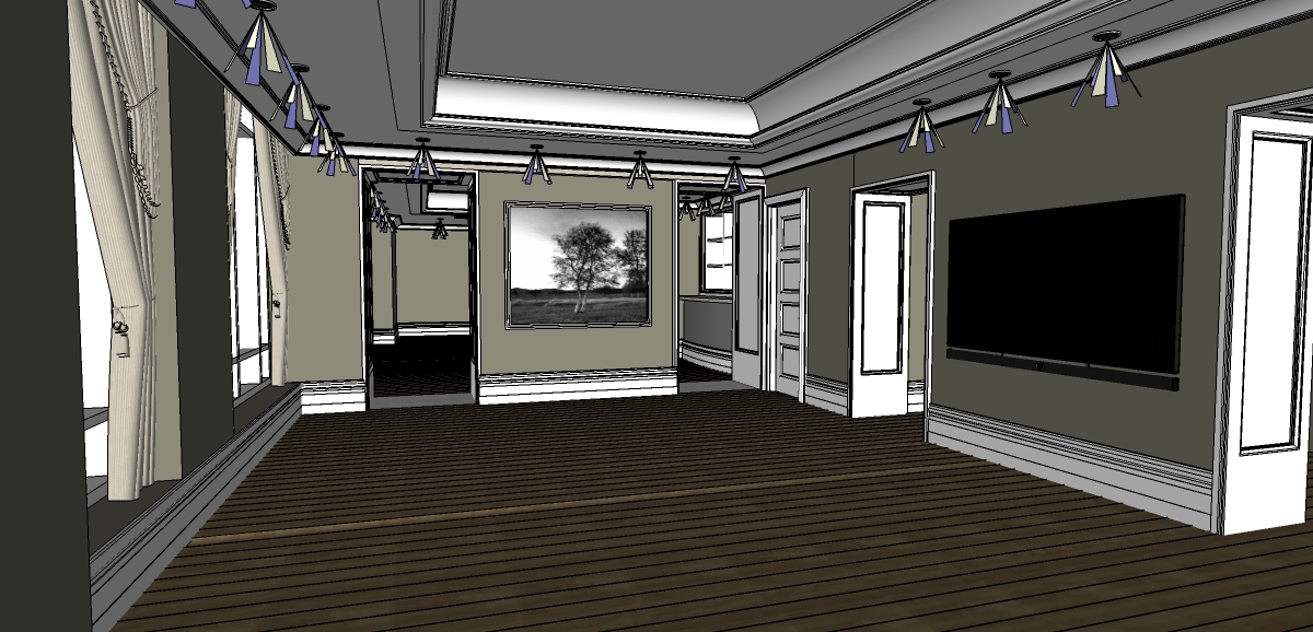
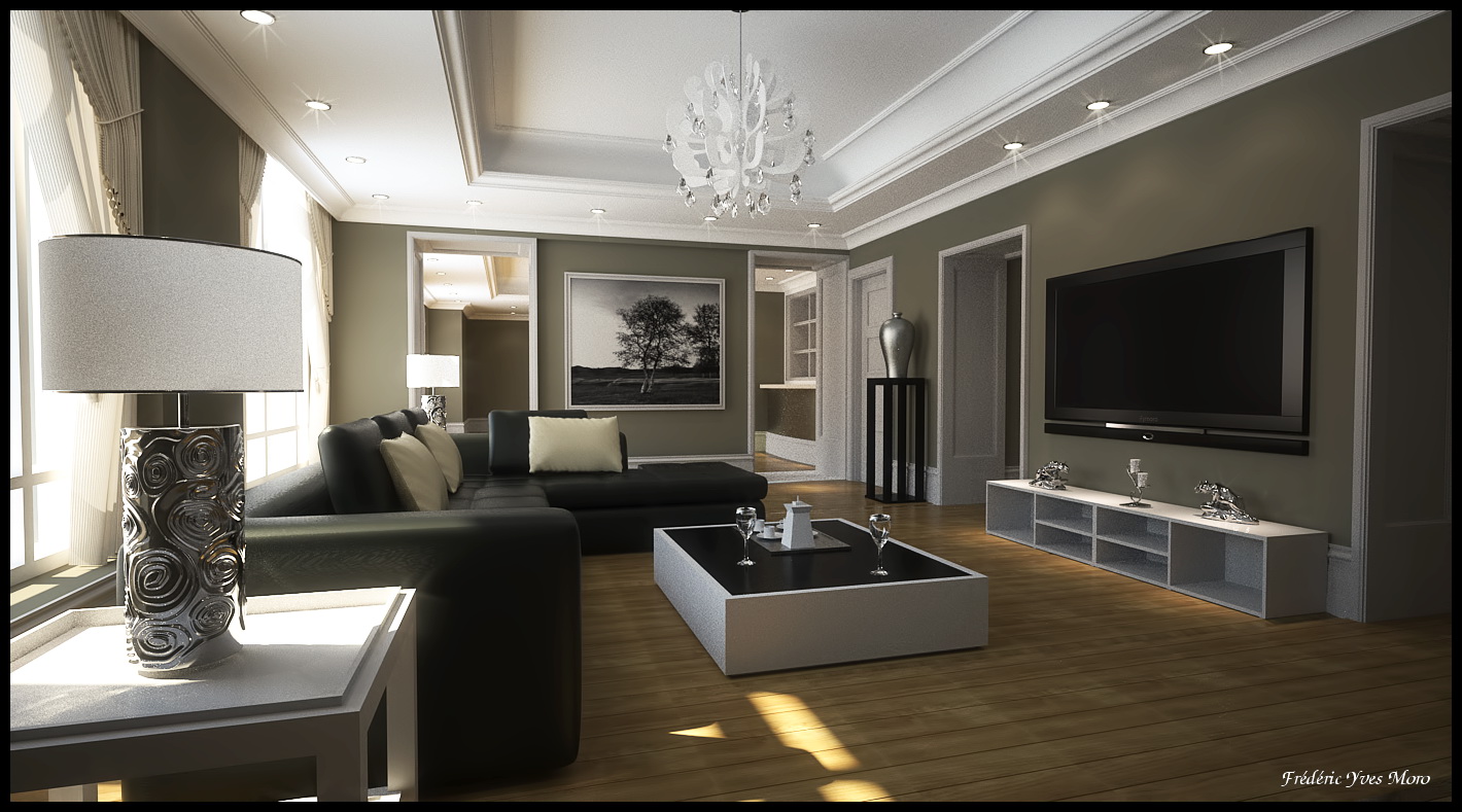
This is a new project, I started by the living room. Built with Sketchup and the fantastic "Profile Builder Pluggin" I really love this one... :thumbup:
Materials and light setup into Sketchup and then exported to Thea.
Sofa and decorating items are 3ds files merged into Thea.
Render time 5 hours, 105 passes, TR1, small PP, De-noised a little bit and contrast.Hope you like it, I start today the back of the scene, the dinning room and the wine cellar.
Comments and questions are welcome.
-
Very nice mate!!!!!


-
great texturing and modelling, I like the colours
-
I really like your style Fred. It's very ...Candice Olson!

The floor texture is not tillable, but WOW, you're good!
Regards,
Stefan -
nice lighting here...
-
Another beauty

-
What's the trick with the light rays I see in Sketchup ?
Peter -
I like the way overscale baseboards and the thick wall. Having said I like the thick walls, what is the reason behind such deep walls?
-
Looks good Fred, if i was being picky i would say the tv needs to show some reflections and the lens flare on the spots is not to my taste.
-
@richard said:
Very nice mate!!!!!


Thanks Richard...

@jo-ke said:
great texturing and modelling, I like the colours
Thanks Joke..

@stefanq said:
I really like your style Fred. It's very ...Candice Olson!

The floor texture is not tillable, but WOW, you're good!
Regards,
StefanCandice Olson !!!
 Thank you...
@zdesayn said:
nice lighting here...
Thanks
@tadema said:
Another beauty

Merci...

@peterboodts said:
What's the trick with the light rays I see in Sketchup ?
PeterHi, The light you see are tne IES spot fromthe Thea exporter pluggin.
@roger said:
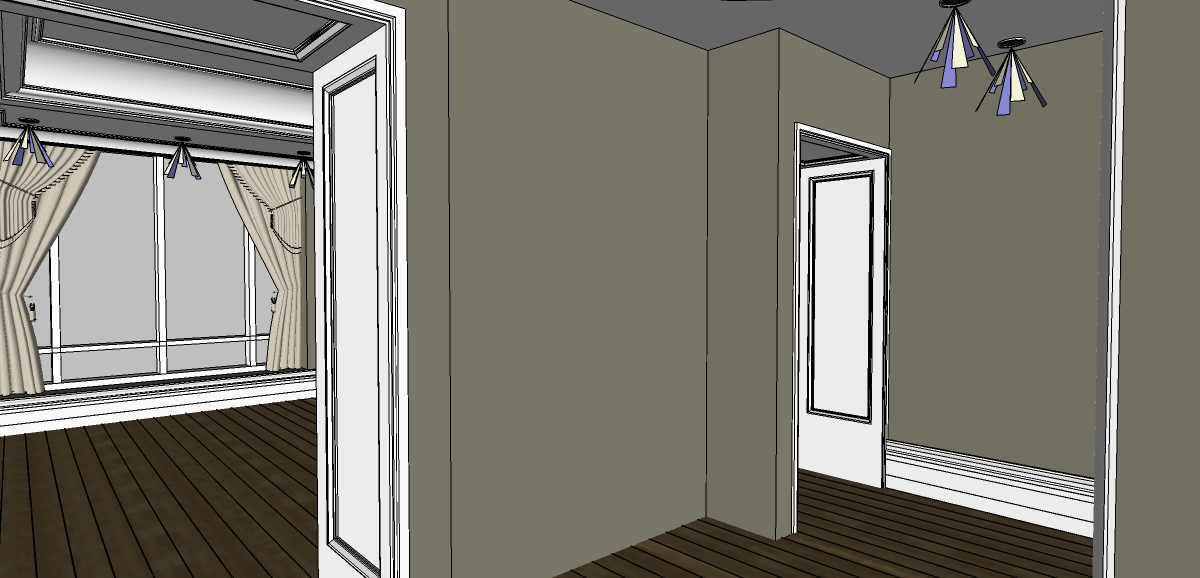
I like the way overscale baseboards and the thick wall. Having said I like the thick walls, what is the reason behind such deep walls?
Hi Roger Thank you, the thick walls are fake it's a trick, my client like thick wall too, so I decided to fake like you can see on the image attached.
@chedda said:
Looks good Fred, if i was being picky i would say the tv needs to show some reflections and the lens flare on the spots is not to my taste.
Thank you, You are right, the lens are not so nice...

-
By the way Fred I note looking back on your image, there is some rather evident tiling in the flooring.
-
@richard said:
By the way Fred I note looking back on your image, there is some rather evident tiling in the flooring.
Thanks Richard, I changed the floor mat in this second view.
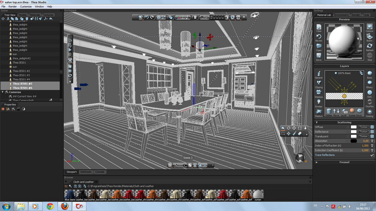
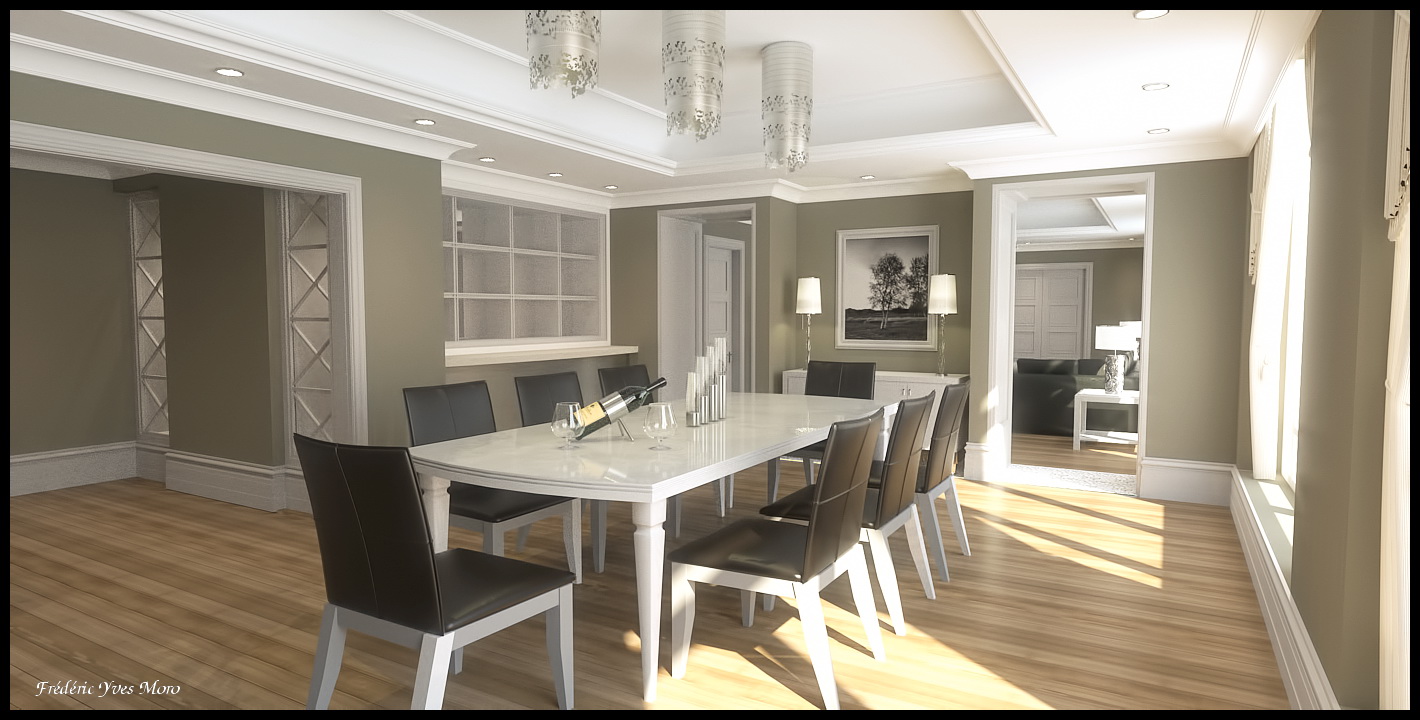
-
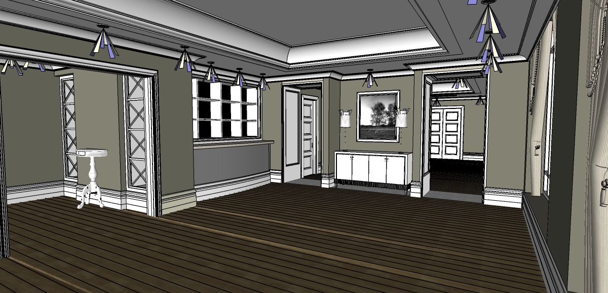
View 3, I stop for this project, waiting the client's feedback...
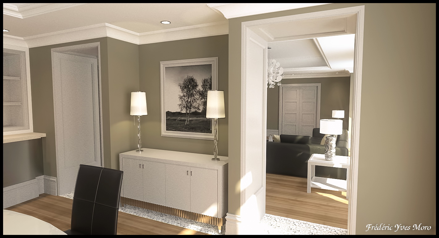
-
Great lighting and subtle tones - I like it!
One of your best, Fred.
Hello! It looks like you're interested in this conversation, but you don't have an account yet.
Getting fed up of having to scroll through the same posts each visit? When you register for an account, you'll always come back to exactly where you were before, and choose to be notified of new replies (either via email, or push notification). You'll also be able to save bookmarks and upvote posts to show your appreciation to other community members.
With your input, this post could be even better 💗
Register LoginAdvertisement


