Landscape Construction
-
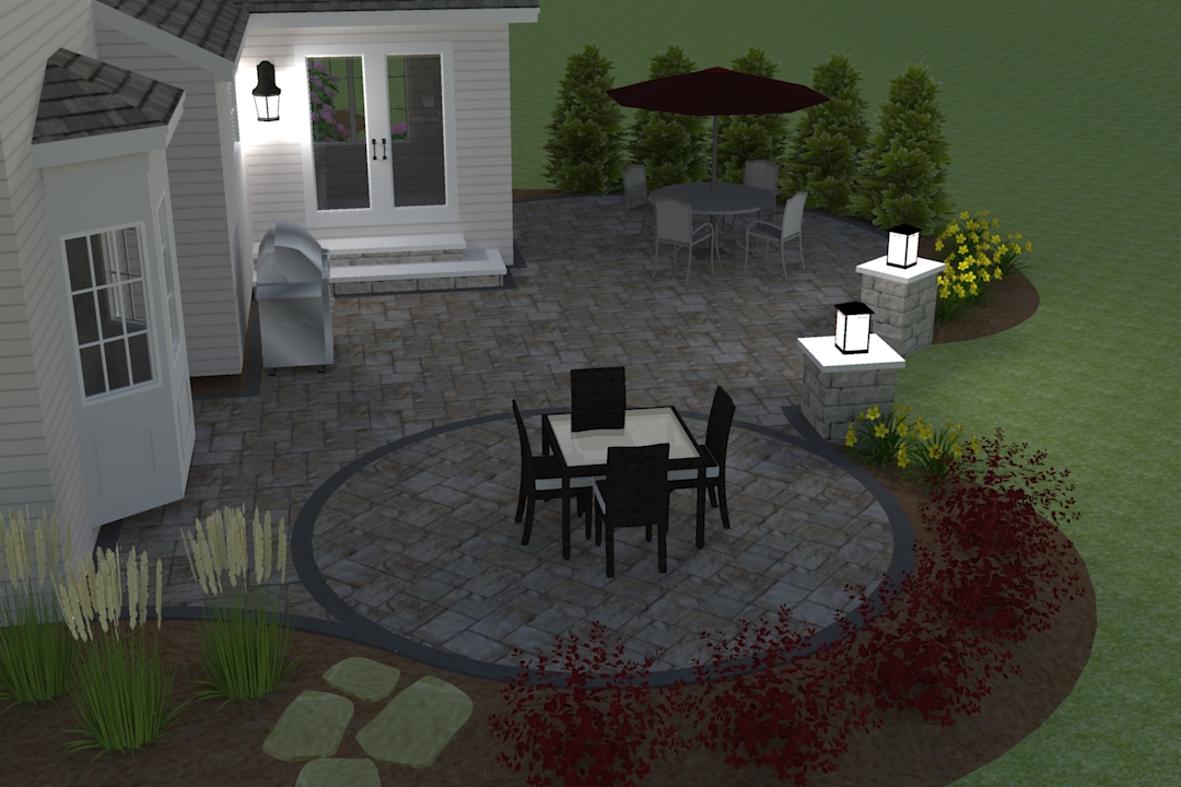
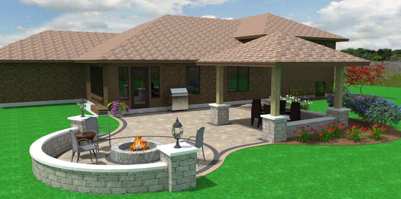
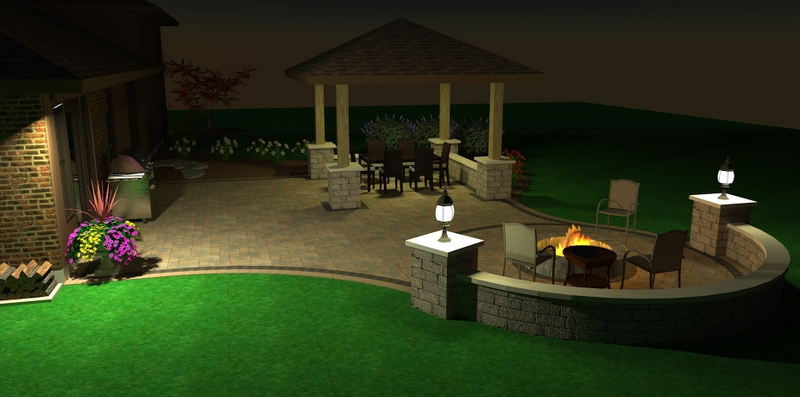
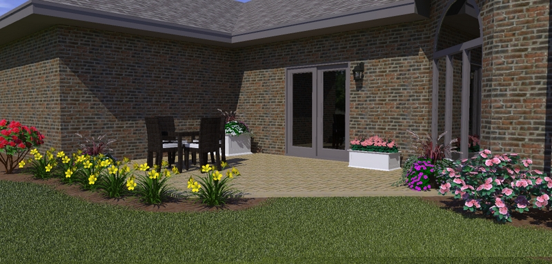
Here is a couple of the projects I have designed and rendered. I feel like I've made about %80 there as far as where I want to be for design quality. I'm looking for any tips and tricks for learning that last %20.
I just started learning Sketchup and Kerkythea this winter. These are all rendered in Kerkythea
Please tell me what you think!


-
Looking for design tips?
These look great. Just a couple ideas:
On the first picture the columns going to the lawn look like they could be further apart. I'd try to make them feel more oriented to something (each other?).
The third needs something on the blank wall. It feels artificially closed in by the walls and the flowers. I'd want a vertical element like a Japanese maple to make the enclosed feeling more cosy or provide an outlet---on the end towards the wall. What I feel is the wall is high, bare and hard. The flowers can't compete.
But what do I know? There are some REAL landscape designers here.
 And then there's site, clients, and budget about which we know nothing.
Nice work!
Peter
-
Getting there Dave. As they say, "the devil is in the details" and that is where the other 20% should be focused. Its the little things that add to a more photoreal render. Some obvious things are better grass, texture that are higher resolution and that don't tile as bad, more detail into the house itself, lower the beds to create an obvious bed edge, better reflection and transparency, bump maps and doing a bit of post work in photoshop.
Best of luck..you definitely have a good starting point.
Hello! It looks like you're interested in this conversation, but you don't have an account yet.
Getting fed up of having to scroll through the same posts each visit? When you register for an account, you'll always come back to exactly where you were before, and choose to be notified of new replies (either via email, or push notification). You'll also be able to save bookmarks and upvote posts to show your appreciation to other community members.
With your input, this post could be even better 💗
Register LoginAdvertisement


