Final image
-
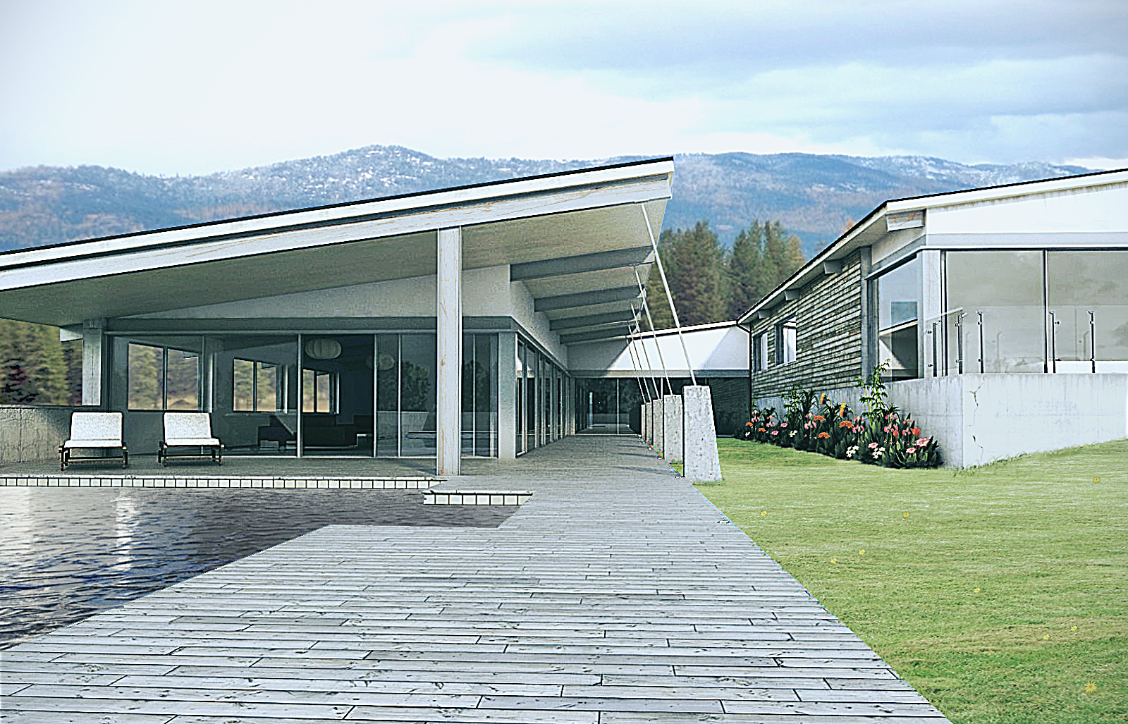
I have previously been adding updates to this image within the WIP progress thread. I now feel I have done it to death and should really be getting on with paying work. So here is the final image.
Created using sketchup, vray and PS.
C & C welcome.
ps. sorry for the low res image, I'm a very impatient person and couldn't be bothered to wait for a larger image to render

-
Looking at it as a whole, the image is very good and has a certain realism to it.
My overarching advice would be to use a more subtle hand in photoshop. The sharpening gives the image a pretty harsh look with the edges being overly defined. The grass is very good but the yellow flowers could have been added a bit better and the edges where you used a nice grass brush to break up the edge - the brush messed up some of the grass you already had. What I like to do to avoid this is place the grass down so that it overlaps where you don't want it (maybe even covering the whole image), then use a mask so that it shows only where you want it. Then instead of painting on the grass image with your grass brush, brush onto your mask with a white brush so that it will reveal a bit more grass anywhere you paint.
Also I'd question using what looks like lake water in the pool. It looks pretty good actually, just seems kinda weird.
-Brodie
-
I agree with Brodie mostly. There is a disconnect between the model and the background. The model is sharp and hard looking, but the background doesn't seem to blend with that look. I like the look of the model on its own, no need to change it unless you'd prefer to get more of a match.
-
Hi Brodie and Jeff,
Thank you for commenting. Having now stepped back from the image and taken on board what you've had said, I definitely agree with you. I think I overdone it it with the unsharp mask.
As for the grass, that's a very useful tip, cheers brodie
Seems rather obvious now, you've pointed it out.The water is maybe to dark? and shouldn't have so much displacement. It does look more like lake water.
I had planned on putting this piece to rest....but may now have another crack at it.
Cheers
-
this is really an excellent render. i can see a different style from your render. the setting and sharpness is great.
Hello! It looks like you're interested in this conversation, but you don't have an account yet.
Getting fed up of having to scroll through the same posts each visit? When you register for an account, you'll always come back to exactly where you were before, and choose to be notified of new replies (either via email, or push notification). You'll also be able to save bookmarks and upvote posts to show your appreciation to other community members.
With your input, this post could be even better 💗
Register Login


Advertisement