:Townhome Develpment:
-
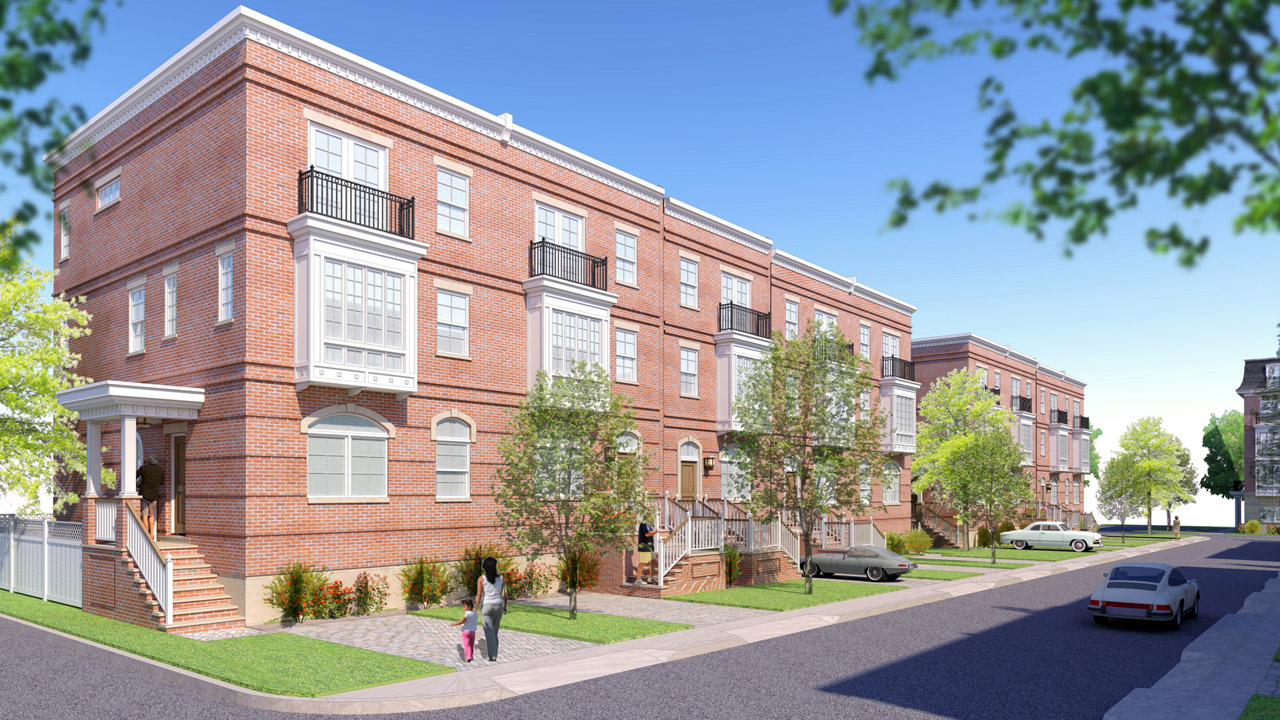
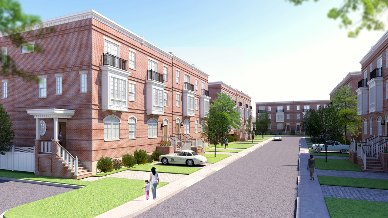
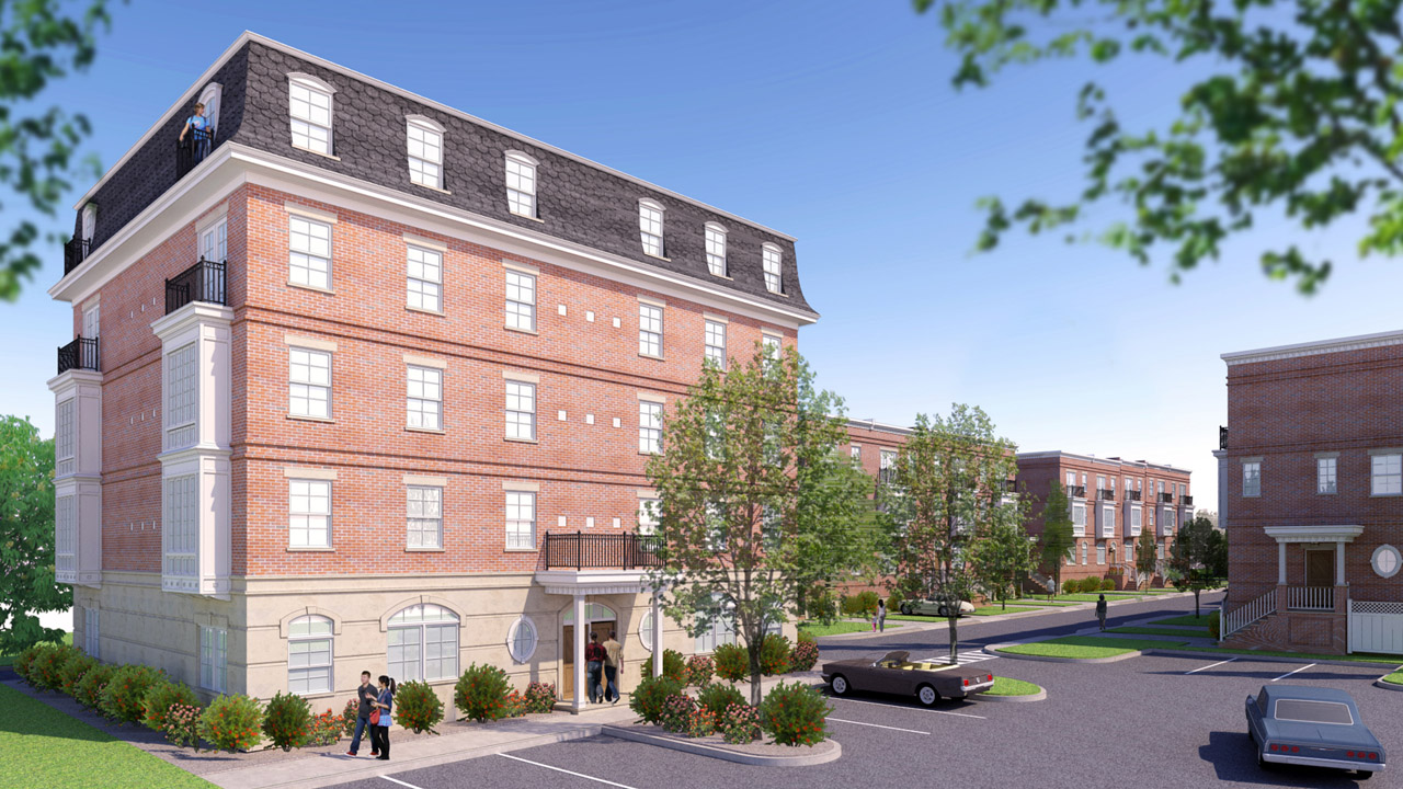
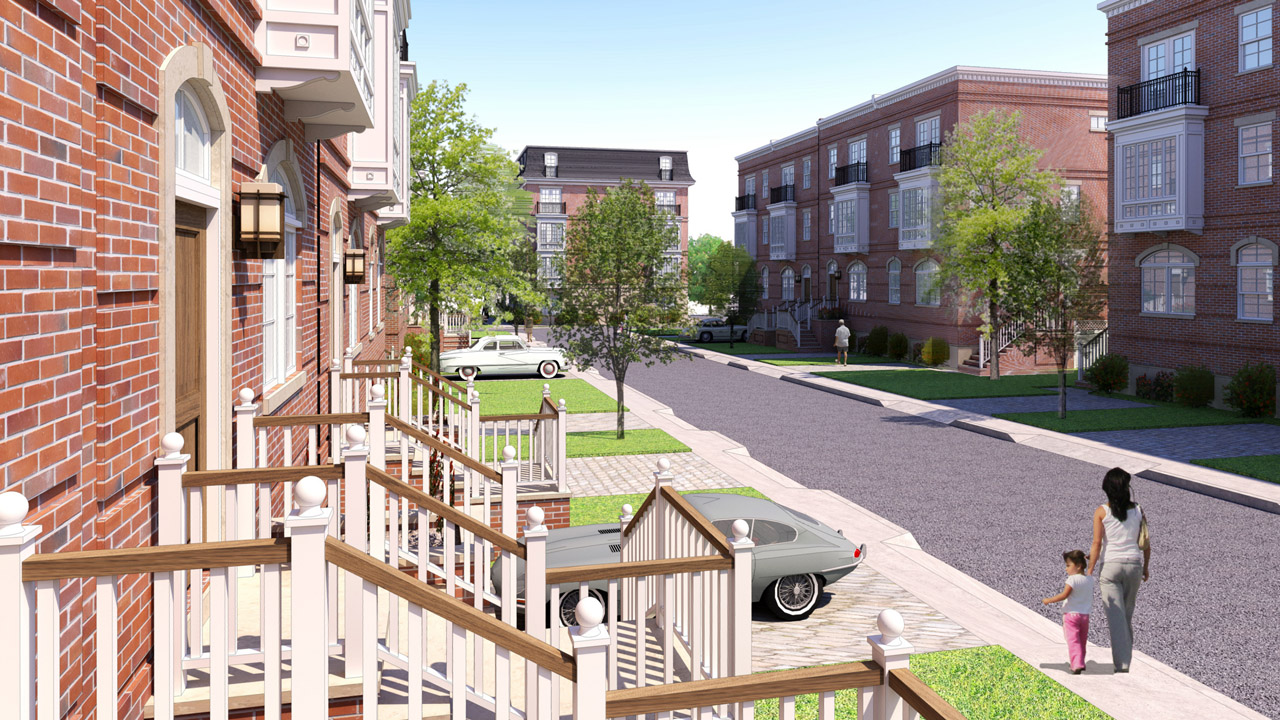
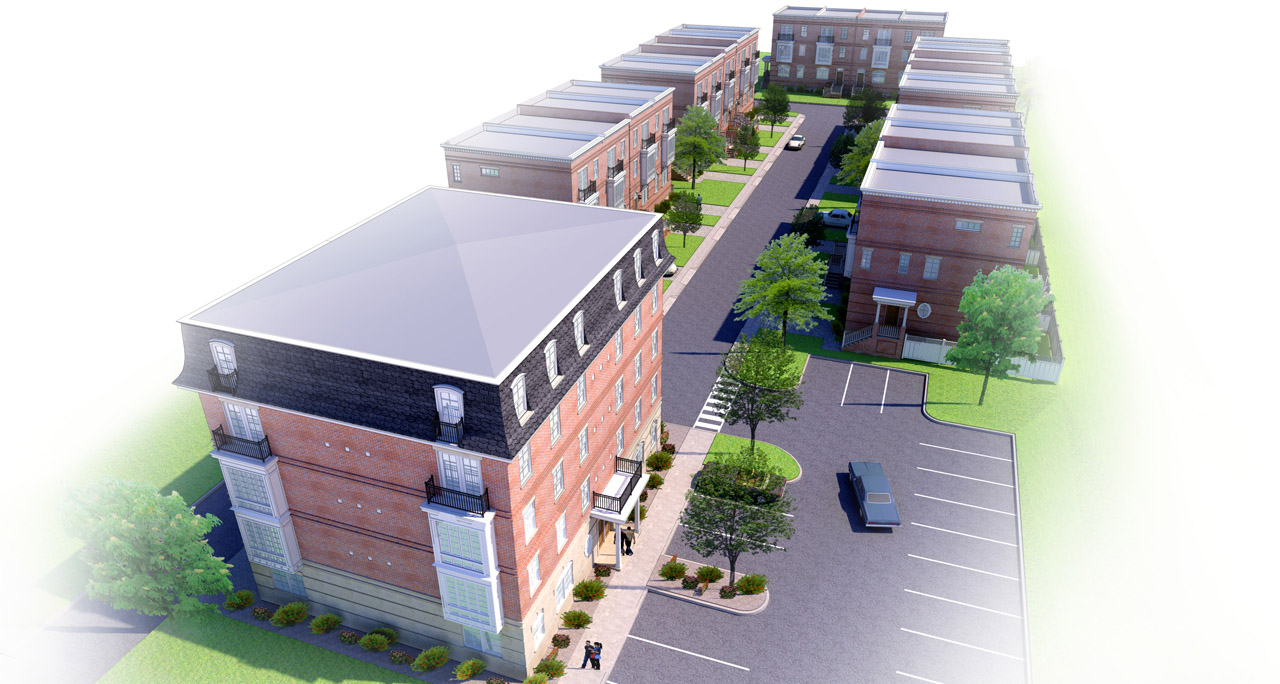
Here's a design for a small townhome development we've been working on in the office for awhile now.. back and forth with a gillion different schemes...finally settling on this one. Keep in mind its a developer project, so this is about as extravagant as it can get...haha. Even though we had a good amount of time to work on it, it came down to the wire as usual and I pretty much completed the modelling and renderings in 2 days (and nights). And, as usual, I'll use the time excuse as to why they're not better..they definitely could use more/better entourage. I wanted to render these in Twilight, but I was forced to use Podium because of the time constraints.
-
it looks really nice and clean but what i suggest is
- some puffy clouds will make it a bit more real / less cartoony.
- what about the glass in the windows looks a bit dull to me maybe a 10% reflection with a deeper blue / grey ish color will give it a bit more depth
besides that i really like the style you renderd this are these custom settings you are using or using photoshop afterwards? cause the trees and people + cars look really nice.
could you share you settings + your way on how to create this style.
I have Podium V2.7 registered version and also V1.7 with a license.
good luck on further development and im looking forward to your answer.
-
thanks aad... i'm always torn on clouds, but you're probably right. i just don't like when the sky distracts from the subject..
no special settings..entourage is all in sketchup. just a bit of editting in pshop... exposure, photo filter, brightness/contrast, saturation... and there's a very light light line overlay as well.
-
Nice clean renders...which version of Podium are you using 2.x or 1.x?
-
Two thoughts as that is all my mind will handle tonight. 1) Architecture is all about how buildings fit into their environment, so clouds and other bits of entourage in no way detracts from a presentation. 2) when possible use a little cloud and foreground tree shadow to mottle streets and lawns so they don't have that "right out of the texture palette look."
-
Thanks for the help, Roger...good call on the shadows.
v2.x, sepo...
-
Great modelling on the walls, and great composition. I think the general approach is nice as a certain style. Roger's suggestion is good. First time I've heard that pointed out.
Call the style "DeveloperLight". Show them a more dolled-up example and make them pay for it if they want it.

-
Great work Jason, not as great as your previous works but with that tight deadline I think you deliver a good work...
There is really not enough time for real production for clients and always not good enough you have to give your best and hopefully the client will like it. Most of the time they don't, even though everyone tells you that your work is Great.
allanx
Hello! It looks like you're interested in this conversation, but you don't have an account yet.
Getting fed up of having to scroll through the same posts each visit? When you register for an account, you'll always come back to exactly where you were before, and choose to be notified of new replies (either via email, or push notification). You'll also be able to save bookmarks and upvote posts to show your appreciation to other community members.
With your input, this post could be even better 💗
Register LoginAdvertisement


