Interior
-
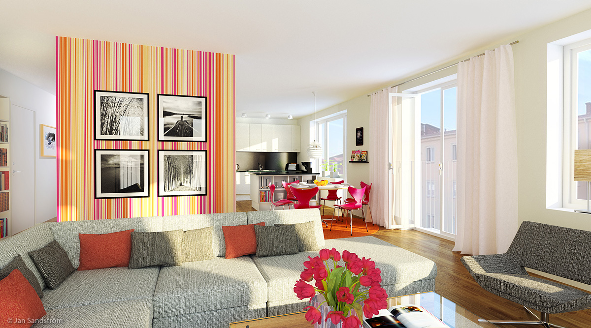
Here is a interior render I did recently with SketchUp and Thea.
Image reduced. Original render was 4500 pixels wide.
-
Cosy

-
At first it must be said that your render is very nice, thumb up
 .
.- to design - i can imagine how i live in this spacious, brighten, fresh flat
 . two things - distracting wallpapper and boring kitchen.
 - to modeling - very good model of sofa and cushions, non sharp corners, windows and french door could be more detailed, curtain is great
- to rendering - i am missing more shadows, the book on the coffee table has great reflection (this is what I like the most at this render), sunshine light is too yellow, the flowers looks odd, nice coffee table
did you model all the equipment? did you use artificial lights, if yes - why?
Is there any special reason for so high definition renderig? How long did last the rendering? Have you tried Vray for sketchup? If yes, can you compare work and rendering with Vray vs. Thea. Does your name Jan same meaning as John in english (is name Jan same name as John in english)? do you model e.g. sofa which customer specially want in his interior or use what you have in private 3D warehouse? i think thats all .
.Nice render
 .
. - to design - i can imagine how i live in this spacious, brighten, fresh flat
-
-
@jarynzlesa said:
two things - distracting wallpapper and boring kitchen.
I had a much subtler image in mind when starting but a collegue convinced me to go for brighter colors and a "barcode" inspired wallpaper. I did a few variations in photoshop thogh. About the kitchen, first it wasnt much defined when I made the image and secondly I wanted to have the forground and the background (kitchen) in "grayscale" while so the bright colors stood out more. The black area between the lower and the wall cabinets is a glass plate which is painted black on the inside. (very popular here now.)
@jarynzlesa said:
i am missing more shadows, the book on the coffee table has great reflection (this is what I like the most at this render), sunshine light is too yellow, the flowers looks odd, nice coffee table.
"The scandinavian light" late afternoon in autumn looks like this.

@jarynzlesa said:
did you model all the equipment? did you use artificial lights, if yes - why?
Is there any special reason for so high definition renderig? How long did last the rendering? Have you tried Vray for sketchup? If yes, can you compare work and rendering with Vray vs. Thea. Does your name Jan same meaning as John in english (is name Jan same name as John in english)? do you model e.g. sofa which customer specially want in his interior or use what you have in private 3D warehouse? i think thats all .
.No i didn't. There simply wasnt time (or budget) for it. One artificial light in the "hall" just to have some light in that part so it wouldn't look too dark and "un welcoming". I let it render over night with TR1. Made a rerender later with biased for a few hours just to get the door handle material (in the hall) which I had accidently forgotten in the first render. Original render was 4500 pixels wide.
Yes I have Vray, both for SketchUp and Max. I think Vray for SketchUp is lacking: Since its 32 bit I had problems rendering highres images with alot of geometry. Vray for Max is much faster to start rendering and have many more features but I really like Thea and the quality it gives. I do many more testrenders with Vray before I get it right. With Thea I just set the materials and press render (unbiased TR1). Hoping future versions will have built in noise reduction.
The sofa was a modular one and I arranged it so that there would be a part without back cusions to the right so that the dinner table would be seen better.
Jan, Jon, John, Johan and Johannes exist in Swedish. It might be an old version of John.
Thanks for the comments. -
thank you for reply

@pixero said:
The black area between the lower and the wall cabinets is a glass plate which is painted black on the inside. (very popular here now.)
same in our country
@pixero said:
"The scandinavian light" late afternoon in autumn looks like this.

I was not sure, but I have thought that.
Jan is name we use in Czech language too. -
Do you do more designs (variantions) for one flat, or just one which is changed durring sessions with client?
-
@pixero said:
@jarynzlesa said:
i am missing more shadows, the book on the coffee table has great reflection (this is what I like the most at this render), sunshine light is too yellow, the flowers looks odd, nice coffee table.
"The scandinavian light" late afternoon in autumn looks like this.

Agree. Looks familiar to me. Quite different than central European light.
Hello! It looks like you're interested in this conversation, but you don't have an account yet.
Getting fed up of having to scroll through the same posts each visit? When you register for an account, you'll always come back to exactly where you were before, and choose to be notified of new replies (either via email, or push notification). You'll also be able to save bookmarks and upvote posts to show your appreciation to other community members.
With your input, this post could be even better 💗
Register LoginAdvertisement


