sketchucation logo sketchucation
    • Login
    ℹ️ Licensed Extensions | FredoBatch, ElevationProfile, FredoSketch, LayOps, MatSim and Pic2Shape will require license from Sept 1st More Info

    Summer/autumn

    Scheduled Pinned Locked Moved Gallery
    45 Posts 18 Posters 4.3k Views 18 Watching
    Loading More Posts
    • Oldest to Newest
    • Newest to Oldest
    • Most Votes
    Reply
    • Reply as topic
    Log in to reply
    This topic has been deleted. Only users with topic management privileges can see it.
    • StinkieS Offline
      Stinkie
      last edited by

      Very nice indeed! πŸ‘ I like the first one best.

      Edit: I think (this might very well be a matter of personal preference!) the composition could be improved. Currently, the tip of the tower is in the upper part of the image. It should be in the lower part. Think of seventeenth-century Dutch seascapes - if that makes any sense. I've been wrong before, though! 😎

      1 Reply Last reply Reply Quote 0
      • D Offline
        davidh
        last edited by

        a distressed watercolour effect,maybe a bit too distressed!
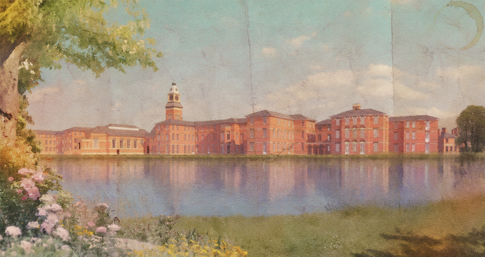

        LAKESIDE SUN watercolour distressed.jpg

        1 Reply Last reply Reply Quote 0
        • D Offline
          davidh
          last edited by

          a little less distressed


          LAKESIDE SUN watercolour 1.jpg

          1 Reply Last reply Reply Quote 0
          • StinkieS Offline
            Stinkie
            last edited by

            I like those. πŸ‘

            1 Reply Last reply Reply Quote 0
            • B Offline
              bhbarchitects
              last edited by

              @davidh said:

              1 more lakeside view with foreground depth of field added in the second image.the foreground rocks have had highlights burnt onto them in photoshop to try and make them more compatible with the lighting in the render.

              Really nice renders, just something about the water, possibly reduce the reflection or more blur??
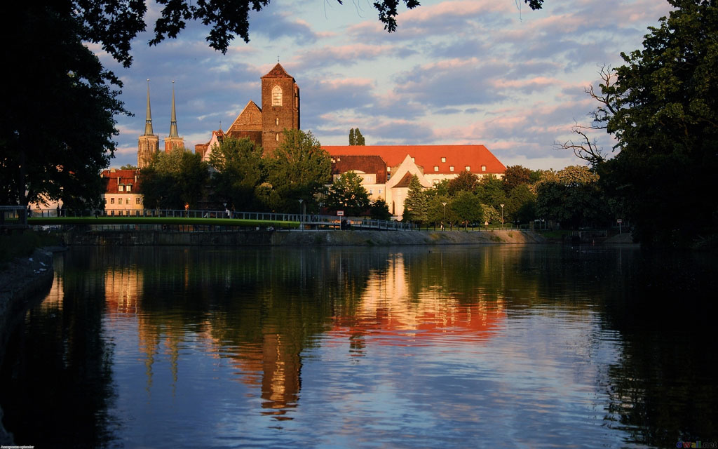

              Reflections in lake (photo)

              1 Reply Last reply Reply Quote 0
              • D Offline
                davidh
                last edited by

                I think looking at the above photo that the reflections in my renders should be much darker.Next render I'll try and do something similar.Its really all about getting the correct lighting.My favourite light is definetly the low evening/morning sun because its possible to get much more dramatic images.

                1 Reply Last reply Reply Quote 0
                • pbacotP Offline
                  pbacot
                  last edited by

                  These are really nice! Both PR and WC. Peter

                  MacOSX MojaveSketchUp Pro v19 Twilight v2 Thea v3 PowerCADD

                  1 Reply Last reply Reply Quote 0
                  • R Offline
                    Roger
                    last edited by

                    BORN TO RENDER

                    http://www.azcreative.com

                    1 Reply Last reply Reply Quote 0
                    • D Offline
                      davidh
                      last edited by

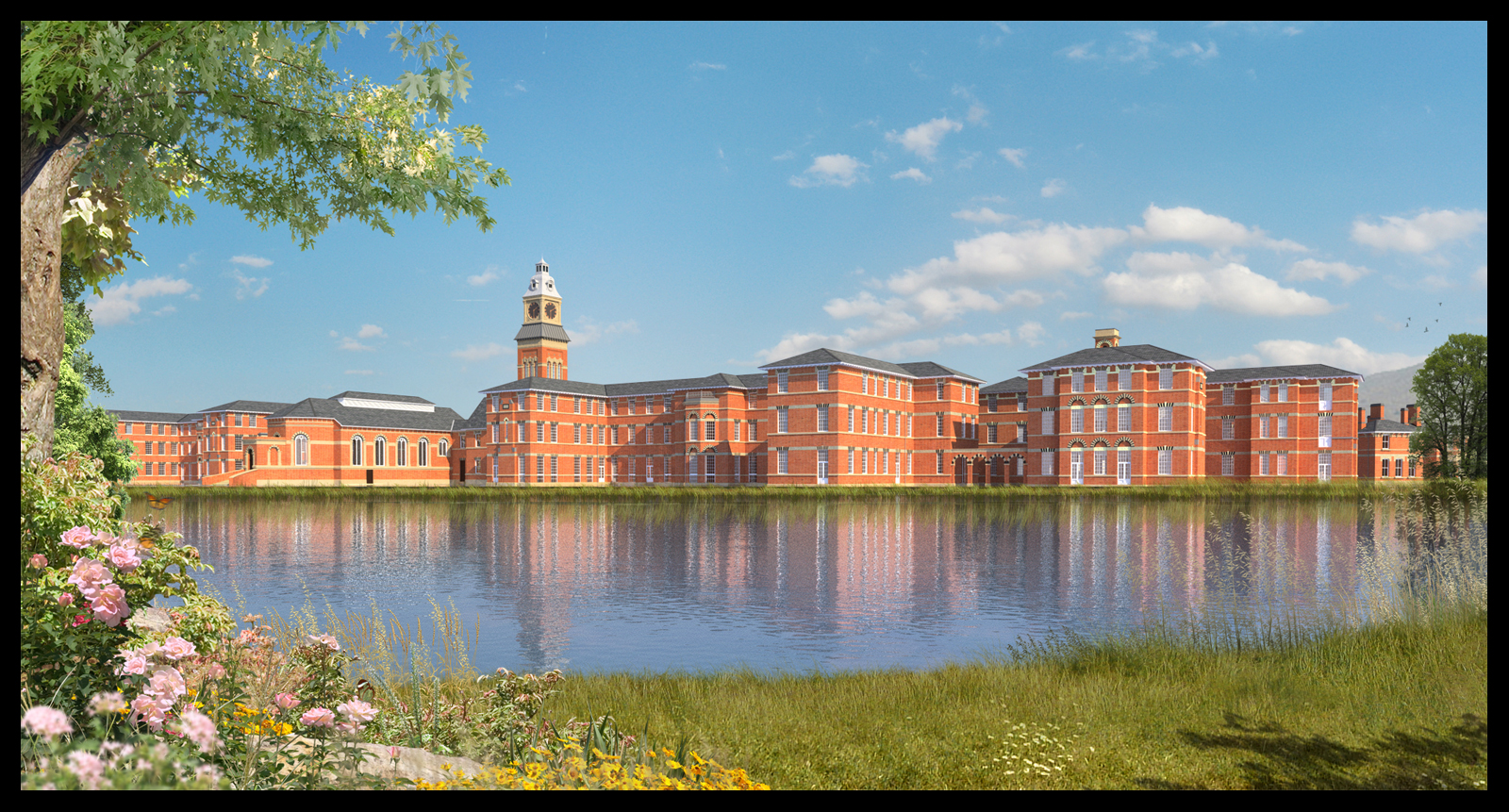
                      The original of the last image uploaded.i.e before the watercolour effect was applied.The foreground grass element at the waters edge is made up from the grass .png I uploaded a few days ago,but with some additional elements added such as the daisy's.I think the water reflection is still too blue so I guess its back to the drawing board on that one.

                      LAKESIDE SUN 2.jpg

                      1 Reply Last reply Reply Quote 0
                      • StinkieS Offline
                        Stinkie
                        last edited by

                        The water is fine, IMHO. The way it looks fits the style. I'd look into the purple cast on the roofs' edges, though.

                        1 Reply Last reply Reply Quote 0
                        • allanxA Offline
                          allanx
                          last edited by

                          Wow you are indeed the Master of Post production...the water reflection fits the scene very well and also the foliage..

                          Thanks for sharing your stuffs...

                          allanx

                          [Portfolio](https://www.coroflot.com/designers/work-stream?id)

                          1 Reply Last reply Reply Quote 0
                          • pbacotP Offline
                            pbacot
                            last edited by

                            All looking great. Thanks for posting.

                            MacOSX MojaveSketchUp Pro v19 Twilight v2 Thea v3 PowerCADD

                            1 Reply Last reply Reply Quote 0
                            • D Offline
                              davidh
                              last edited by

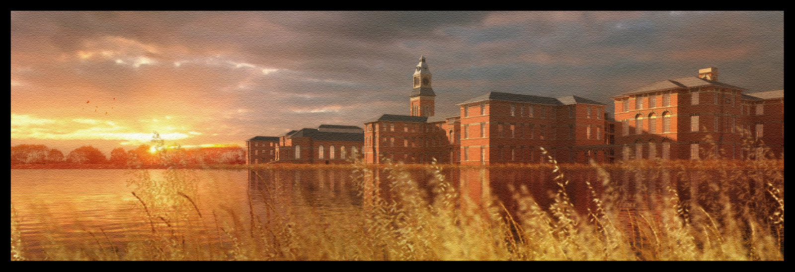
                              A"watercolour" sunset version.I think I will have to move the sky background(a layer in photoshop) over to the left, as at the moment the light on the buildings seems to be slightly different.But the mood of the scene is close to what I want to achieve.The treeline at the rear is also photoshop and when I used the "overlay" blend option,I got the effect I was looking for - an almost semi transparent,red colour as if the sun is burning thru the trees.

                              sunset.jpg

                              1 Reply Last reply Reply Quote 0
                              • tademaT Offline
                                tadema
                                last edited by

                                WOW, thats superb πŸ‘ πŸ‘ πŸ‘

                                1 Reply Last reply Reply Quote 0
                                • D Offline
                                  davidh
                                  last edited by

                                  Thanks tadema,I must say that your images are always the ones I gravitate towards when I see a new post.Your use of textures and mood are some of the best Ive ever seen.Because we use a digital medium sometimes its easy to think that "the computer does the work".
                                  Obviously it does to a certain degree,but the best images always have a style,imprint and a certain uniqueness that no matter how many tutorials are used ,certain "ideals" , for want of a better word,come to the fore.
                                  For me its composition.Then its light.Then its whatever I have to work with.I dont mean that in a smart way,Im lucky that now I work for myself,so every decision is mine,good or bad.

                                  1 Reply Last reply Reply Quote 0
                                  • D Offline
                                    davidh
                                    last edited by

                                    a jpg of the original render.


                                    bldg.jpg

                                    1 Reply Last reply Reply Quote 0
                                    • D Offline
                                      davidh
                                      last edited by

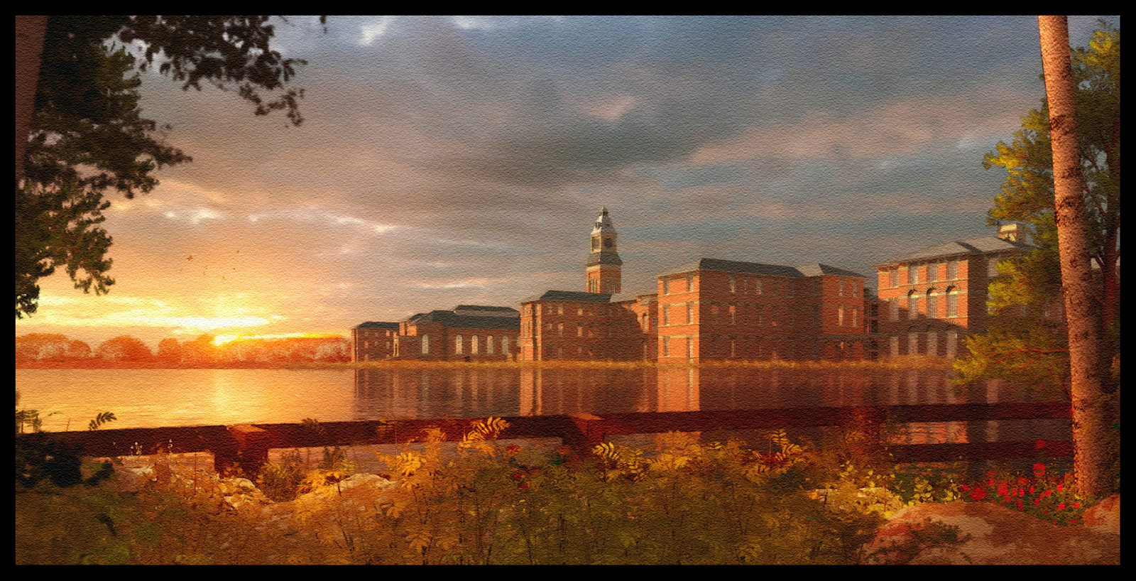
                                      Another version of the previous image.The foreground was initially much darker but again I burnt highlights to try and match the background lighting.

                                      sunst watercolour 3.jpg

                                      1 Reply Last reply Reply Quote 0
                                      • artysmediaA Offline
                                        artysmedia
                                        last edited by

                                        @davidh said:

                                        Another version of the previous image.The foreground was initially much darker but again I burnt highlights to try and match the background lighting.

                                        I like the mood, and atmosphere of this last one. Beautiful! πŸ‘

                                        Working with: Win7 64 bit OS - Core i5 - 2,27GHz and 8GB RAM

                                        Blog: Artysmedia

                                        1 Reply Last reply Reply Quote 0
                                        • R Offline
                                          Roger
                                          last edited by

                                          Not enough to be great, he has to be prolific too.

                                          http://www.azcreative.com

                                          1 Reply Last reply Reply Quote 0
                                          • soloS Offline
                                            solo
                                            last edited by

                                            Epic!

                                            http://www.solos-art.com

                                            If you see a toilet in your dreams do not use it.

                                            1 Reply Last reply Reply Quote 0
                                            • 1
                                            • 2
                                            • 3
                                            • 2 / 3
                                            • First post
                                              Last post
                                            Buy SketchPlus
                                            Buy SUbD
                                            Buy WrapR
                                            Buy eBook
                                            Buy Modelur
                                            Buy Vertex Tools
                                            Buy SketchCuisine
                                            Buy FormFonts

                                            Advertisement