Summer/autumn
-
WOW, thats superb


-
Thanks tadema,I must say that your images are always the ones I gravitate towards when I see a new post.Your use of textures and mood are some of the best Ive ever seen.Because we use a digital medium sometimes its easy to think that "the computer does the work".
Obviously it does to a certain degree,but the best images always have a style,imprint and a certain uniqueness that no matter how many tutorials are used ,certain "ideals" , for want of a better word,come to the fore.
For me its composition.Then its light.Then its whatever I have to work with.I dont mean that in a smart way,Im lucky that now I work for myself,so every decision is mine,good or bad. -
a jpg of the original render.

-
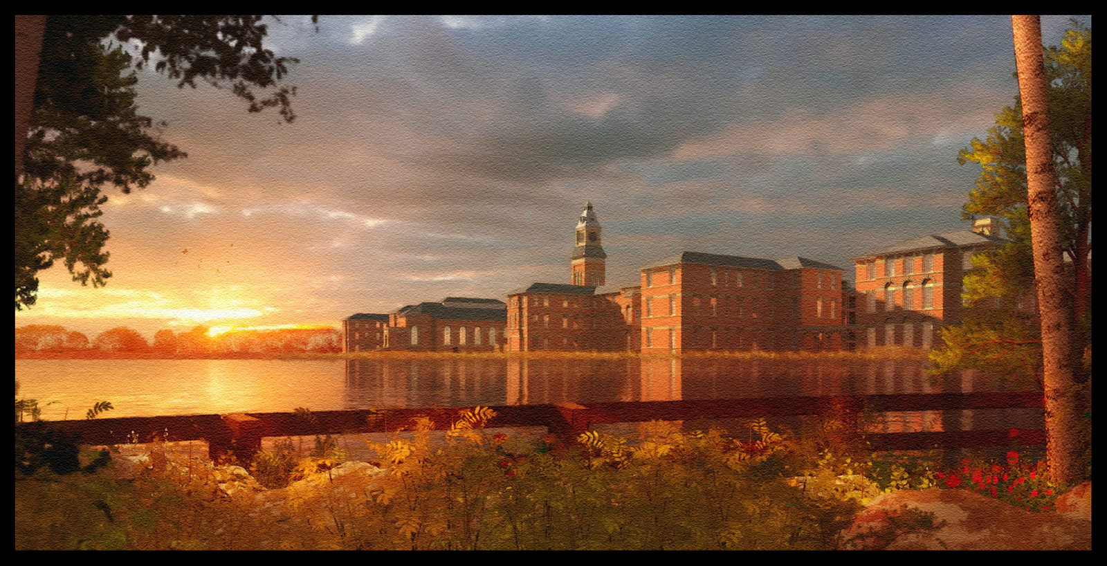
Another version of the previous image.The foreground was initially much darker but again I burnt highlights to try and match the background lighting.
-
@davidh said:
Another version of the previous image.The foreground was initially much darker but again I burnt highlights to try and match the background lighting.
I like the mood, and atmosphere of this last one. Beautiful!

-
Not enough to be great, he has to be prolific too.
-
Epic!
-
Maybe a sign that I need to take a break from rendering!(The hand on the left was downlaoded from the DeviantArt website,originally drawn by Rowen Silver)

-
and the final image

-
Clearly the right hand knows what the left hand is doing, and can render it too.
-
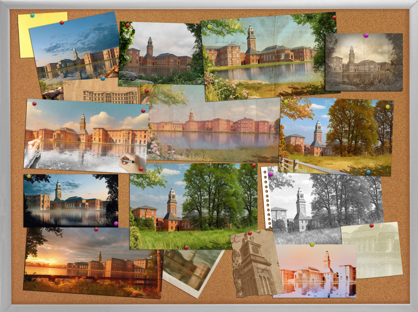
the final images in this series,just playing around with different presentation styles.
-
Masterful! What a beautiful presentation. This is one of my favorites.
Thanks for sharing.
Hello! It looks like you're interested in this conversation, but you don't have an account yet.
Getting fed up of having to scroll through the same posts each visit? When you register for an account, you'll always come back to exactly where you were before, and choose to be notified of new replies (either via email, or push notification). You'll also be able to save bookmarks and upvote posts to show your appreciation to other community members.
With your input, this post could be even better 💗
Register LoginAdvertisement


