Summer/autumn
-
@davidh said:
a misty morning version of the lakeside image.the model was re-rendered with a low sun but,again,all the same vegetation was used,just darkened and a low mist added over the far bank.
Very nice, most excellent, love it!
-
Very nice indeed!
 I like the first one best.
Edit: I think (this might very well be a matter of personal preference!) the composition could be improved. Currently, the tip of the tower is in the upper part of the image. It should be in the lower part. Think of seventeenth-century Dutch seascapes - if that makes any sense. I've been wrong before, though!

-
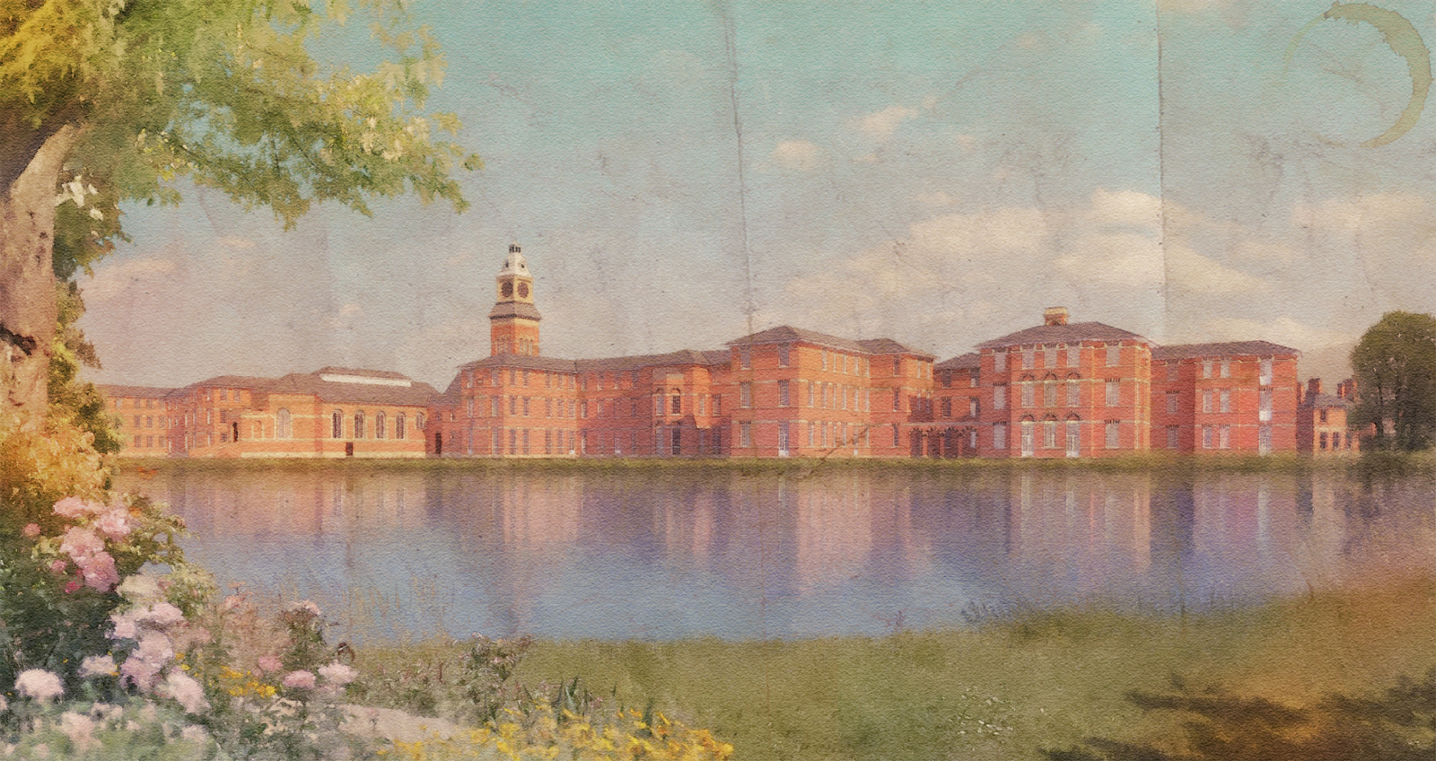
a distressed watercolour effect,maybe a bit too distressed!
-
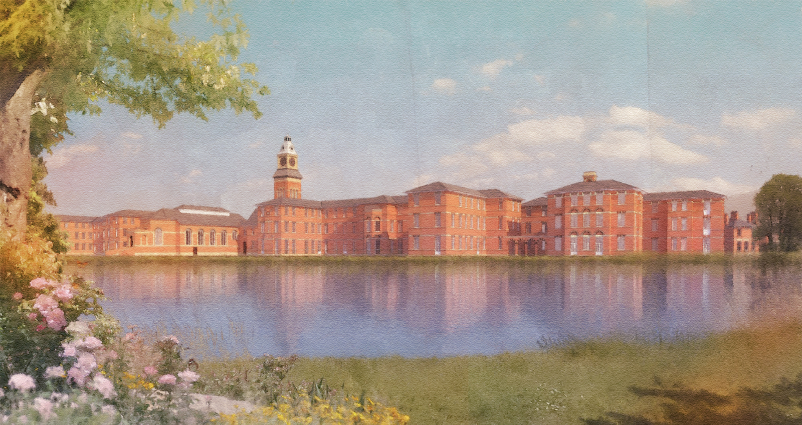
a little less distressed
-
I like those.
-
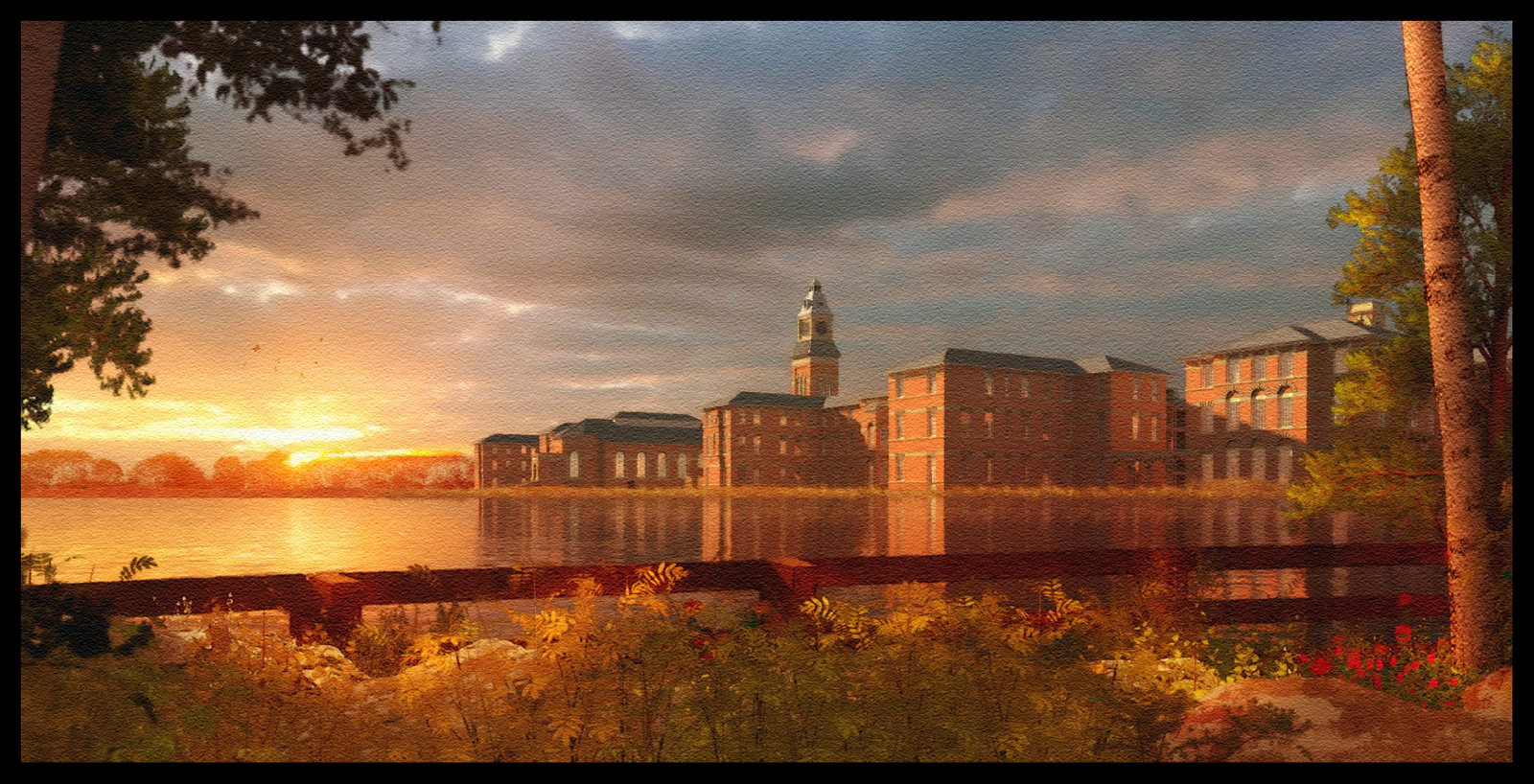
@davidh said:
1 more lakeside view with foreground depth of field added in the second image.the foreground rocks have had highlights burnt onto them in photoshop to try and make them more compatible with the lighting in the render.
Really nice renders, just something about the water, possibly reduce the reflection or more blur??
")
-
I think looking at the above photo that the reflections in my renders should be much darker.Next render I'll try and do something similar.Its really all about getting the correct lighting.My favourite light is definetly the low evening/morning sun because its possible to get much more dramatic images.
-
These are really nice! Both PR and WC. Peter
-
BORN TO RENDER
-
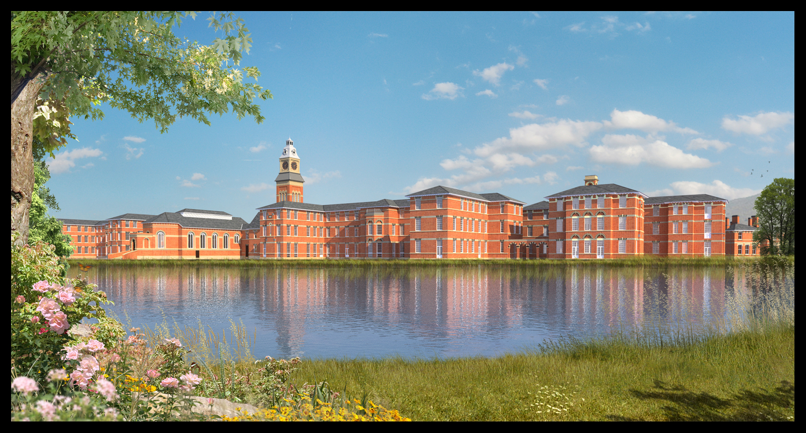
The original of the last image uploaded.i.e before the watercolour effect was applied.The foreground grass element at the waters edge is made up from the grass .png I uploaded a few days ago,but with some additional elements added such as the daisy's.I think the water reflection is still too blue so I guess its back to the drawing board on that one.
-
The water is fine, IMHO. The way it looks fits the style. I'd look into the purple cast on the roofs' edges, though.
-
Wow you are indeed the Master of Post production...the water reflection fits the scene very well and also the foliage..
Thanks for sharing your stuffs...
allanx
-
All looking great. Thanks for posting.
-
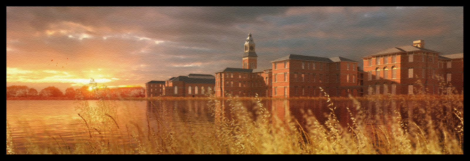
A"watercolour" sunset version.I think I will have to move the sky background(a layer in photoshop) over to the left, as at the moment the light on the buildings seems to be slightly different.But the mood of the scene is close to what I want to achieve.The treeline at the rear is also photoshop and when I used the "overlay" blend option,I got the effect I was looking for - an almost semi transparent,red colour as if the sun is burning thru the trees.
-
WOW, thats superb
-
Thanks tadema,I must say that your images are always the ones I gravitate towards when I see a new post.Your use of textures and mood are some of the best Ive ever seen.Because we use a digital medium sometimes its easy to think that "the computer does the work".
Obviously it does to a certain degree,but the best images always have a style,imprint and a certain uniqueness that no matter how many tutorials are used ,certain "ideals" , for want of a better word,come to the fore.
For me its composition.Then its light.Then its whatever I have to work with.I dont mean that in a smart way,Im lucky that now I work for myself,so every decision is mine,good or bad. -
a jpg of the original render.

-
Another version of the previous image.The foreground was initially much darker but again I burnt highlights to try and match the background lighting.
-
@davidh said:
Another version of the previous image.The foreground was initially much darker but again I burnt highlights to try and match the background lighting.
I like the mood, and atmosphere of this last one. Beautiful!
-
Not enough to be great, he has to be prolific too.
Hello! It looks like you're interested in this conversation, but you don't have an account yet.
Getting fed up of having to scroll through the same posts each visit? When you register for an account, you'll always come back to exactly where you were before, and choose to be notified of new replies (either via email, or push notification). You'll also be able to save bookmarks and upvote posts to show your appreciation to other community members.
With your input, this post could be even better 💗
Register Login


Advertisement