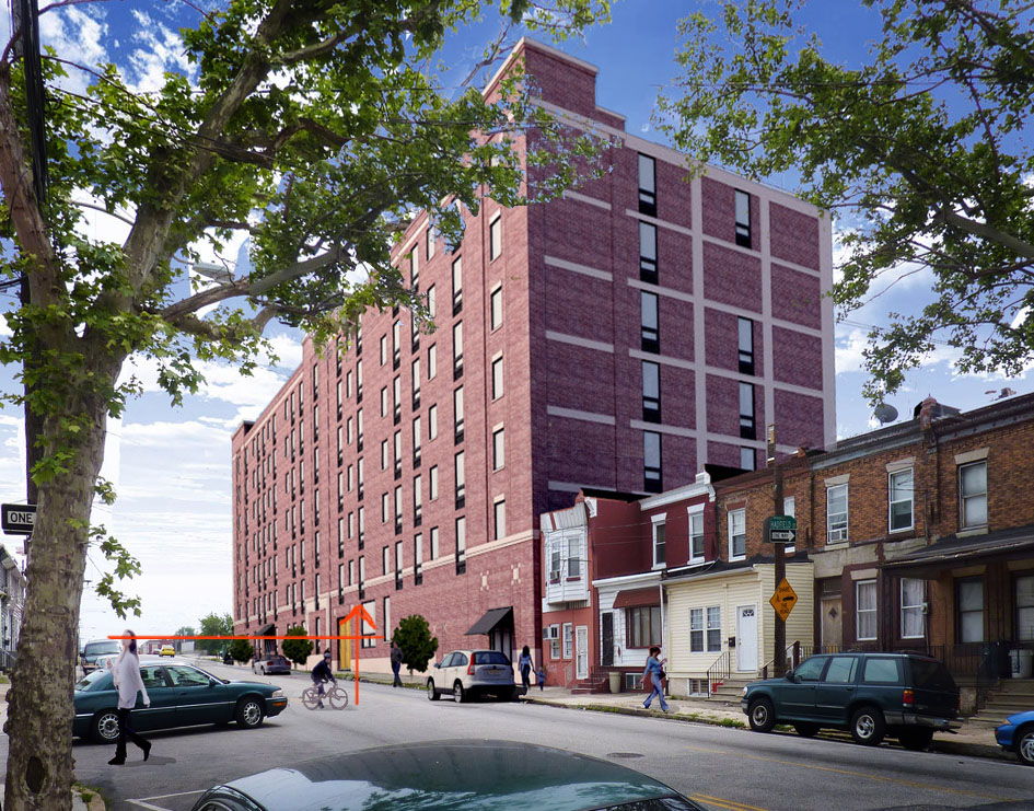
:Photo Composite: WIP
-
here's a couple of photo composites I'm working on.. any input is certainly appreciated. i'm actually pretty happy with them, for once.
prelim setups in SketchUp:


-
...that was earlier, here's where I'm at now after a quick Podium render and a bit of Pshop.


-
Those look good, especially the last one. Those trees are really big, though.

-
I think the trees look correct, but what I don't like too much is the people. They look flat and croped. Everything else looks great and the match is perfect, even the light.
Are you using HDRI for illumination?I've never used a photo to composite, when I try I see soooo many lines that I get scared LOL. Some day maybe.
-
Nice building, it looks almost real in this set-up
 I never knew how to do this in SU..
 -
They are all really great, but I agree that the people in the last one are a distraction. The girl on the left seems too large in proportion to the car behind her and I don't like the pose. The bicycle looks fuzzy, and the other girl on the far right looks cropped (around her shoulder). The other two people that are furthest away look fine. Otherwise it looks awesome! I kinda like the first one the best!
-
the trees in the second image, stinkie? those are from the photo! haha... perspective

i'll see what i can do about the people..I've got dosch3d people I could be using, but the 2d were easier to throw in.
no HDRI, this is literally a 3 minute podium render with about 10 seconds of setup.
-
Take another look at where the edge of the roof and the branches of the tree on the left meet.

-
LOL you are right stinkie! that branch is behind the building!!!

-
hsha...yeah, i got ya now! i did notice that earlier and swore i had fixed it...guess not.
-
Jason, that looks fantastic.
Any chance of one day showing how you merge those together in a quick tutorial? I'm especially interested how you get the tree so clean in the foreground.
-
@solo said:
Any chance of one day showing how you merge those together in a quick tutorial?
That would be great and very interesting.
Great visuals btw.

-
Very nice work, and a great fit with the photo (except for that "Escher" tree on the left

How did you manage to get the reflection of the building on the roof of that car in the front, even in the SU version? Was there a similar, real building hidden behind the model?
Apart from that I think they look a slightly overexposed?
And some better glass/reflections and less repetitive bricks wouldn't hurt. -
exactly, bjorn... this is a renovation of an existing building, and honestly, it didnt change that much. I definitely don't have those pshop skills! I barely pulled this together as it is.
pete...once you see the original photos, it'll take all of the mystique away.. haha.. those trees were existing in the photo..


-
What a gnarly sycamore tree tangled in wires! Must have been a pain to cutout. Love seeing Philly streets. Brings back memories. Nice to see the old buildings being renovated, too. To add realism, you need at least one cutout of a guy pushing a shopping cart full of scrap metal!
I think it looks great for what it is. I'm sure the client isn't worried about the added people being a fraction of an inch too big or small.
-
They probably won't be bothered by the trees either. I forgot to mention I really like the version with the npr building. Works rather well.
-
the bike dude just needs to go...period. he didnt cut out too well anyway.
thanks for the help, guys... i'm going to adjust the image a bit, but don't have time to fully go through and address everything..so don't get offended.. haha.
here's a rear image... pretty unexciting, but these are all required for zoning.

-
Here is one of the best methods I've seen for replacing skies in Photoshop:
http://www.digital-photography-school.com/how-to-replace-a-sky-in-photoshop
It will make that foreground tree look much better. -
Thanks Wyatt, I will definitely give that a shot!
Here is a quick interior I threw together this morning..

-

If the biker is a kid, he is too small. If he is an adult, he is way too small. A person sitting on a bike is almost as tall as a person standing and is a head taller than a small sedan. So if the street had been level the biker should be smaller than the woman standing but their eyes would be on the same level. Now add to that the tilt of the street which means the biker is physically higher than the woman although diminished by distance and the biker's head is way too low.
Hello! It looks like you're interested in this conversation, but you don't have an account yet.
Getting fed up of having to scroll through the same posts each visit? When you register for an account, you'll always come back to exactly where you were before, and choose to be notified of new replies (either via email, or push notification). You'll also be able to save bookmarks and upvote posts to show your appreciation to other community members.
With your input, this post could be even better 💗
Register LoginAdvertisement


