Lastest work (Thea4Su 13 May)
-
awesome awesome stuff, again... loving it.
-
Yes, really great work.
Thanks for posting it.
Cheers -
you are right. brilliant designs. another prejudice overcame.
-
This is my first major play with Thea. Coming from Vray4sketchup I by passed learning the basics and went straight to instancing.
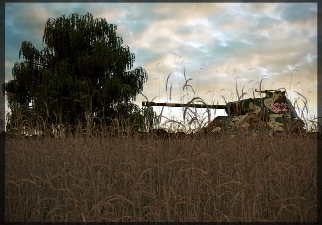
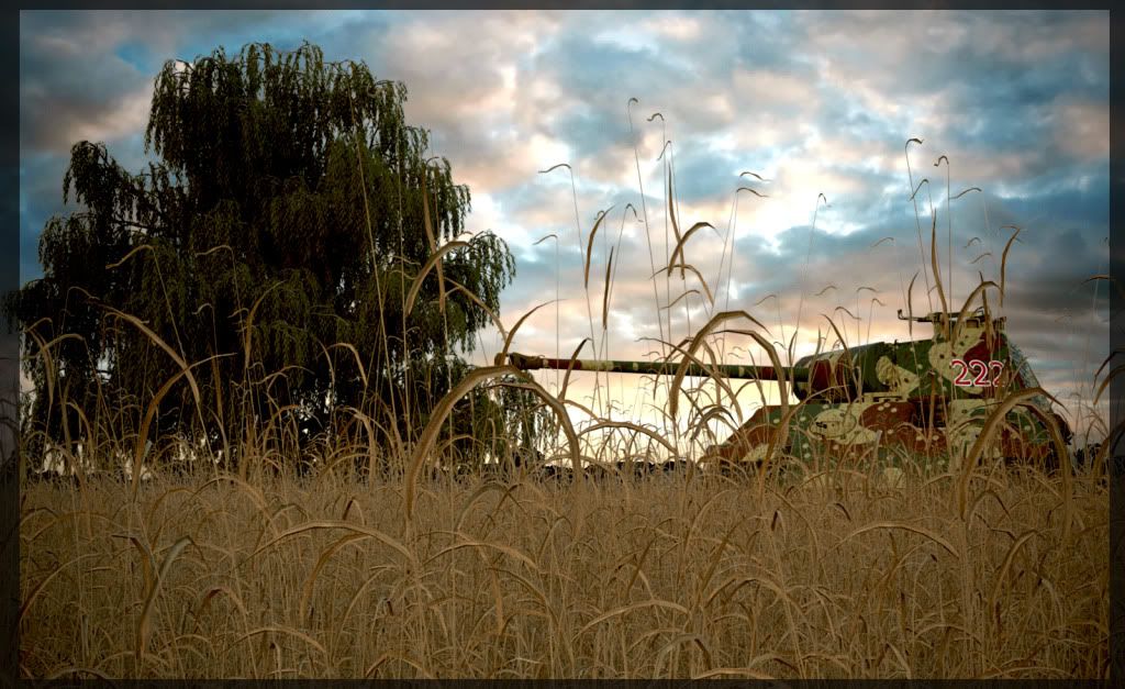
This image is influenced by a very addictive free game called "World of Tanks". That game will be the death of me. Huge thanks to DallasRT for the wildgrass and sharek for the Panther tank.First one with DOF

Second one over Photoshopped

-
lovely renderings...esp the first house. Do you mind sharing the swimming pool water setting and the window reflection. I really liked the effect,gives a very real effect..
Good job!!!cheers. -
-
How I missed these ? Beautifull Vray renders. Well done Holmes.
-
Sid, they are Thea renders.

-
The first renders are Vray , right....thea ones are good but I prefer the Vray ones.
-
@sepo said:
How I missed these ? Beautifull Vray renders. Well done Holmes.
 cheers mate
@rose said:lovely renderings...esp the first house. Do you mind sharing the swimming pool water setting and the window reflection. I really liked the effect,gives a very real effect..
Good job!!!cheers.
cheers again. check your inbox for pool water material -
@sepo said:
The first renders are Vray , right....thea ones are good but I prefer the Vray ones.
Oh! okay, I was refering to the tank.
-
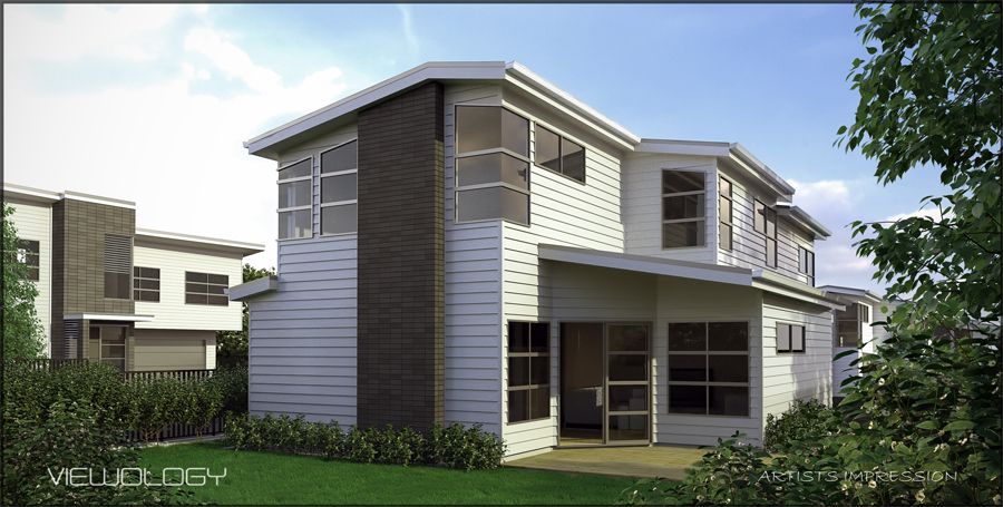
Im loving the Thea 4 Su pluggin. The workflow is so fast. Still having problems with noise but am still new to it. I hope to learn how to better avoid noise. Below is a housing development. For the budget/time Im pretty happy with the rendered outcome. Turn around 4 hours (Not including render time)

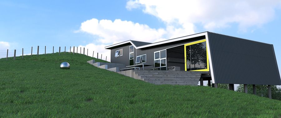
Testing to see how far I could push the pluggin using proxies. Below is a farm house designed for a friend.

-
Looks good, especially the first one.
-
I like the wild grass instance pretty convincing, is the model available here on the forums ?
-
You sould pay more attention for image composition. This is the only one thing at this level which makes your renders weak.
First image, too much of vegetation on the right side.
Second image. I could not understand what are you trying to show. The house or chrome ball? If house, pay more attention for the facade. More over, corner of the roof is gone which makes house not so important in this image
Good luck in next renders, and remember that compositon is extremaly important
-
@chedda said:
I like the wild grass instance pretty convincing, is the model available here on the forums ?
Im pretty sure the grass model is on the Thea Render forums.
-
@edenux said:
You sould pay more attention for image composition. This is the only one thing at this level which makes your renders weak.
First image, too much of vegetation on the right side.
Second image. I could not understand what are you trying to show. The house or chrome ball? If house, pay more attention for the facade. More over, corner of the roof is gone which makes house not so important in this image
Good luck in next renders, and remember that compositon is extremaly important
Although i agree, the first image is unbalanced with lots of focus of the tree to the right side, unfortunately there are other factors to consider with a paid job. Firstly clients brief "Render to show house with living court surrounding gardens and tree on boundary in a sunny environment". In my experience with Real Estate images you have to be very accurate, they are less interested in a piece of art work than showing what is exactly there
 . I would have like to pulled the camera angle back further but in reality there is a tall concrete wall there which would block the view to the living court.
In the second image, as I said in the description is a test with instancing the grass. I should have stated its a WIP. The chrome ball was to see the position of the HDRI background. But I would like to play around with that image in the future. So I will make the focus of the image the house and not the grass field.
Cheers so much for your crits. -
Hi ...Could you please share about the render setting for a good result like interior and exterior setting..i'm using thea too but never get a good result like yours..


-
@bahri said:
Hi ...Could you please share about the render setting for a good result like interior and exterior setting..i'm using thea too but never get a good result like yours..


I haven't tried to do an interior in Thea yet. Best to go to the Thea site and ask for help. They are a friendly lot over there.
-
@jarynzlesa said:
nice piece of architecture that I wouldn't expect in New Zealand.

Australia has some brilliant Architects yet I know myself what I see coming from New Zealand they are becoming FAR ahead of the rest!
We get a lot of NZ Architectural publications in Aust and these have become my favorite collectibles. The little beach shacks (bachs?) are some of the most well considered small spaces you will witness.
@ HOLMES - mate you have achieved AWESOMENESS level. Well done mate!
My only crit would be a little more DOF in some of the images, this would help to highlight your points of interest!
Again inspiring stuff mate!
Hello! It looks like you're interested in this conversation, but you don't have an account yet.
Getting fed up of having to scroll through the same posts each visit? When you register for an account, you'll always come back to exactly where you were before, and choose to be notified of new replies (either via email, or push notification). You'll also be able to save bookmarks and upvote posts to show your appreciation to other community members.
With your input, this post could be even better 💗
Register LoginAdvertisement


