FOYER - interior setup...
-
Process : su + vfsu + ps
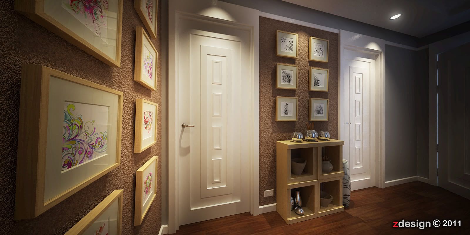
featured wall
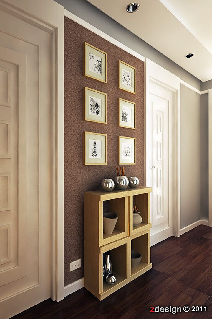
detailed wall
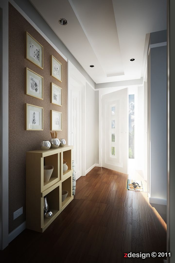
day scene
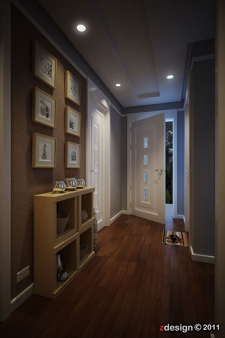
night scene
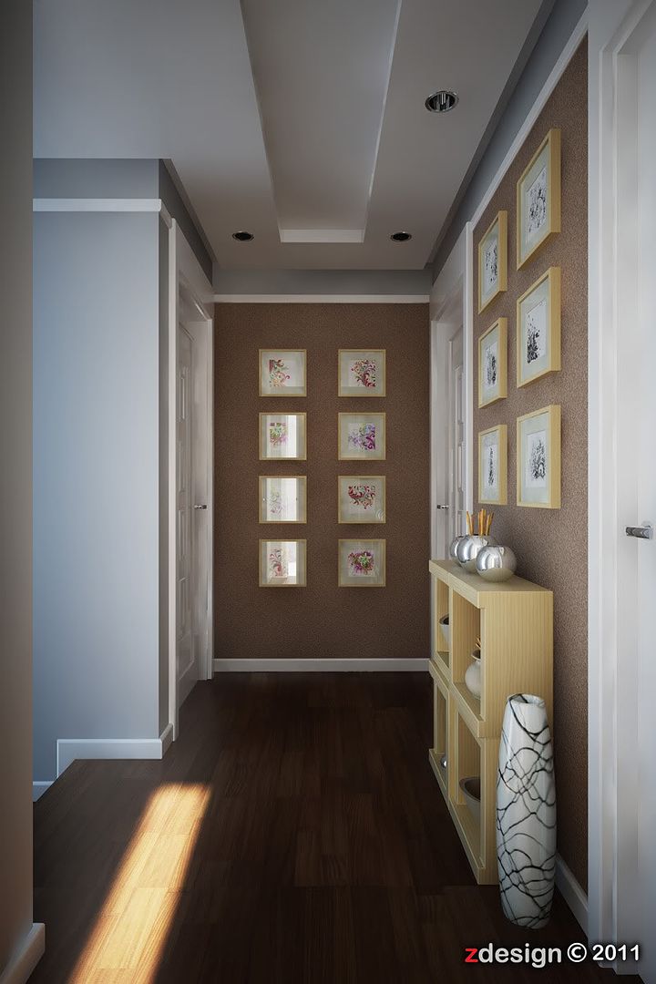
other view day scene
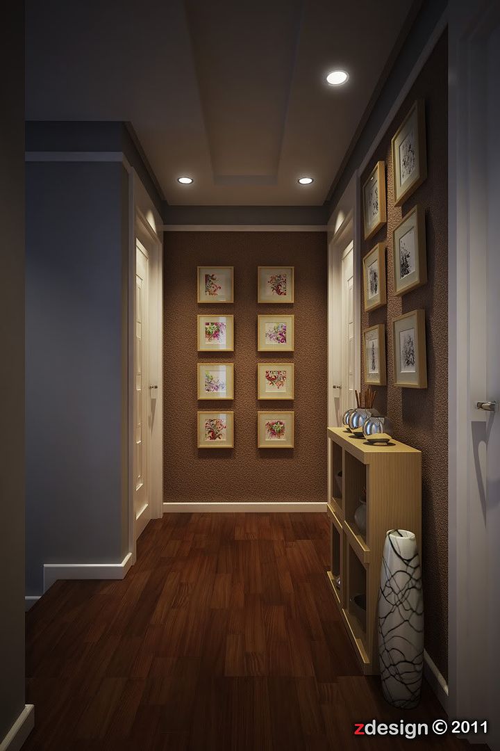
additional view...night scene
-
Wow. I wish my house looked that nice!
Excellent lighting, composition, subject and.... and oh heck, I wished I lived there.
-
Really nice. I think the bump on the wall and floor are a bit strong but all in all nice stuff.
Scott
-
good work
 .
. -
@bryan k said:
Wow. I wish my house looked that nice!
Excellent lighting, composition, subject and.... and oh heck, I wished I lived there.
thank's bryan...this is my first time to post here, sorry for the big images. thank's anyway.
-
@scottpara
@jarynzlesa
thank's a lot... -
I like the beveled mats on the pictures on wall, and the fact that they hang like in real life, not flat on wall, nice detail.
Oh yeah, do tone down the bump on wall, it gets way too much attention. Are you able to share this wonderful work?
-
Really nice looking renders...

If I should be nit picking it would be on the FOYER2_POSTcg image, where the bump on the floor seem too strong...
But any client should be really happy with these... -
@unknownuser said:
I like the beveled mats on the pictures on wall, and the fact that they hang like in real life, not flat on wall, nice detail.
Oh yeah, do tone down the bump on wall, it gets way too much attention. Are you able to share this wonderful work?
thank's to your comment,sure i will share my process here.
-
@unknownuser said:
Excellent, excellent, excellent...second image slightly out of focus?....brilliant lighting too

thank's a lot...
-
@frederik said:
Really nice looking renders...

If I should be nit picking it would be on the FOYER2_POSTcg image, where the bump on the floor seem too strong...
But any client should be really happy with these...yes that's thru but i need to show the bump texture of the floor,thank's a lot.
-
nice nice nice ~!!!
enjoy seeing high quality rendering like these!! thanks man -
@unknownuser said:
nice nice nice ~!!!
enjoy seeing high quality rendering like these!! thanks manthank's bro...
-
Very nice work. You got skills man.
-
Nice Job.....
-
Honestly ...this is absoluatly amazing...BIG UP
-
many thank's to all who like my work...
my blog - http://zdesignporfolio.blogspot.com/
Hello! It looks like you're interested in this conversation, but you don't have an account yet.
Getting fed up of having to scroll through the same posts each visit? When you register for an account, you'll always come back to exactly where you were before, and choose to be notified of new replies (either via email, or push notification). You'll also be able to save bookmarks and upvote posts to show your appreciation to other community members.
With your input, this post could be even better 💗
Register LoginAdvertisement


