Garden
-
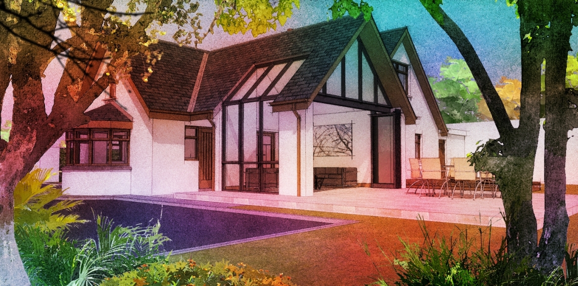
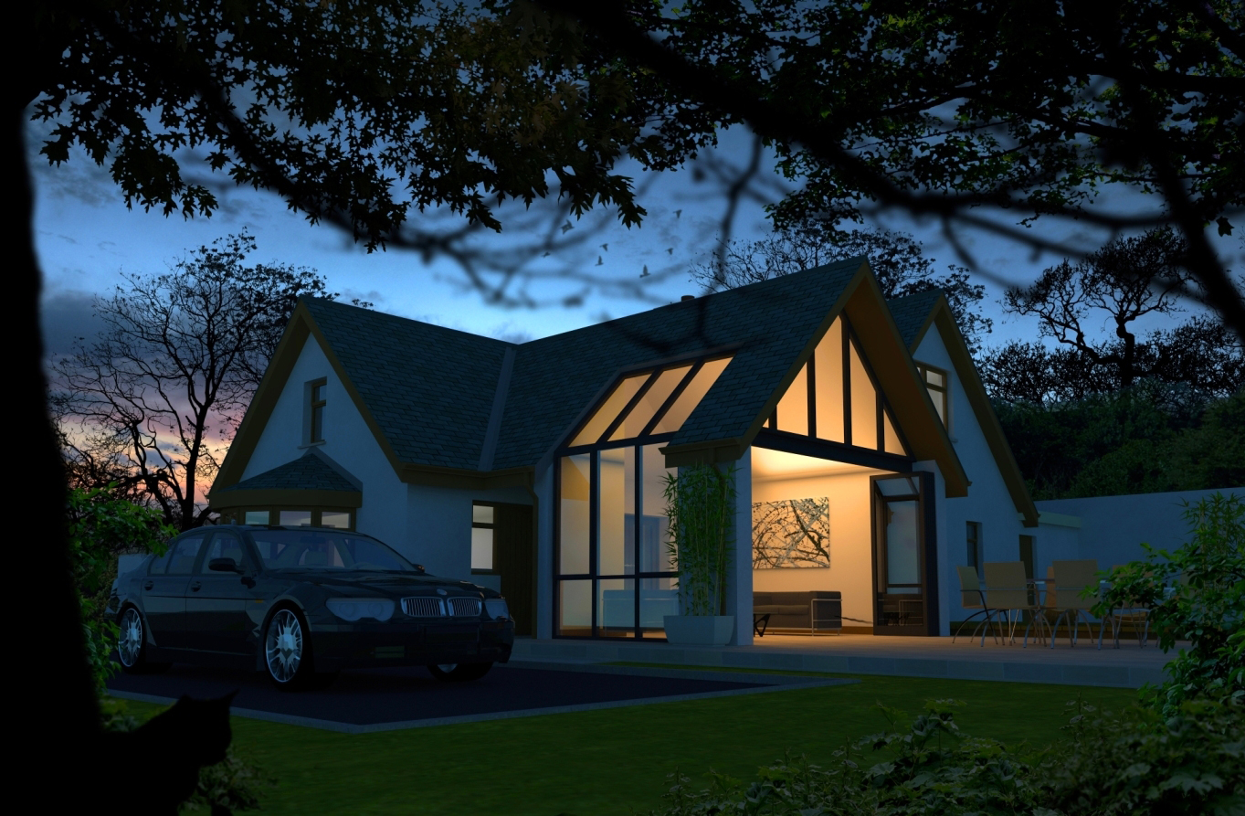
Attached are 2 images of the same project,one a fotosketcher version,the second a vray render.I need to revise the lighting in the house and hope to upload some updated vray images in the comming days
-
i loved the second one, good job
-
me too, especially the DOF at the tree
-
Both are very good. To me, time is of the essence. If I can get the second in time, OK, but I would gladly settle for the first. BUT, maybe the second actually takes less "on the board time" to do?
-
Very impressive.
On the subject of time. I think the degree of client buy in is of the essence, because it can save you time and tension down the road. A client can nod his head up and down on the outside and not be so sure on the inside. Number one intrigues me. Number two convinces and sells me. Both great work.
-
that is marvelous... and I love the glass... but someone should call the police on the stalker in the bushes taking photos...
-
Thanks for the comments guys.
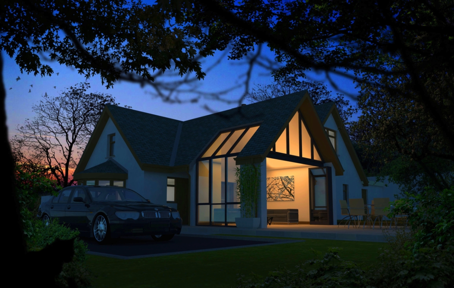
Attached is a revised evening shot.I have added extra vegetation to the right handside to try and "close off" that side as to me the original image was slightly unbalanced.I also added a different sky and increased contrast.What I try and do for night/dusk shots is have a lot of contrast between inside and out,normally in an orange/blue colour scheme.regarding the watercolour,that was based from a 10 minute render in twilight and brought thru fotosketcher.The time taken for that image was about 20 minutes in total(not including modelling time).The second image was 50 minutes to render in vray and about one and a half hours in post production.A lot ,if not most of my night shots involve some degree of dark foreground as I think it helps not only to bring the viewer into the image but also helps tie the building to its surroundings.
The glass is the standard vray glass but with fresnel reflection increased to 2.5
-
Very nice renders, David. Love the night scene.

Could you please post a screenshot of the sketchup model/geo.
Thanks and keep it up!
_KN
-
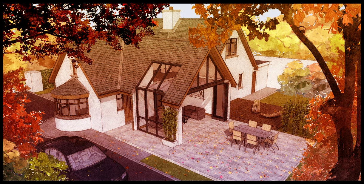
2 more images from the same project.The vray summer garden needs to be redone because the brown on the doors and fascias are 2 flat.But because the planting and sky are set up on layers in photoshop ,hopefully all I will have to do is drag the revised render onto a new layer and it will be finished.
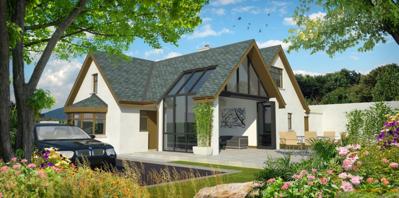
-
Attached is a "summer" watercolour(again,a 10 minute twilight render taken thru fotosketcher and post produced in photoshop.)
EDIT- Shadows and colours revised
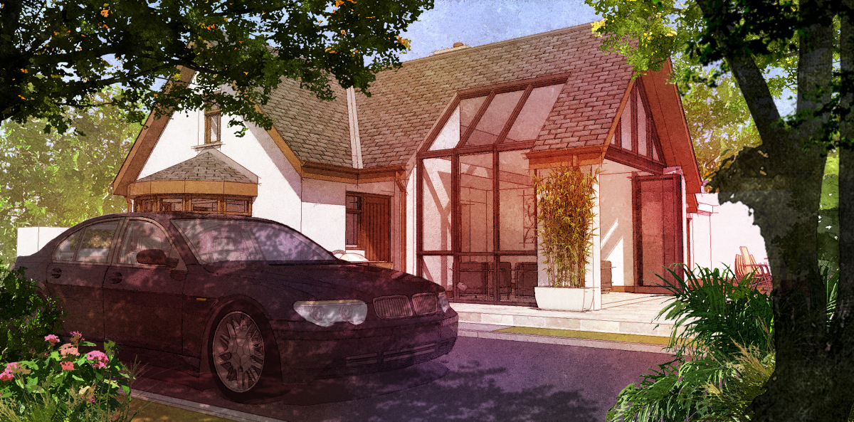
-
David, exquisite work, so understand this crit is being ultra picky. On the daylight photoreal I would start to desaturate the mid ground trees just to create some aerial perspective to add depth.
Two observations on this subject:
I photographed a hotel in the mountains of New Mexico with infrared film that totally cut through 10 miles of atmospheric haze. I will admit that the white plants also contributed to viewer reaction, but many viewers thought the photo was a model because of the lack of aerial perspective.I also read about an Everest Expedition where the air was so clear and there were no familiar objects to help gauge scale so an ice field the climbers expected to cross in an afternoon actually took two weeks.
Haze is a great tool to create depth in a 2D presentation.
-
Roger,thanks very much for your comments.I agree,the daylight vray is not as successful as the last watercolour image regarding depth,a good image should have definition between foreground,middleground and background.
I think that the house being almost pure white,without any texture,dosent help either(I will fix this and repost later).I find personally that dusk shots/early morning shots work so much better because you have more contrast with the light.My background is oil painting/acrylic painting and I am always trying to get the composition right,sometimes to the detriment of other areas. -
A further image,using a HDRI as the main environment lighting source and with 2 rectangular vray lights inside.As usual,all planting is entourage added in photoshop.
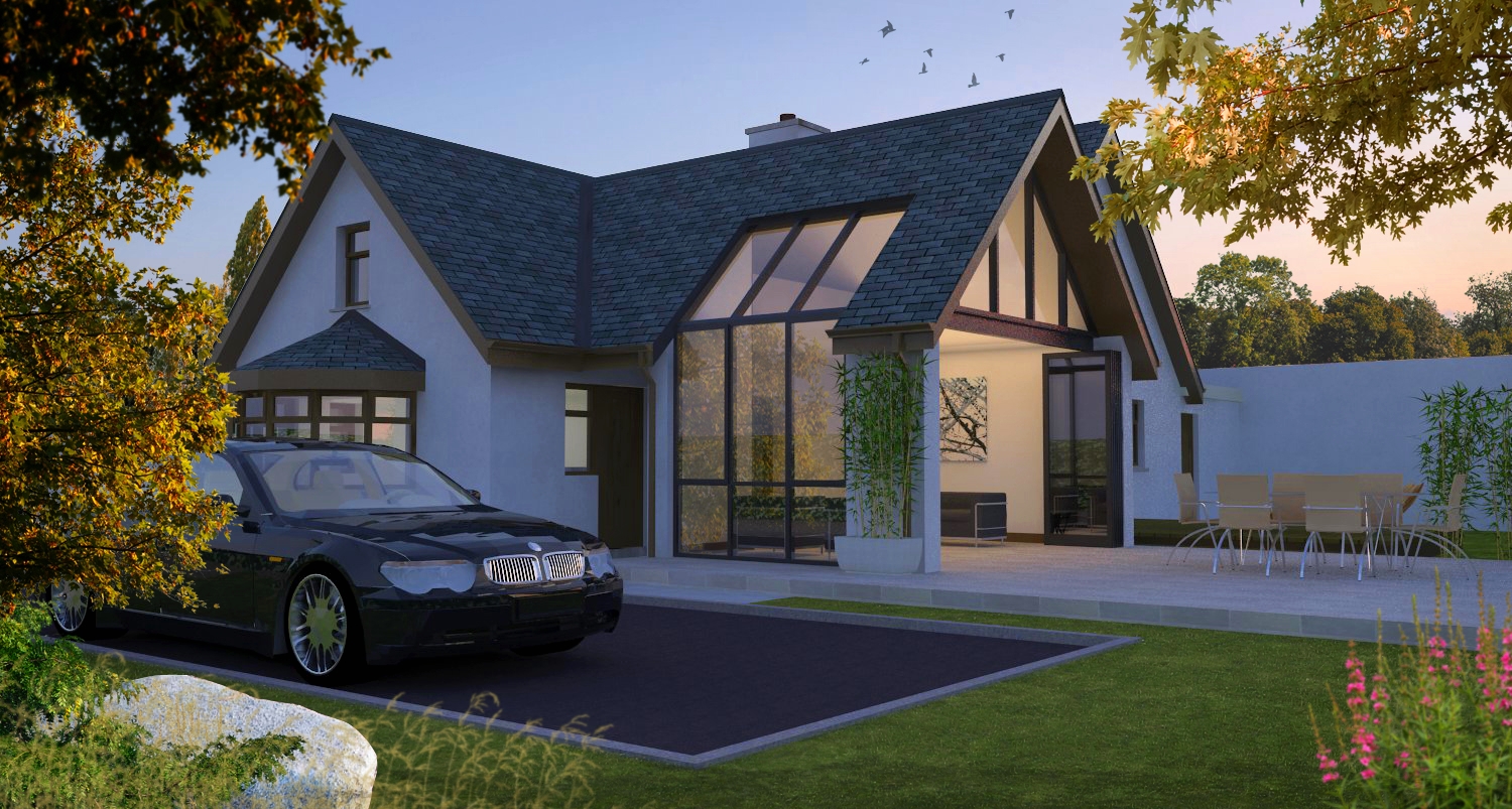
-
Very cool

Is that a Pollock painting inside?
-
A different project this time,I will be re rendering as the original render had quite a low light cache setting which became more noticable when I increased contrast(more so around window reveals which show some burn out as does the seating at foreground)
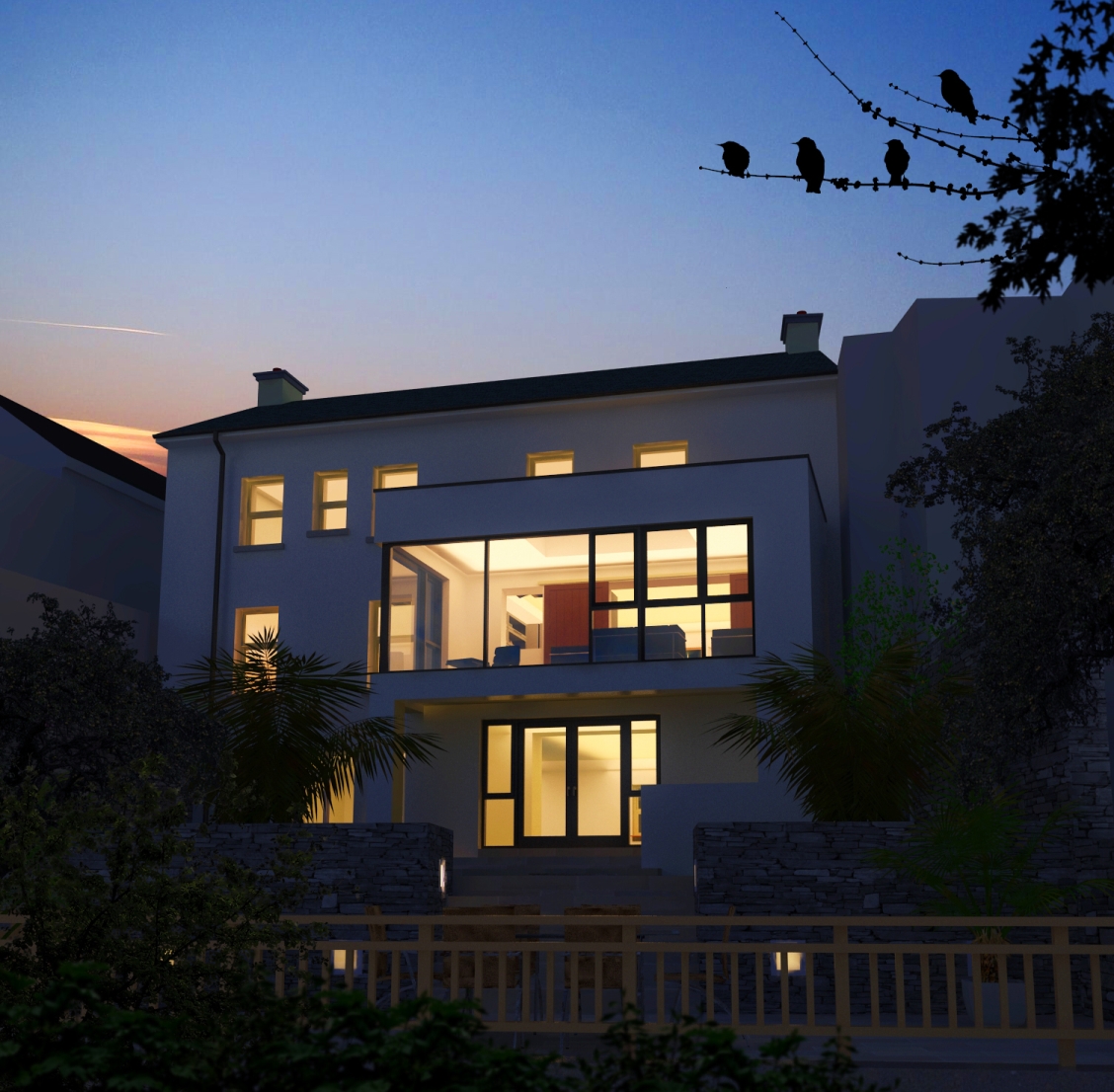
Hello! It looks like you're interested in this conversation, but you don't have an account yet.
Getting fed up of having to scroll through the same posts each visit? When you register for an account, you'll always come back to exactly where you were before, and choose to be notified of new replies (either via email, or push notification). You'll also be able to save bookmarks and upvote posts to show your appreciation to other community members.
With your input, this post could be even better 💗
Register LoginAdvertisement


