Render Pic from a Newbie!!!
-
Hi guys,
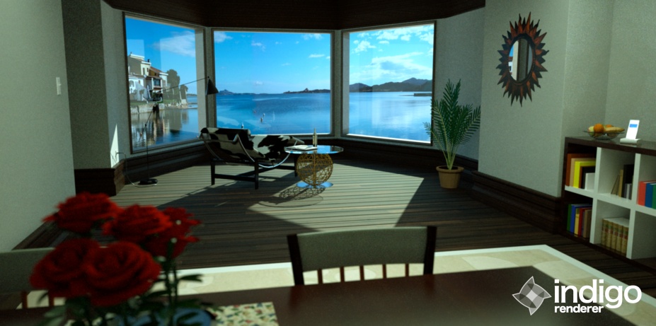
I have been surfing the forum for quiet some time and now I feel it's finally time to post something myself. I would like to show you my render I created using Indigo. All the objects in the image come from Google Warehouse and in this way I want to give credit to all the people that created them. I slightly modified some textures and objects to create this nice living room. I would be happy to get some feedback from you guys, so please don't hesitate to let me know what you think.

-
great start and welcome. nice layout and some good stuff you grabbed from the warehouse.
some crits
the whole thing is a bit dark, and id say the sun on the floor needs to be a bit brighter too
maybe move the roses left a bit more, to draw the eye into the center, i thikn they draw too much attention atmfinally, im not quite sure what is meant to be the focus of the image, if its the chair then maybe the background is too much? if its the background, its not enough
 maybe put a boat or something!
just my opinions
-
I think I remember this room from some kind of vray interior tutorial!
Am I right? But the picture looks nice, also if it has a little too much green in it!Greetz, Fritz
-
Hi guys
@sir said:
great start and welcome. nice layout and some good stuff you grabbed from the warehouse.
some crits
the whole thing is a bit dark, and id say the sun on the floor needs to be a bit brighter too
maybe move the roses left a bit more, to draw the eye into the center, i thikn they draw too much attention atmfinally, im not quite sure what is meant to be the focus of the image, if its the chair then maybe the background is too much? if its the background, its not enough
 maybe put a boat or something!
just my opinions
You are right, I tried to put the camera focus on the chair, but that might have been not the greatest idea. Thank you very much for your feedback
@unkr3at1v said:
I think I remember this room from some kind of vray interior tutorial!
Am I right? But the picture looks nice, also if it has a little too much green in it!Greetz, Fritz
Thank you very much for your feedback. And you're right this room is from a vray interior tutorial from andeciuala

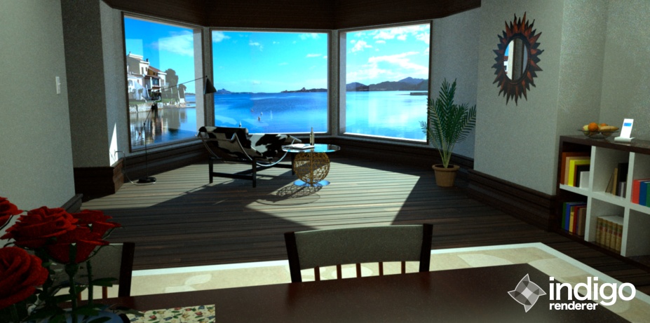
In my new render I tried to incorporate all your guys feedback and I wanted to see what you think about the changes I made.Greetz, Alex
Hello! It looks like you're interested in this conversation, but you don't have an account yet.
Getting fed up of having to scroll through the same posts each visit? When you register for an account, you'll always come back to exactly where you were before, and choose to be notified of new replies (either via email, or push notification). You'll also be able to save bookmarks and upvote posts to show your appreciation to other community members.
With your input, this post could be even better 💗
Register LoginAdvertisement


