FotoSketcher is pretty cool
-
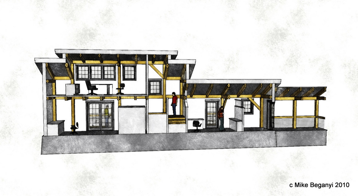
quick try with a section.
3 jpg exports - hidden line, profiles turned off, 'normal' sketchup view.fotosketch each of them.
assemble in photoshop by layering.would work better as an exterior, with some shadows, trees, landscaping... but a cool process.
-
Oli
Yeah I have to agree. I'm looking at a new macbook pro, and pretty much convinced to add fusion. Anyone I know who uses it loves it. Glad you agree, it makes the decision easier. -
Sorry to be a fanboy but Fotosketcher is really cool in my opinion. What can I say, I suck at rendering! If you are on Facebook I have an example http://www.facebook.com/#!/photo.php?pid=1836523&id=665888847&fbid=80713438847
-
@ Oli,
Thanks for starting this thread! I really prefer your Fotosketcher image to your rendering in the first post...nice work.
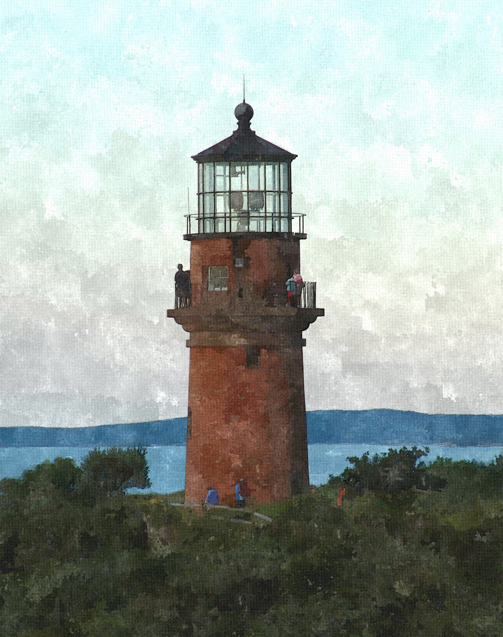
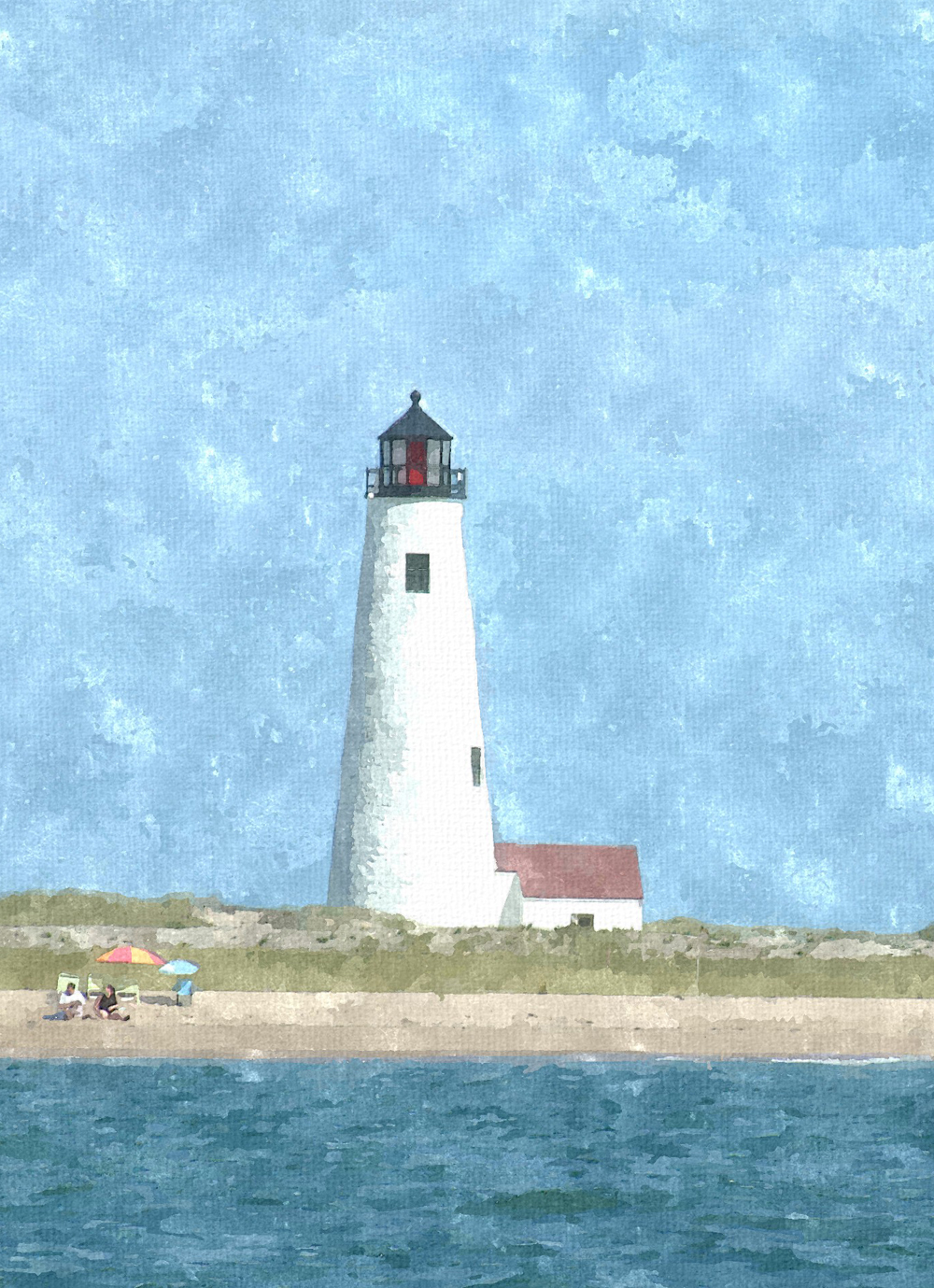
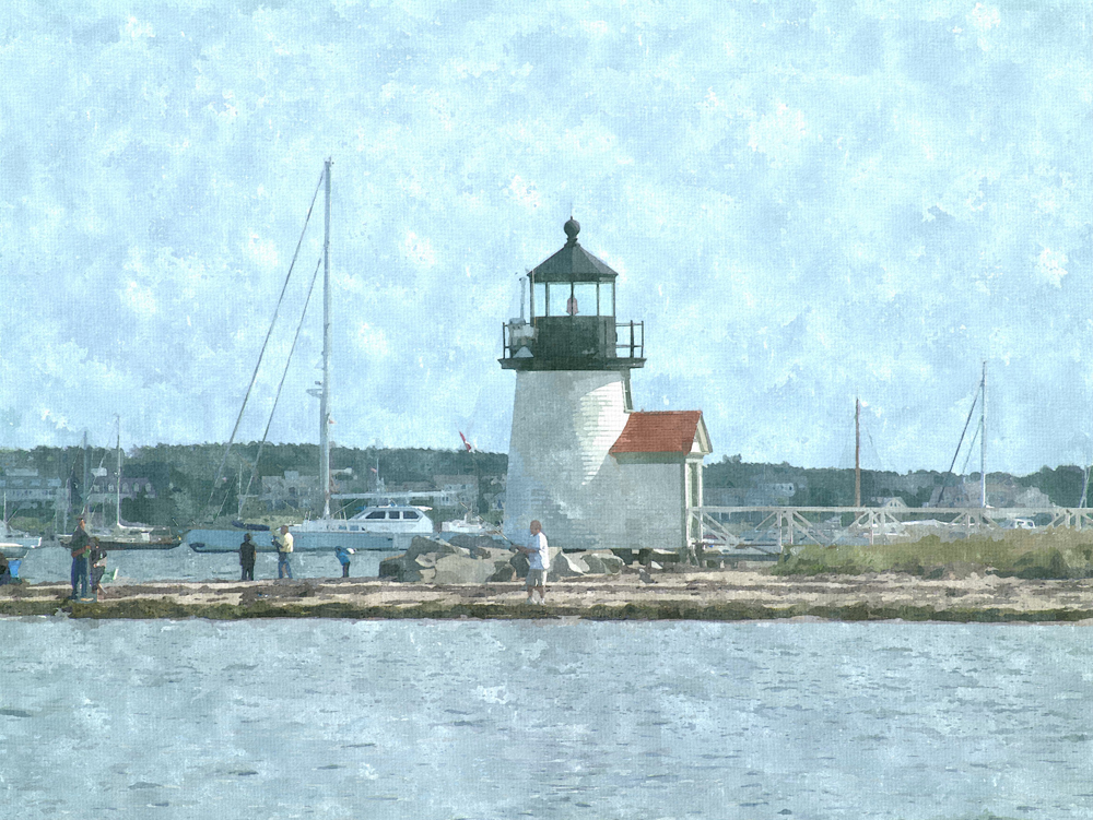
Thanks to this forum and Boofredlay, I discovered Fotosketcher a few days ago. 4 of my friends and colleagues are now using it...it is indeed a fun, easy to use piece of software and you can beat the price.Here's some photos that I took that were pretty much throwaways until I ran them through the FS watercolor filters.
Robert
-
@sepo said:
quick one
Sepo,
I really like this image! Care to post the original and your settings in FS?
Robert
-
Not sure if this works or not...took a photo of the fields, sky and tree line behind my house...ran it through FS. The used it as a billboard backdrop behind a SU model.
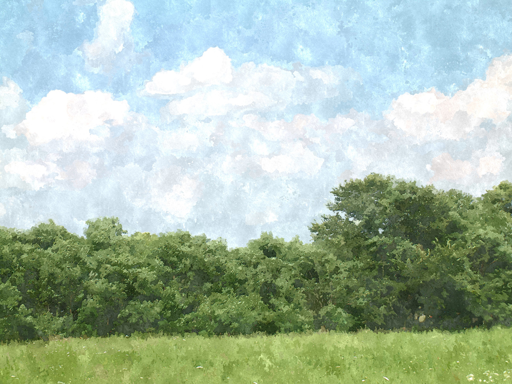
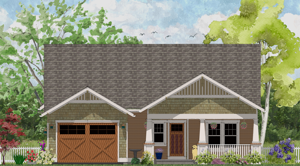
-
I've been playing around with it. Very Fun!
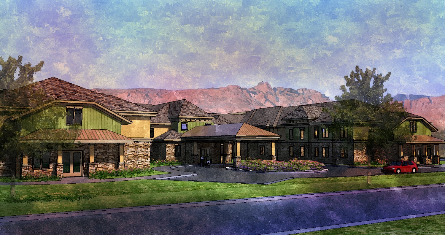
-
Thanks Marek, finger painting is what I suspected. A watercolor painting has sharp and and blurred details at the same time, this is what makes your picture look so realistic.
I tried to achieve this with the color blending of the bilateral filter in FS. This one is first watercolor and then median + bilateral. Warehouse model, just a few passes in Twilight.
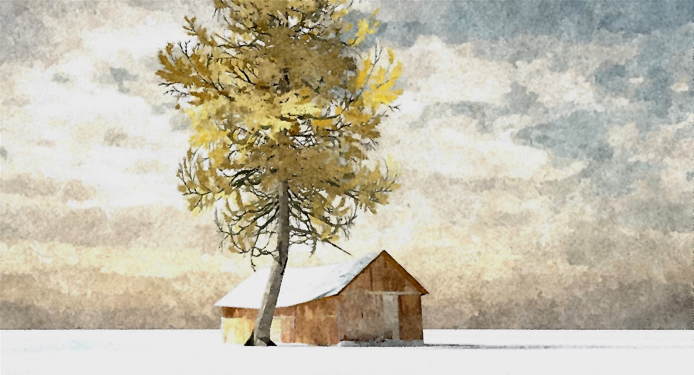
-
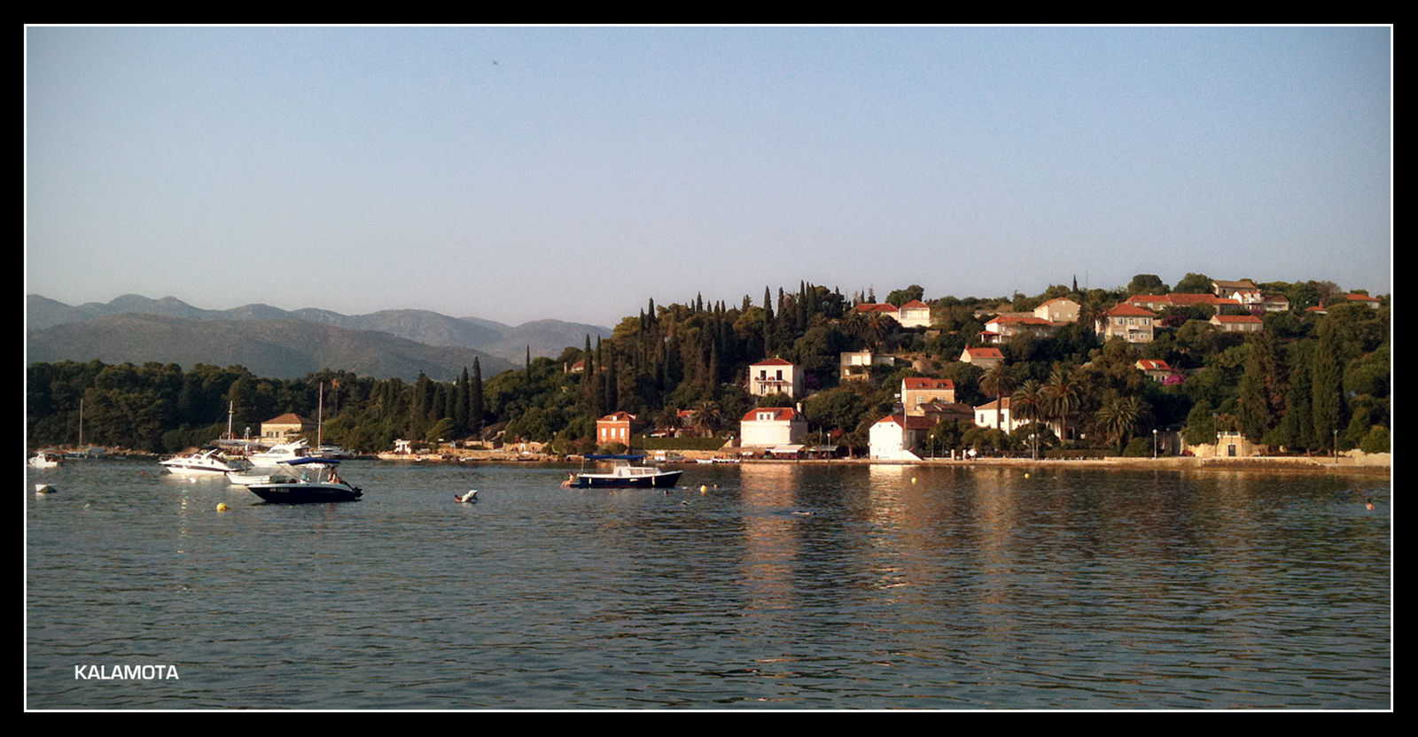
This is base photo shot with Iphone. Basic pp contrast, vignette and frame.
-
some great images here

need to have another play.

-
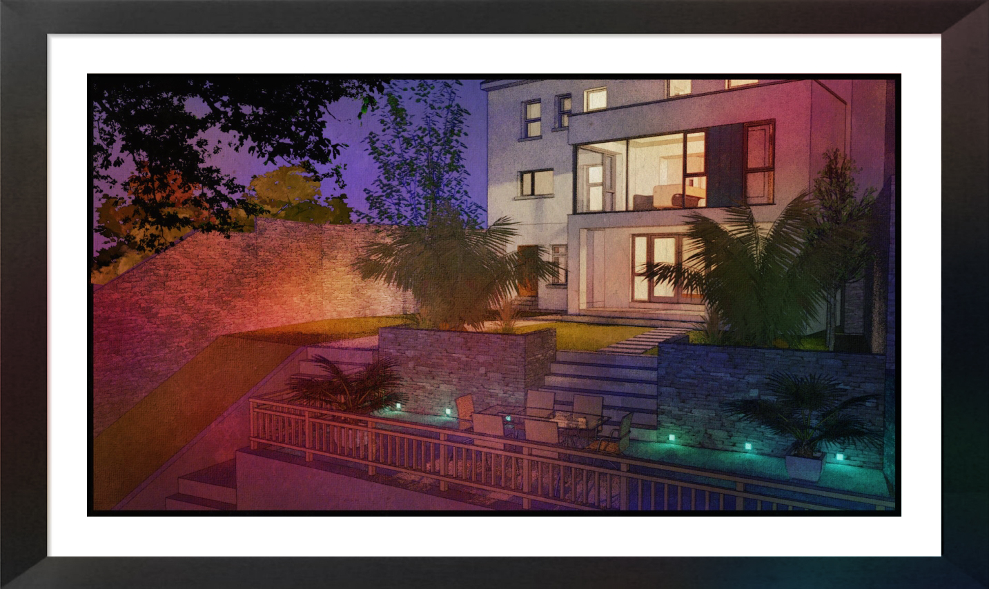
Fotosketcher again-Rendered in twilight(it could have been taken directly from sketchup but I wanted the lighting and some reflection).
Also added was a textured watercolour paper,slightly stained(not one of the default fotosketcher textures).
-
@shura said:
Thanks Marek, finger painting is what I suspected. A watercolor painting has sharp and and blurred details at the same time, this is what makes your picture look so realistic.
I tried to achieve this with the color blending of the bilateral filter in FS. This one is first watercolor and then median + bilateral. Warehouse model, just a few passes in Twilight.Nice job...I really like this look!
Can you post the original image? -
Nice david. yeah its so much better using a render rather than straight SU. SU to FS looks flat
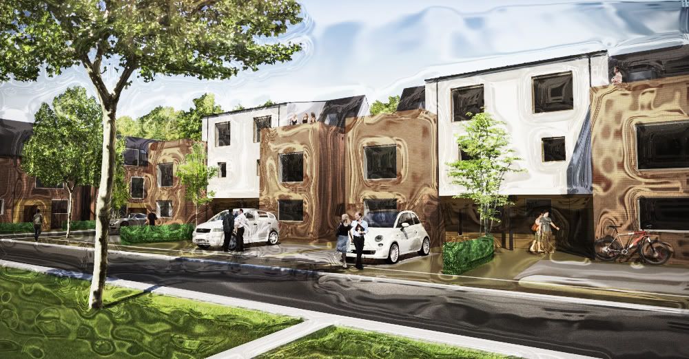
I thought i'd post this mistake, sorry its not fotosketcher but it looks cool.
Chrome filter in photoshop....blending mode "overlay". Quite striking I think, not exactly sure why! I think it may work for adding movement streaks to cars/people.
-
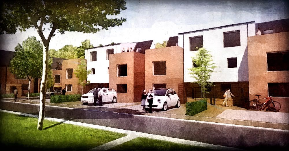
anyway, back to fotosketcher:
tried some grungey overlays with this one. the colour bleeds look sweet so I added some in photoshop.
-
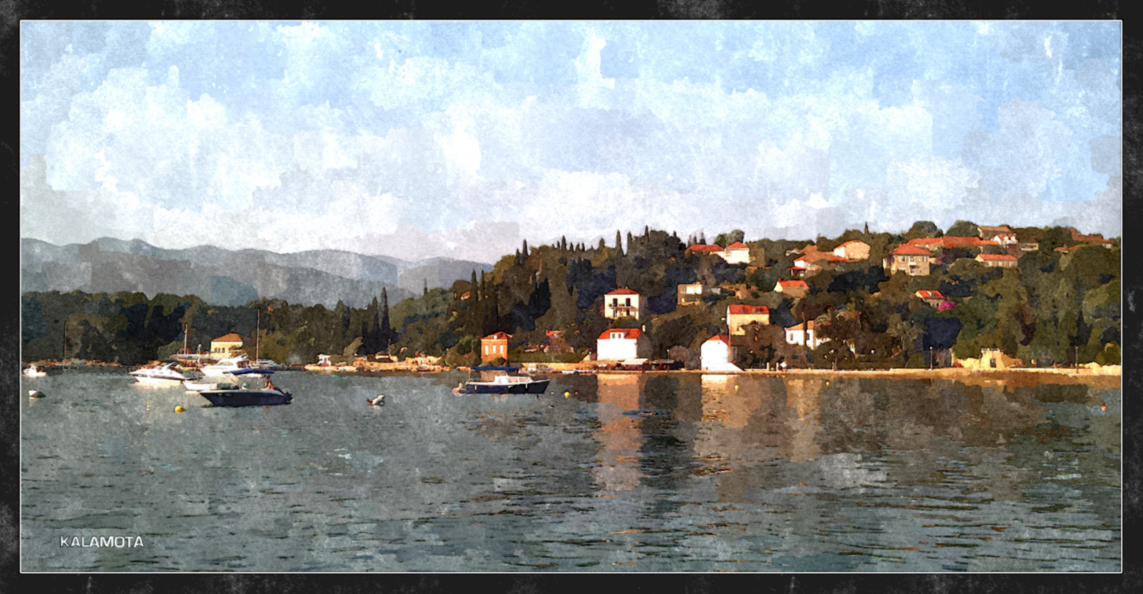
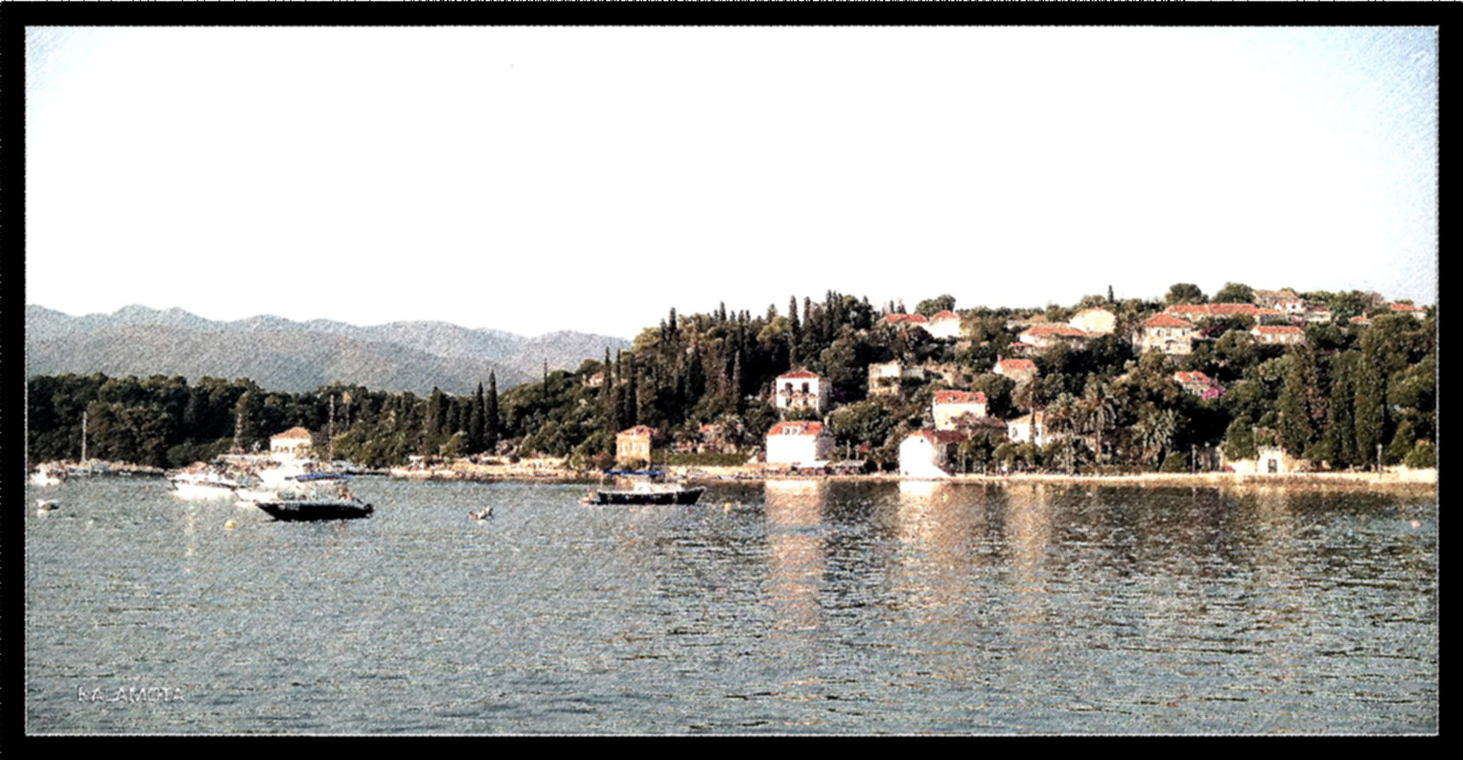
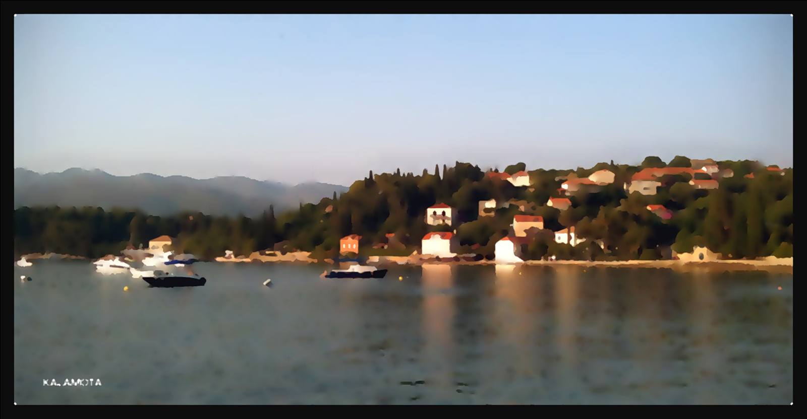
Created 3 different outputs from Fotosketcher + original and brought them to Photoshop for mixing. Used various % and type of blending such luminosity and soft light. Finally added bleeding colour layer. I do not have exact info on how each file/layer was manipul;ated. It was purely visual.
-
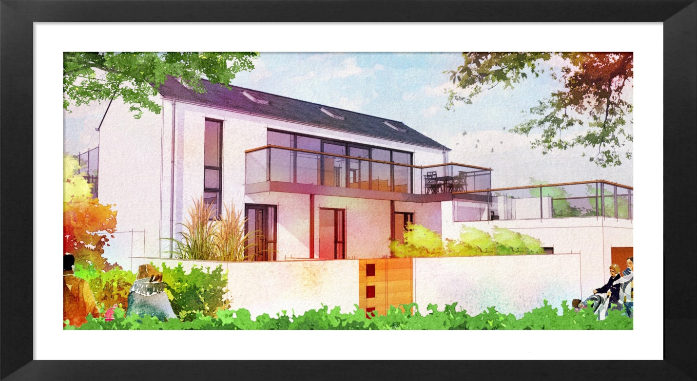
fotosketcher straight from sketchup,probably as pure a watercolour effect as I can get..In this image the house has a basic white colour only accentuated by the overlaying of colour.
-
Oli, good idea to use vignetting! maybe the vignette could fade to white, this would be more likely to happen with watercolour painting (just a suggestion).
David, thats a nice one!
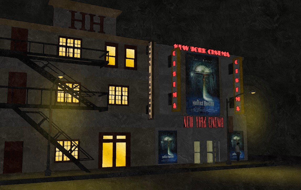
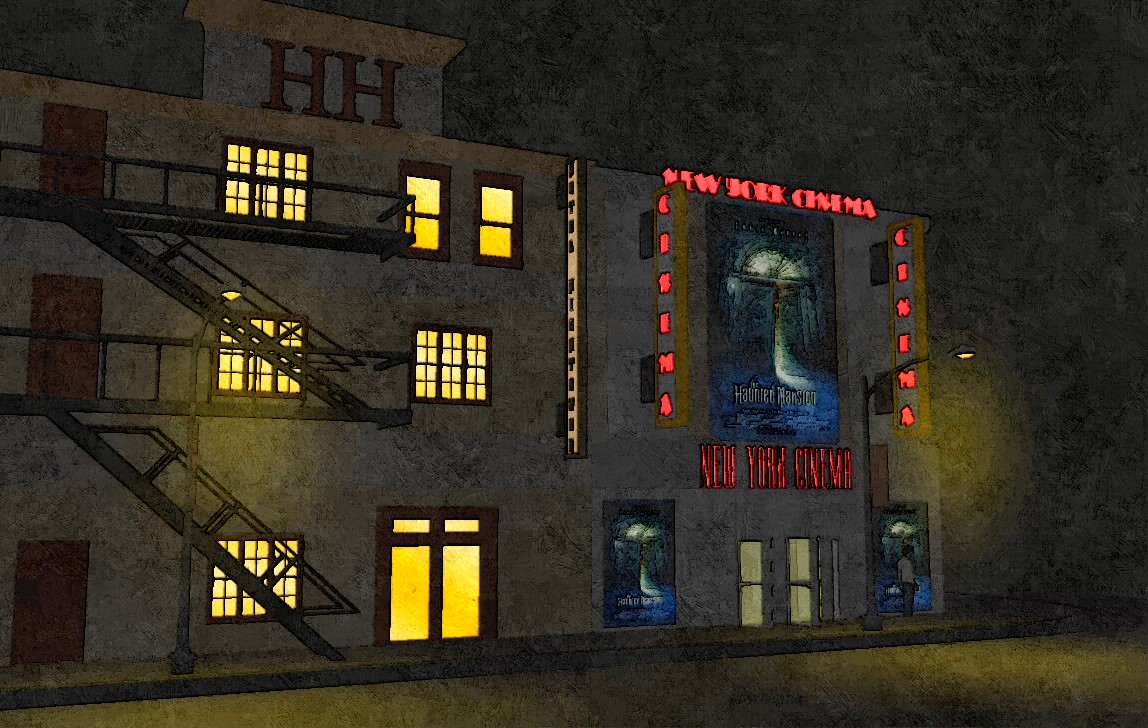
I am doing night scenes very often and was never happy with FotoSketchers results on dark pictures.
Just found that the oil painting filter does a good job:
(model from warehouse)
-
yeah i like the oil filter too. may need some PS though to stop it looking too automated.
cheers shura, yeah you're right. although i wanted a grungey/dirty image. I recommend some grunge textures here:
FREE TO DOWNLOAD AND HIGH RES.
also some FREE brush strokes:
This media militia website is a fantastic resource.

-
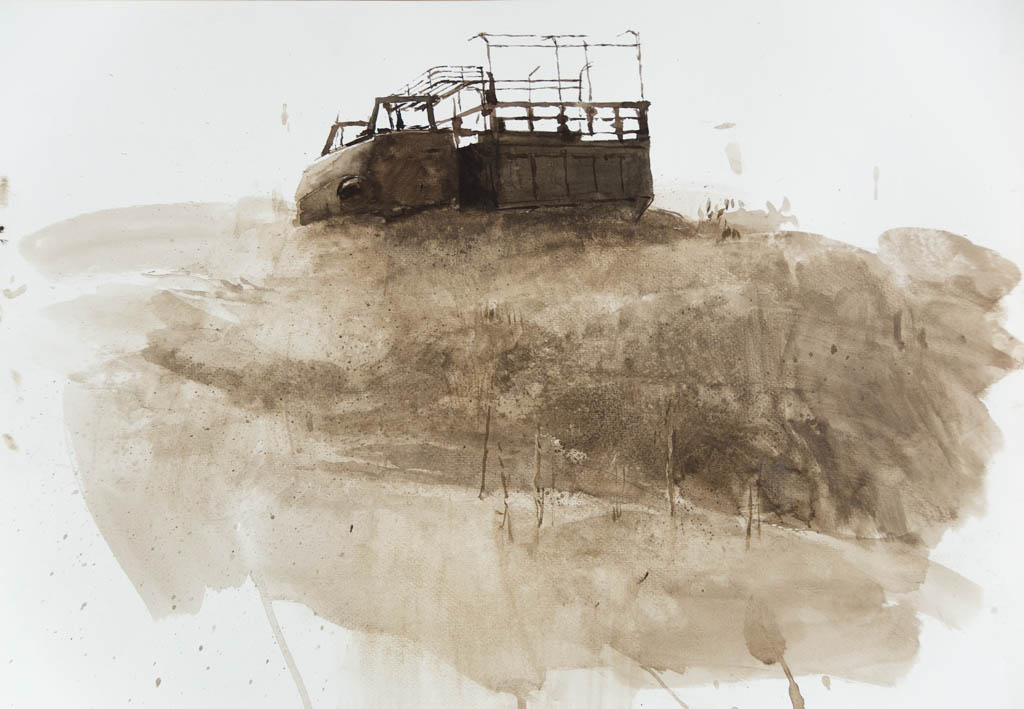
If you like warercolours, then use wrecolours and stop this nonsense. If you don't feel that you have this 'talent' then forget it. This is quit ridiculous to my eyes. Good -maybe- for archi presentation but not for art lovers.
 I really don't believe this.
To learn how to do some watercolours is easier than learning SU. What you can do with your hands, then you have to do it with your hands.
I'm expecting more photo-real renders from all of you. Sorry oli for this. Its your thread anyway.
-
michalis i think you are looking too far into it. its just an experiment, theres no substitue for the real thing. personally i hate faux-watercolour renderings, its just my opinion. but a client asked for this and the client pays so it has to be done!! especially when its a WIP, cant keep sending them hand-painted images! commercially its not always possible! i would love to paint more but its just not feasible. spare time yeah....
Hello! It looks like you're interested in this conversation, but you don't have an account yet.
Getting fed up of having to scroll through the same posts each visit? When you register for an account, you'll always come back to exactly where you were before, and choose to be notified of new replies (either via email, or push notification). You'll also be able to save bookmarks and upvote posts to show your appreciation to other community members.
With your input, this post could be even better 💗
Register LoginAdvertisement


