Autumn Render SU > Maxwell
-
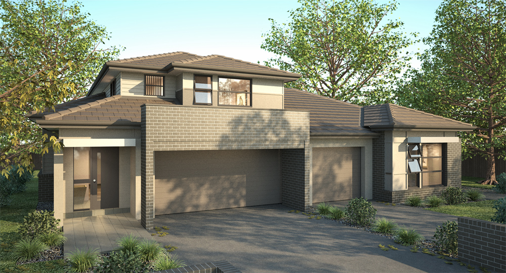
Autumn Render of a dual family home!
SU > Maxwell, no post pro yet! Nice lighting now I think though still to do lighting edit with Multilight!

-
great work richard, very warm. are the roof tiles modeled? (not the ridges)
love the leaves on the floor. nice touch and the brick is pretty tasty too

-
Yes, really nice render image, congrats...

-
Nice work Richard!

What did You used for vegetation? Trees are 3d models? -
Nice render. Have to study this one.
-
nice render.
man i hate these new house designs though. is that a three car garage with a small living quarters attached to it martha?
i think garages bel;ong in the alley or unattached! greedy subdivision developers can get a few more lots by having no alleys but then everyone gets to live in their garage. give me an old neighborhood any day!
how can anyone possibly show off a nice design with those huge garage doors in the way????? -
well, one could take the shot from the rear of the house... where the bbq is and the gezelligheid (a dutch word that isn't translate-able and which everyone should know
 )
) -
Beautifully rendered and the attention to detail is superb.
I like the little things like open windows, modelled roof tiles, the roof valley and especially the ridge tiles.
Great work
-
Funny because here it's Spring time

-
Hey thanks to all for the positive comments!!
@ Aidus - Mate all the trees are from Onyx, the plants all self modelled and mapped. The ground leaves are modelled and mapped.
@ Oli - The tiles are modelled, a bit of up and down added here and there to upset the perfections. Even the upper left weatherboard is modelled. I've developed a nice workflow that works well to speed these small frontage scenes. Hey surprised you didn't pick my crap tile mapping at the front door! Remember clearly picking you up on the same! We have to lift our game mate, neither should be committing that sin!
@ David57 - Vertcals mate verticals!!
@ xrok1 - with you there mate! Luckily I can be critical of the design, I just do the materials / colours and breakup! The building BTW is actually two adjoined dwellings. 2/1 garages!
@ Pyroluna - I agree that where the front cant sell it well pick something else! Though not my choice - Frontages so they can see what it looks like!
Thanks also Fymoro, Dylan and frenchy! BTW frenchy, it's just because you're at the wrong end, when it all runs out we'll probably have the last bit of ice (though be it far away) left to keep the beer cold!
As mentioned to Oli, I've worked out some funnily hidiously simple ways to speed up creating scenes recently (last week) like getting the reflections in windows right (tut posted to the sketchup related forum already) and another simple trick to get perfectly designed shadow cast from foreground objects that I'll get a tut out for too! But basically you just throw something in the scene, turnoff perspective and then rotate the camera so that the object traces it's own shadow perfectly! Then when you put in your foreground trees (in this case clipped billboards) you can move them where you want and get the shadow cast absolutely perfect WYSIWYG!!! Brilliant! And SO darn simple!
-
great stuff, richard.... nice to see some images out of you again. is this 1.7 or have you upgraded? i need to start using maxwell again..
-
Thanks mate! This is 1.7! I have upgraded my license but yet to switch as just need to get these out quickly and don't have time for any issues whilst workflow aint broke at present!
Yeah I'm keen to get into 2 as now with proper shadows from IBL one can set physical sky then save as low res HDRI and use direct instead of sky and about halve render time!
-
Oh yess now I see that they are onyx
 Only onyx has those weird branches and trunks but only if you look very close to that trees
Very very nice work!
-
Hi Richard, yours is a great render.
Can I ask you to link the tutorials you made about the environment? They would come in handy
-
Awesome render, Richard!


I love the lighting and shadows on the ground.
Best,
_KN
-
@broomstick said:
Hi Richard, yours is a great render.
Can I ask you to link the tutorials you made about the environment? They would come in handy
Mate here is the tut on getting perfect reflections, yet to do the other!
-
@unknownuser said:
Hey surprised you didn't pick my crap tile mapping at the front door
mate i really havent picked up on it....whats wrong with it? looks fine to me.....

-
@olishea said:
@unknownuser said:
Hey surprised you didn't pick my crap tile mapping at the front door
mate i really havent picked up on it....whats wrong with it? looks fine to me.....

The entry apron and step to the door are in the same tile but not aligned! Naughty me, normally anal about stuff like that!
Hello! It looks like you're interested in this conversation, but you don't have an account yet.
Getting fed up of having to scroll through the same posts each visit? When you register for an account, you'll always come back to exactly where you were before, and choose to be notified of new replies (either via email, or push notification). You'll also be able to save bookmarks and upvote posts to show your appreciation to other community members.
With your input, this post could be even better 💗
Register LoginAdvertisement


