NPR Style Method [Tutorial]
-
I was asked if I could share my NPR method. Happy to do that. Here it is.
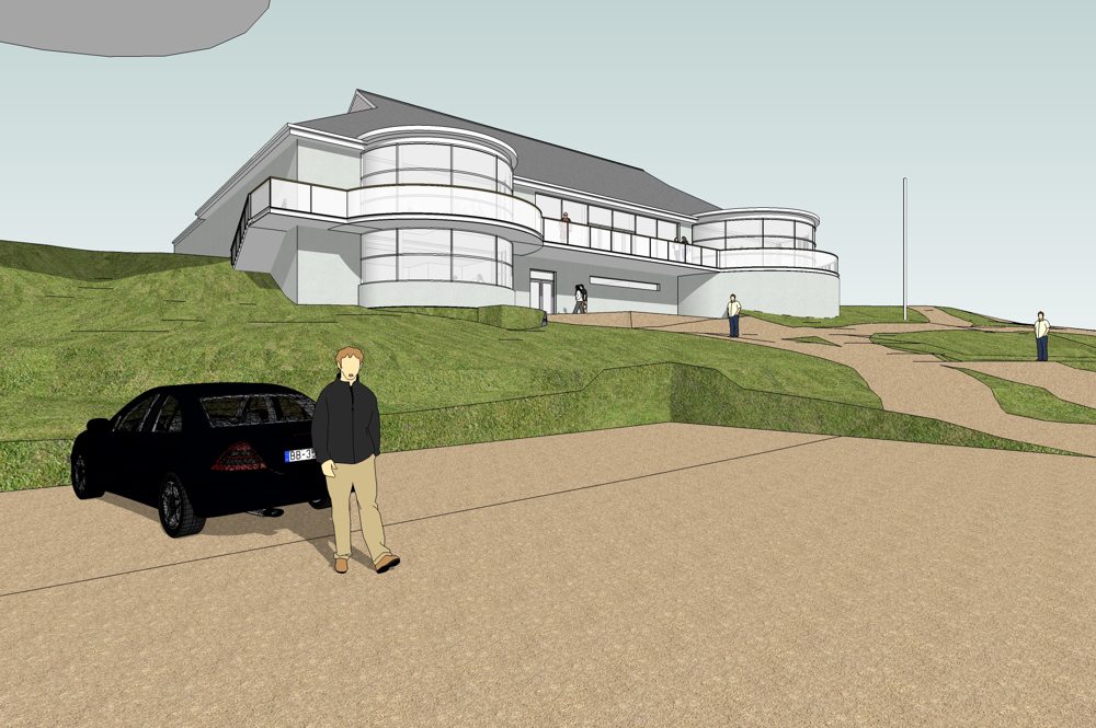
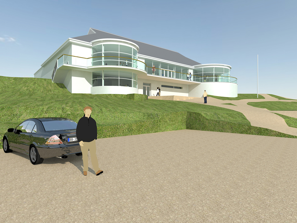
First stage is all Sketchup modelling, lighting and for this visual style some simple materials and colours. This is then exported to, in this case Kerkythea.Second stage is to do a simple render from, Kerkythea on setting 6 at about 2100 pix wide. small and quick. I put a little specularity on a couple of materials and gave the glass a bit of depth, but that was all. Save a png render.
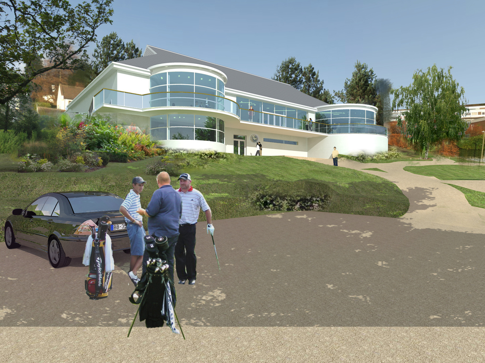
Third stage is compositing in PS working with some alpha masks for the glass and all areas around the building. No need to be too perfect. Save out as a flat PSD ready for overpainting.
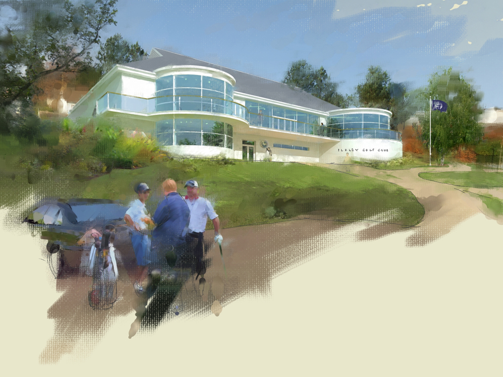
Fourth stage is to bring the image into Corel Painter, set up for clone painting and away you go. It's not essential but it does help to have a graphic tablet and pen for this bit.
Fifth and final stage is to add some extra entourage from the opaque range at http://www.add-life.com, enhance the colours and contrast, and resize to suit.
Well that's what I do If I want a hand drawn NPR look and I've had some great responses to it. Hope you found it of interest.
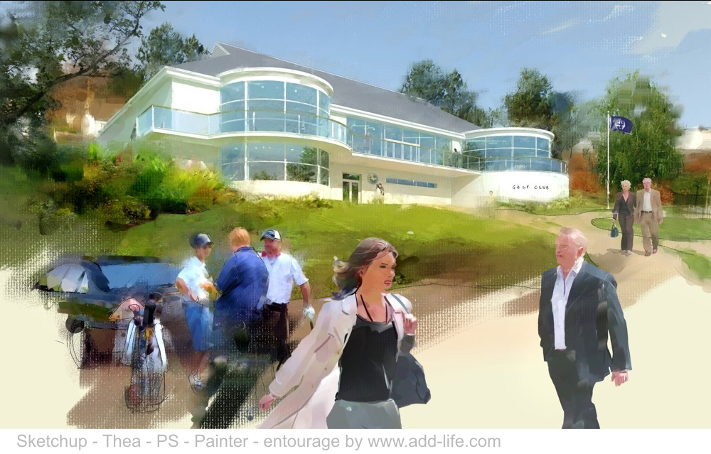
-
Great techniques, Landie.
Thanks for sharing.
Have a nice day,
_KN
-
@unknownuser said:
Second stage is to do a simple render from Thea on setting 6 at about 2100 pix wide
What is setting 6?
Are you using Thea or Kerkythea?
-
Thanks Ken...and Pete, you're right.... setting 6 in Kerkythea. It renders very quickly but gives exactly what I need for the later stages.
This is an impressionist style and so no need to push the render too far toward PR. -
Hi Landie
Great of you to share - images a very good!
Can you tell us a bit more of what cloner brush/paper settings you use in painter?
I don't know painter that well so any help will be appreciated.Regards
Andre
-
@andre51 said:
Can you tell us a bit more of what cloner brush/paper settings you use in painter?
I don't know painter that well so any help will be appreciated.Hi Andre. I prepare a flattend psd file 300dpi at about 2200 pix wide. This works well for the brush heads in painter. Too big a file and the brush stroke drags and the marks are a little out of scale for me.
So open the image in painter > file menu > clone. A new image is created called clone of whatever. In the Select menu > All > Edit menu > Clear. The new clone image is gone and you have a blank white sheet. The original image to clone is still on screen behind your blank sheet. Go to the side toolbar and to the square icon for paper selection. Here I usually go for Artists Canvas. now you're ready to paint.
Now I go to the Window menu > Color palettes > Show colors. This pop up has an important button on it in the shape of a rubber stamp. to clone paint the image behind, whatever brush you use this stamp needs to be clicked on.
Now go to the Window menu > Show layers. Leave this pop up on your screen and straight away add a new layer to work on. I would'nt bother with watercolour layers to begin with.
Now choose your brushes from the brush category selector at the top and have fun. I usually mix and match oil pastels, airbrushes, pencil, blenders etc. Add a new layer for each type and build it up.
Let me know how this works for you and I'll post a second explanation of brushes. -
 great,cool, creative sight and simple tip, thanx mate:)
 -
Thanks Landie
Clear and concise. Going to be a great help.
Regards
Andre
-
Nice work, Landie.
Just wondering why you chose to compose the scene in PS and not add entourage in SU? File size?I just find that its a bit more with the initial medium....
-
@utiler said:
Nice work, Landie.
Just wondering why you chose to compose the scene in PS and not add entourage in SU? File size?I just find that its a bit more with the initial medium....
Thank you. I work this way becouse it allows me a lot more freedom with composition. Especially with the people. I can reposition things until I'm happy, without having to go through the rendering process each time. It is also a lot quicker to amend if later on the client wants extra people or another tree for instance. I also like to keep the 3D clear of people as what works with one view of the building may not with another. I think working 3D is fantastic and I couldn't do without it, but there is still a lot better done 2D
-
Cool workflow

-
Cool work!

Seems like preset 6 are getting popular for KT, but the "Thea" on the final composite is confusing.
-
@unknownuser said:
Cool workflow

Thanks
@d-space said:
Cool work!

Seems like preset 6 are getting popular for KT, but the "Thea" on the final composite is confusing.
Yeah, thats me....confused. You are right of course, should be Kerkythea not Thea
-
Hi. Just to say that all the NPR entourage at add life is now only £2.00 GBP for 20 and totally royalty free.
Hello! It looks like you're interested in this conversation, but you don't have an account yet.
Getting fed up of having to scroll through the same posts each visit? When you register for an account, you'll always come back to exactly where you were before, and choose to be notified of new replies (either via email, or push notification). You'll also be able to save bookmarks and upvote posts to show your appreciation to other community members.
With your input, this post could be even better 💗
Register LoginAdvertisement


