Putting my portfolio together......
-
opinions please, I just wanna see what you all think!
I reduced quality a lot, so sorry if you can't read some text.
Cheers
software used: sketchup, wings, podium, twilight, autocad, photoshop
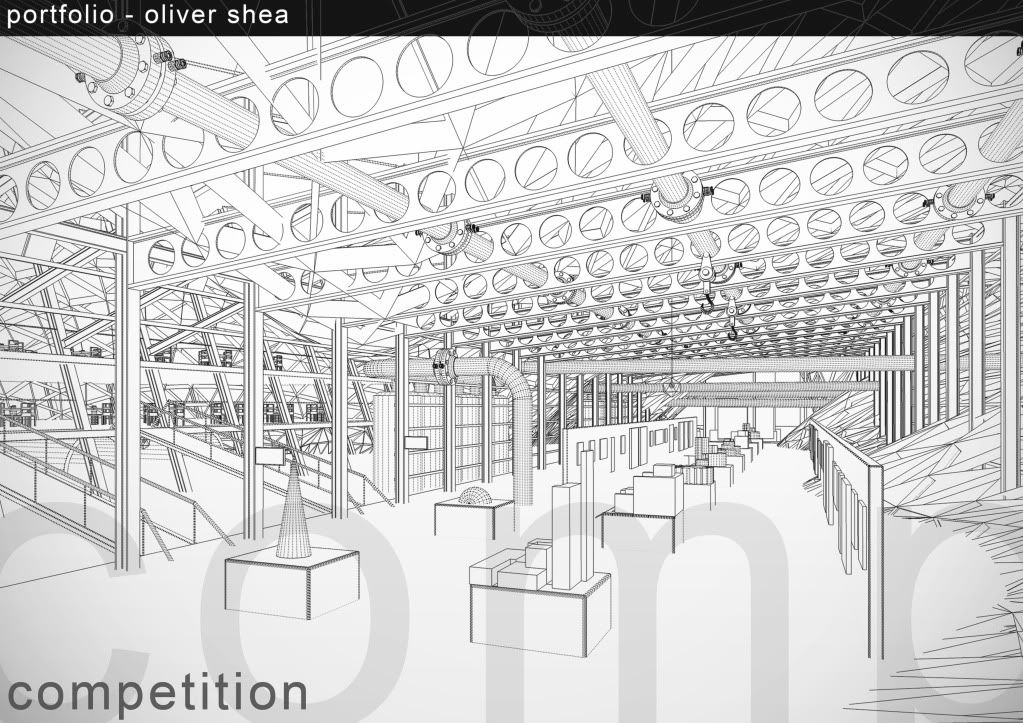
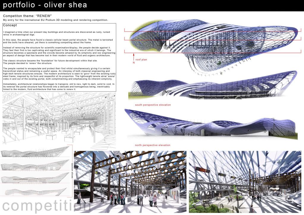
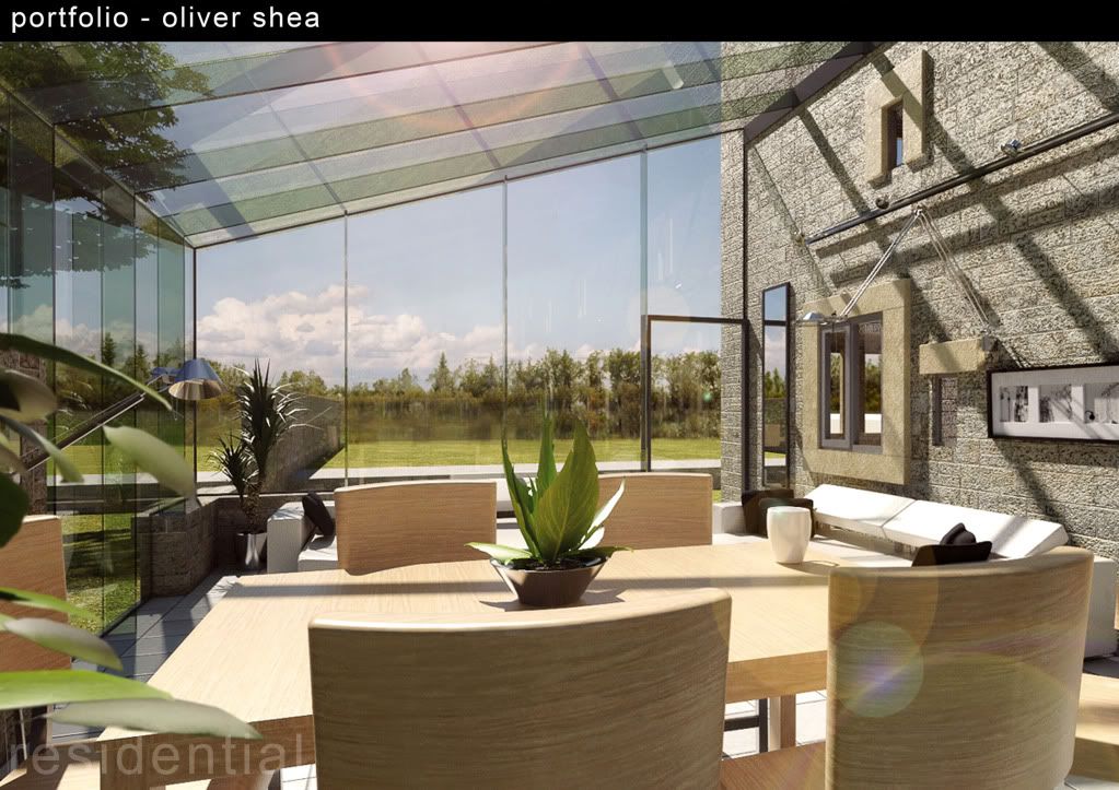
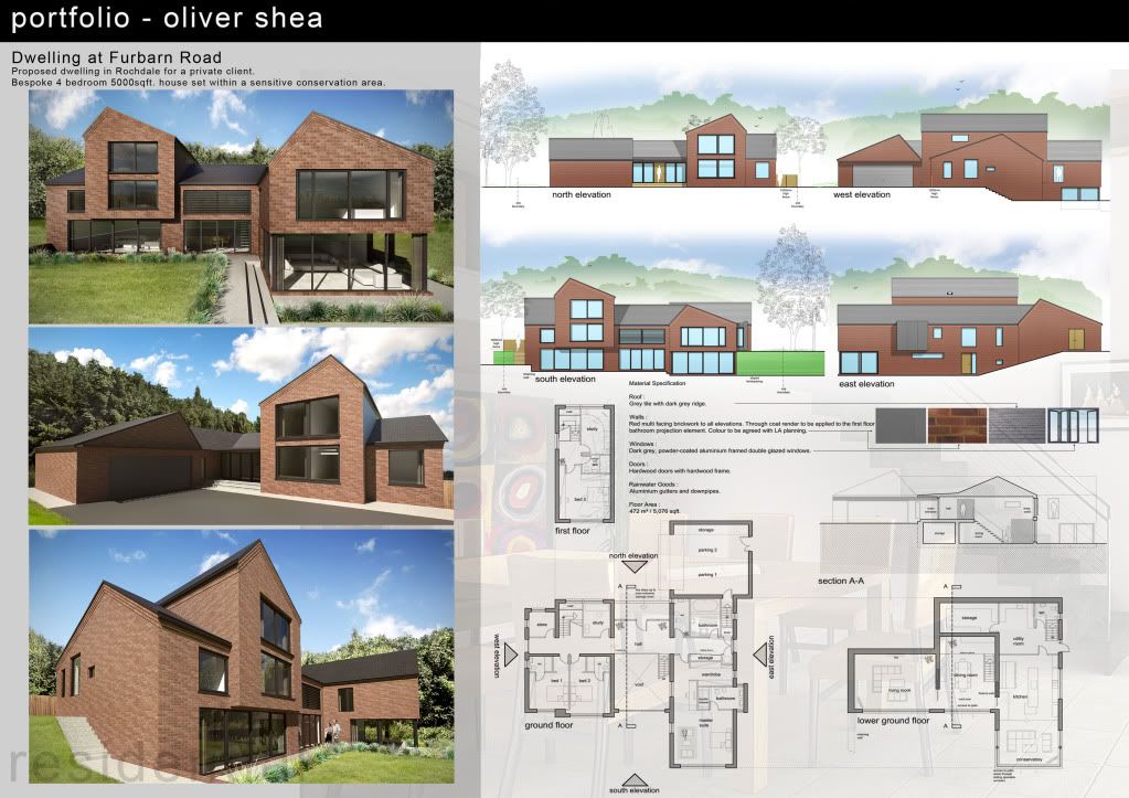
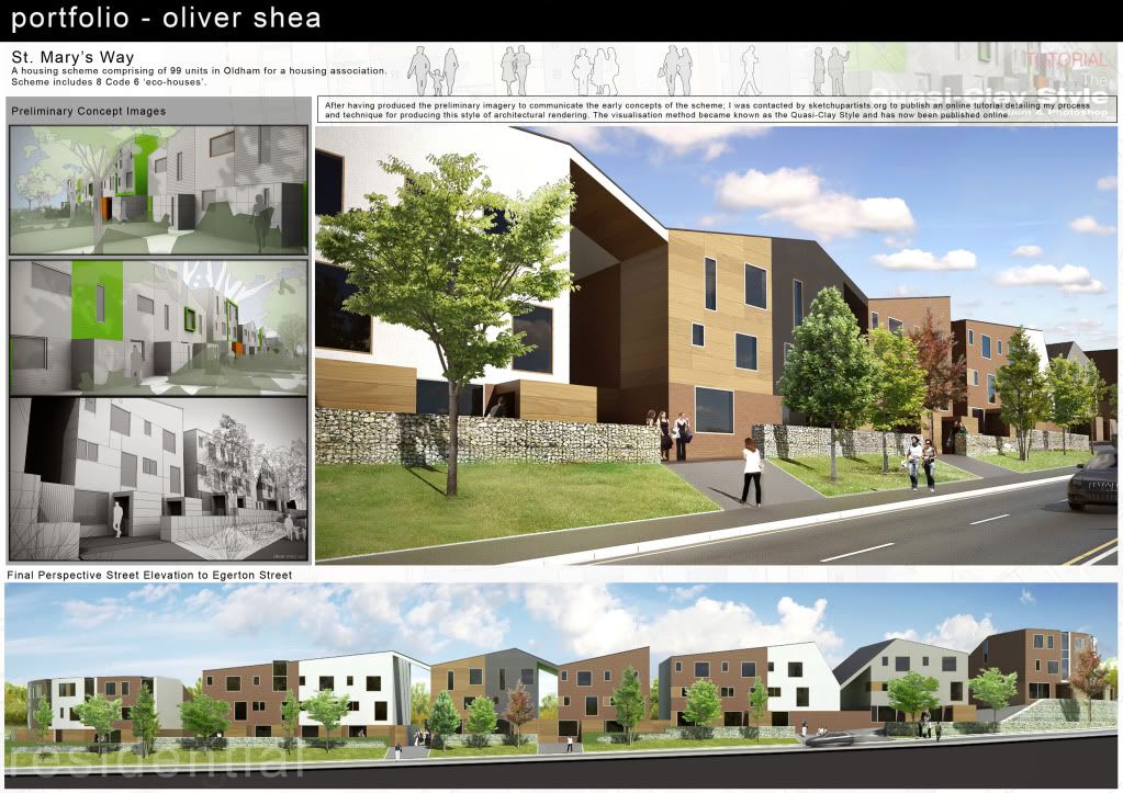
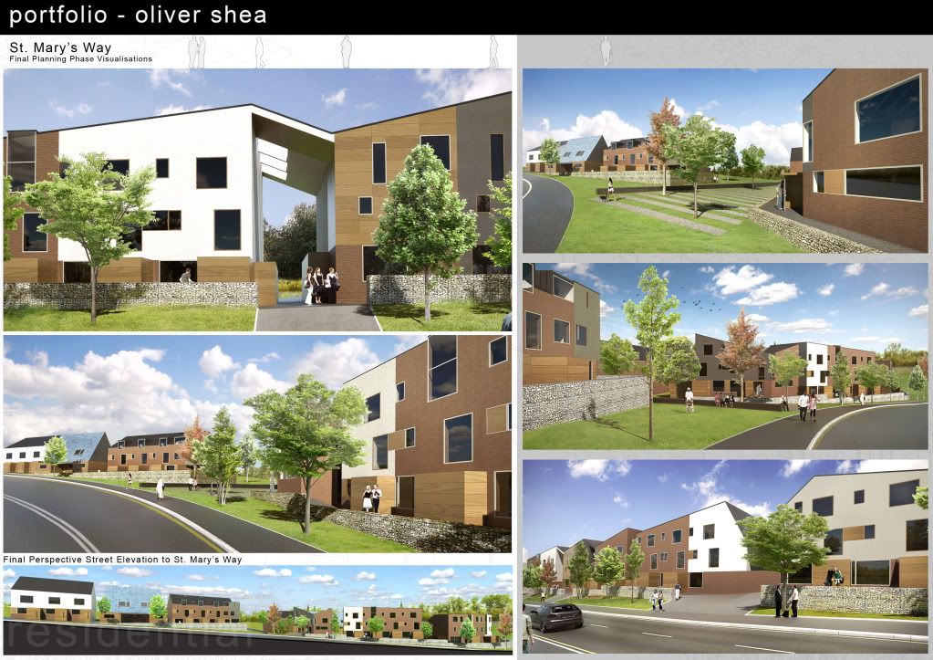
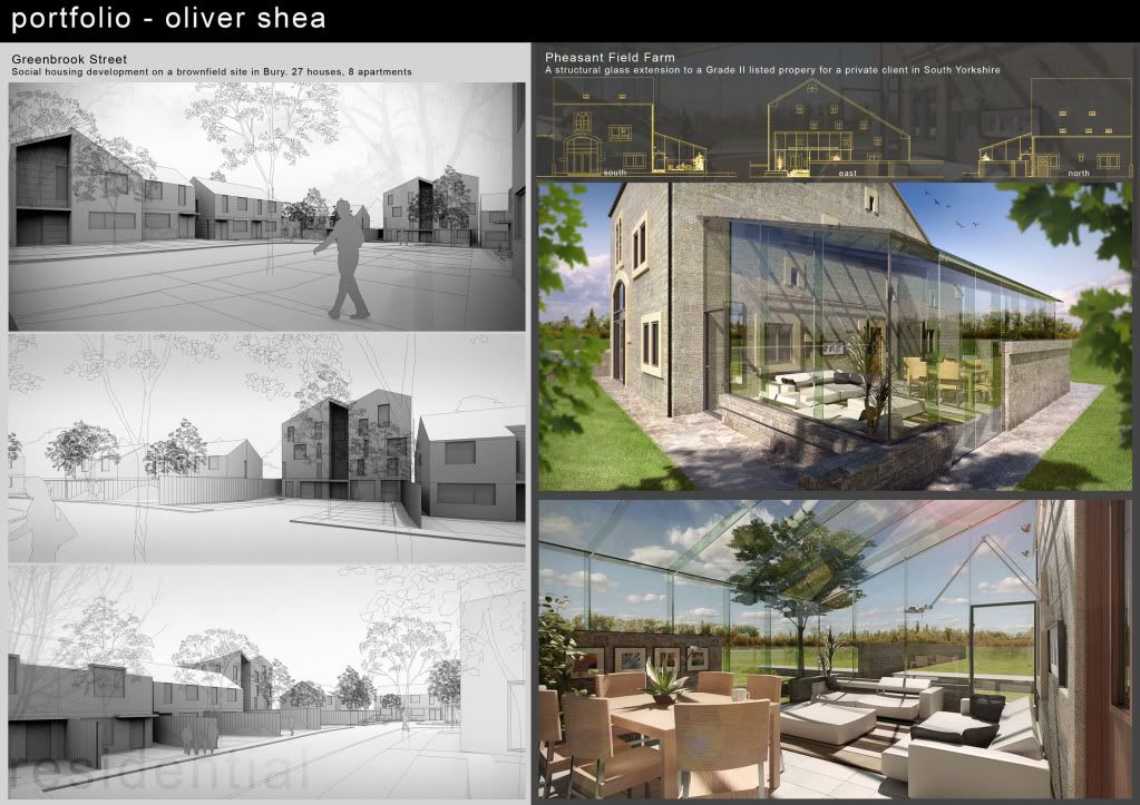
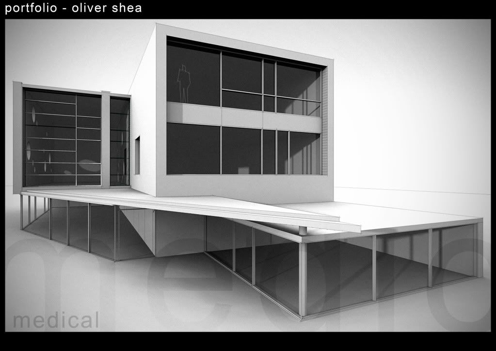
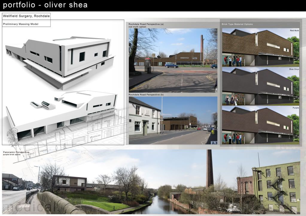
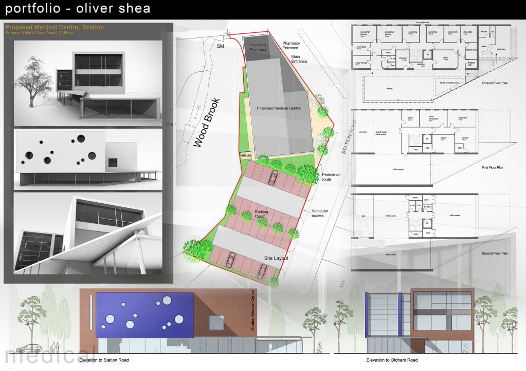
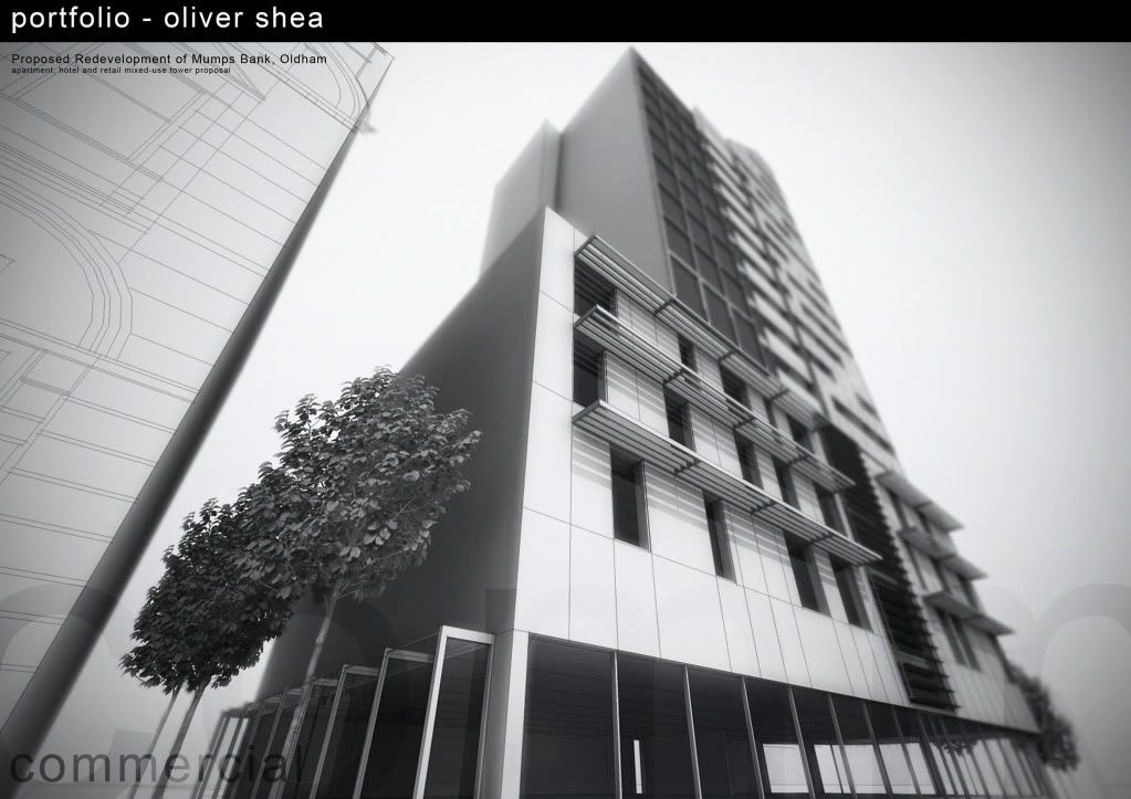
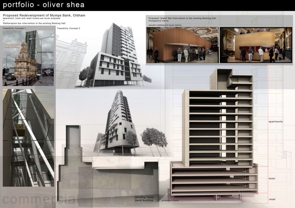
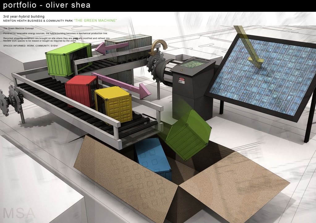
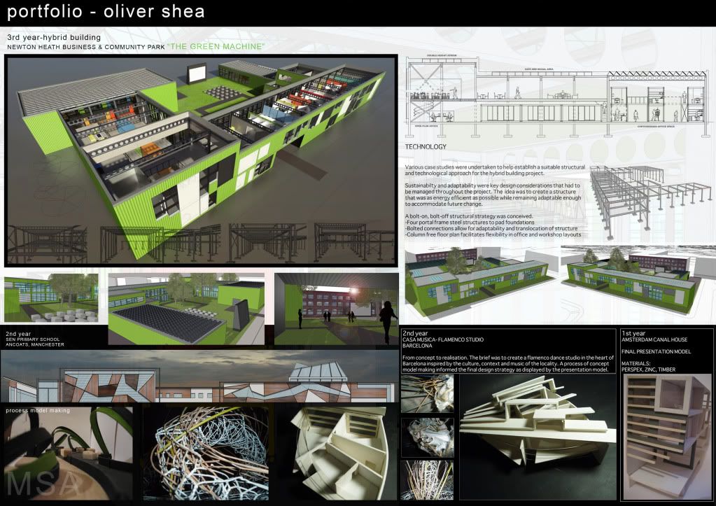
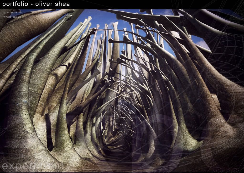
non-architecture related experimental work:
[img:2bu5s900]http://i654.photobucket.com/albums/uu269/olishea/PAGE16.jpg[/img:2bu5s900]
-
Congrats and really awesome portfolio...keep up the great work!

-
Very Nice! I like the layout a lot, and everything seems to flow well. What size will it be printed?
-
Very nice work, Oliver. I noticed on the first and last pages the graphics bleed into the black name band on the top, but they don't on the other pages. You might consider correcting that to keep it consistent.
-
Wow, it's amazing...

-
Thanks for the comments.


Dspace: Thank you very much
JHuman: It's A2 for convenience. But it probably won't be printed as electronic copies are normally requested. Glad it flows!!
Daniel: It was intentional!

Fred: Cheers mate I spent a long time on it
-
This is a great portfolio. I love the look of however they transpose over each other in every page except the third one. This page is pretty difficult to look at...which is a shame because I remember that render from the forum which is great. I am not sure how you can improve that page but I think something needs to be done with it so it compliments the work and doesn't distract from it.
-
ah you have a keen eye. this page troubles me also!! I'm working on it now! I agree its hard to read, cheers!
-
I'm in awe with your work, Oli. As others have said everything flows beautifully.
My only crit (and its NOT you, just wondering HOW) - How will they fit that pipe so it lines up perfectly with the holes in the beams. Those are going to be some costly custom beams to ensure that happens.
Rick
-
Great stuff, Oli.
I do agree with Jeff about the third image. That one is very hard to read due to the reflections and stuff. It is quite busy and it is difficult for the eyes to focus on something.
Good luck!
_KN
-
WOW WOW WOW Oli thats fantastic. How far you have come. Thats one impressive Portfolio's
Want to make me one.
-
Oli, Is there a specific kind of job that you are trying to get? Perhaps if so, the portfolio can address that position.
-
Mate it looks great, not sure though I like the images faded over the top of each other - tends to throw out what are some nice images!
The other thing I think is very important if this is to gain work opportunities to be clear if they are your designs, or part of a team or simply your visuals, if this is not clear and the question is asked and the answer differs to that perceived I would imagine the response would be very negative!
Also mate - never forget the old term "Make white space your friend"! All is looking very cramped! Could you not afford more paper?
-
cheers for all the comments

the portfolio is for university not a job application. there's also an interview so I guess i can discuss involvement etc then.
-
Mate if you are after plenty of examples check out Issuu
Explore Issuu | Discover Flipbooks, Magazines, Catalogs & More
Issuu turns PDFs into interactive digital flipbooks for publishing, sharing, and embedding magazines, catalogs, brochures, and branded content online.
(issuu.com)
-
cheers mate, nice resource

-
these are great ,mate

-
I'm impressed, Oli...!
Really impressed...!!
-
Its Oliver alright. So, no surprise. Excellent oli.


-
Awesome portfolio pal.....really ... let me guess you've taken a full fledged training in Advanced SketchUp and training yeah?? Really amazing work once again... you've truly inspired an architecture student like me........
Hello! It looks like you're interested in this conversation, but you don't have an account yet.
Getting fed up of having to scroll through the same posts each visit? When you register for an account, you'll always come back to exactly where you were before, and choose to be notified of new replies (either via email, or push notification). You'll also be able to save bookmarks and upvote posts to show your appreciation to other community members.
With your input, this post could be even better 💗
Register LoginAdvertisement


