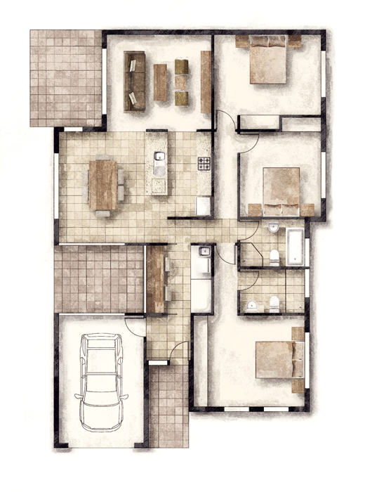
Watercolour Style Floor Plan
-
Sort of touching on Tomdesks style here I guess!
A watercolour style test for a brochure presentation. Not the sort of thing I like at all!
Layout / Indesign / Fotosketcher.

-
Well, I love it! (A little more sketchy line style would help, I think.)
-
Did I just see 'Richard' and 'watercolour' in the same thread?
what's going on?! u going soft?
-
@tomsdesk said:
Well, I love it! (A little more sketchy line style would help, I think.)
Mate I thought you would! Have to agree somewhat about the line style, though have that tiny concern already about legibility, if it where an exterior image I'd agree in total.
Wonderful little app though, rather surprised at it ease of use and just how good the results are! Unlike PS's filters to do similar, you actually see it breaking down and creating the effect on every floor tile - so it really is creating a better effect of how an artist would do the same!
-
@olishea said:
Did I just see 'Richard' and 'watercolour' in the same thread?
what's going on?! u going soft?
Yeah I'm wondering the same mate!

You should have seen my face when the client suggested that he wanted a soft painted look! Luckily I hadn't just sipped on my coffee he would most likely worn it!
Actually I probably should have posted it today, have you thinking it was an april fools joke!
-
To me it seems to be part of your professional ethics to do it well even if you don't like the client's idea.
I have always admired the way you work with SU output.
Anssi
-
@anssi said:
To me it seems to be part of your professional ethics to do it well even if you don't like the client's idea.
I have always admired the way you work with SU output.
Anssi
Thanks mate!
Funny though if I don't like the way the client wants to do it I just tell them sure, I can do it that way it will just take longer and cost more! Hopeful!!!

Hello! It looks like you're interested in this conversation, but you don't have an account yet.
Getting fed up of having to scroll through the same posts each visit? When you register for an account, you'll always come back to exactly where you were before, and choose to be notified of new replies (either via email, or push notification). You'll also be able to save bookmarks and upvote posts to show your appreciation to other community members.
With your input, this post could be even better 💗
Register LoginAdvertisement


