The Art of SketchUp - part 1: Fantasy
-
Hi there,
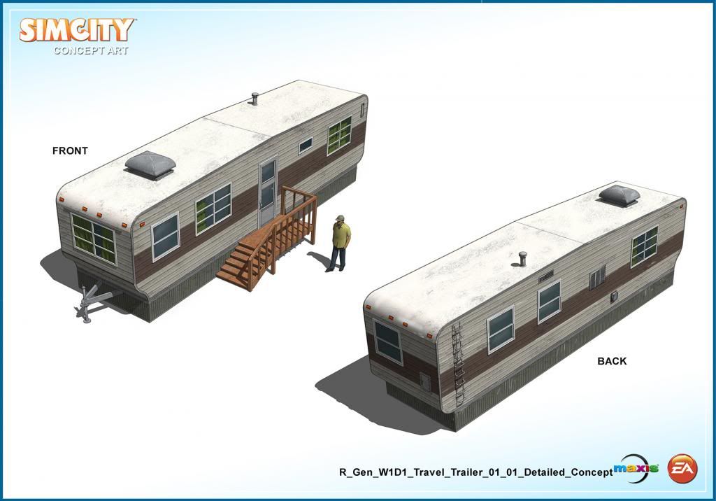
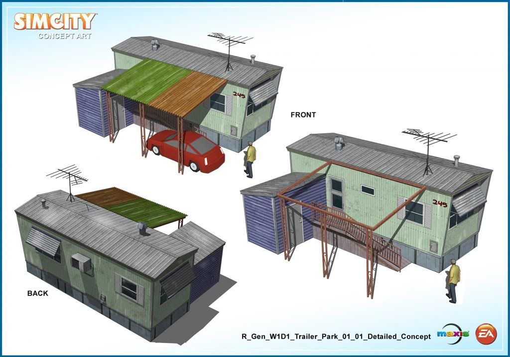
Here's a couple of trailer homes for Simcity.
Have a great day!
_KN
Sketchup for Sci-Fi Art:
http://forums.sketchucation.com/viewtopic.php?f=81&t=27030
My interview with Sketchupartists.org:
http://www.sketchupartists.org/spotlight/artists/sketchup-art-in-the-online-game-industry/
My interview with Nomer:
http://sketchupvrayresources.blogspot.com/2012/05/q-and-with-our-featured-artist-ken.html
Texturing Tutorials:
http://www.sketchupartists.org/tutorials/sketchup-and-photoshop/art-of-sketchup-texture-workflow/ -
Very cool as usual!

-
Beautifully done. I supose there not ADA compliant ether. (Ha)
-
Impressive. The red car looks kind of small, and it's also a nice car for someone living in a 'shed'.

-
@unknownuser said:
Very cool as usual!

>> Merci, Pilou.
@ccaponigro said:
Beautifully done. I supose there not ADA compliant ether. (Ha)
>> Thanks, Ccaponigro. I included ADA compliance in the design of some of my first concepts, but the Art Director told that we can skip it and have a more simplified design since these buildings are for video games.
@adorno said:
Impressive. The red car looks kind of small, and it's also a nice car for someone living in a 'shed'.

>> Thank you for your kind words, Adorno. Similar to my answer above, vehicles, props and people are also simplified and smaller than real life proportions.
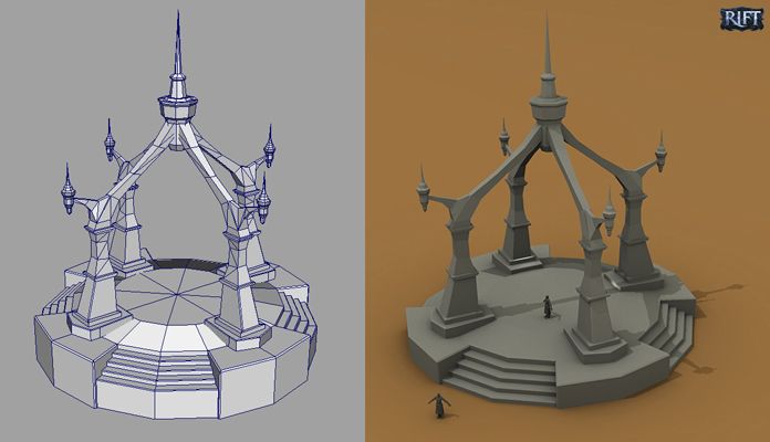
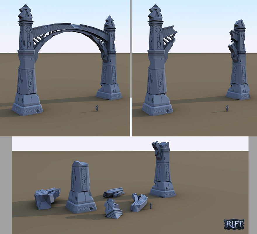
**Hello everyone,
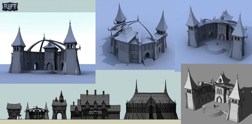
It has been a while I have not posted some stuff for Rift. (http://www.riftgame.com/en/)
So I dug out some older conceptual models I did.
Have a great day!

_KN**
Sketchup for Sci-Fi Art:
http://forums.sketchucation.com/viewtopic.php?f=81&t=27030
My interview with Sketchupartists.org:
http://www.sketchupartists.org/spotlight/artists/sketchup-art-in-the-online-game-industry/
My interview with Nomer:
http://sketchupvrayresources.blogspot.com/2012/05/q-and-with-our-featured-artist-ken.html
Texturing Tutorials:
http://www.sketchupartists.org/tutorials/sketchup-and-photoshop/art-of-sketchup-texture-workflow/ -
Middle age Lego!

-
@unknownuser said:
Middle age Lego!

LOL...merci for your comment, Pilou.

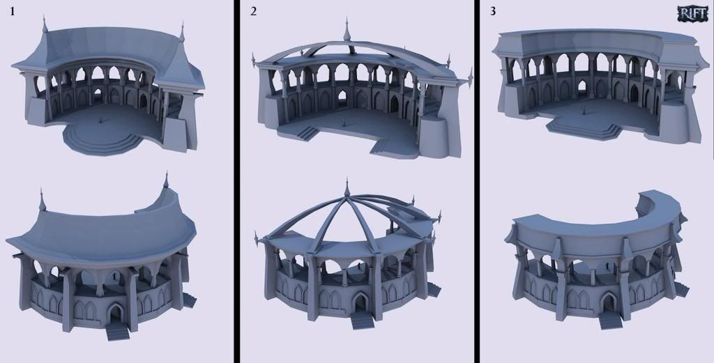
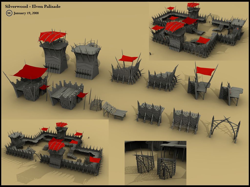
Some more Rift conceptual models:
This Elven palisade is a set of modular pieces that can be use to create different designs. This was one of my first projects when I started working for Trion world.
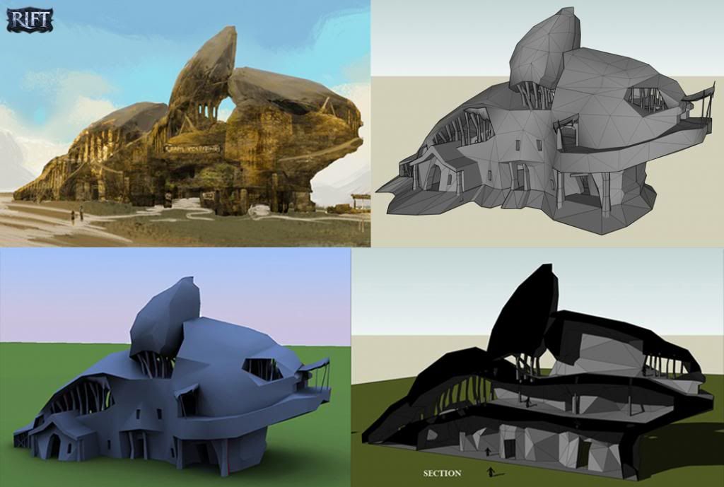
Sometimes when I was not assigned to come up with the design, I built conceptual models based on another concept artist's art. The left images in these two following images were done by the lead concept artist. What I did was build the conceptual model and solve problems like perspective, interior section, etc. I also was able to come up with my own designs for parts that were not well thought out.

Thanks for visiting.
Have a great week!
_KN
Sketchup for Sci-Fi Art:
http://forums.sketchucation.com/viewtopic.php?f=81&t=27030
My interview with Sketchupartists.org:
http://www.sketchupartists.org/spotlight/artists/sketchup-art-in-the-online-game-industry/
My interview with Nomer:
http://sketchupvrayresources.blogspot.com/2012/05/q-and-with-our-featured-artist-ken.html
Texturing Tutorials:
http://www.sketchupartists.org/tutorials/sketchup-and-photoshop/art-of-sketchup-texture-workflow/ -
Hello everyone,
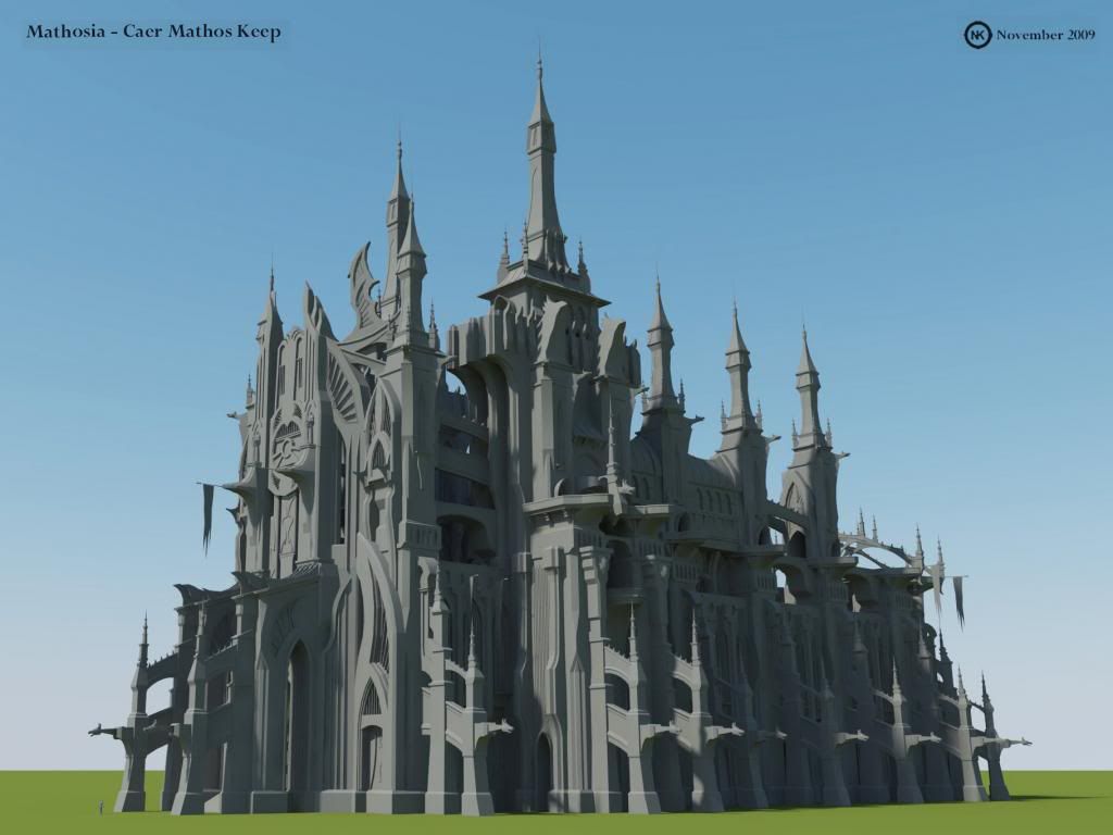
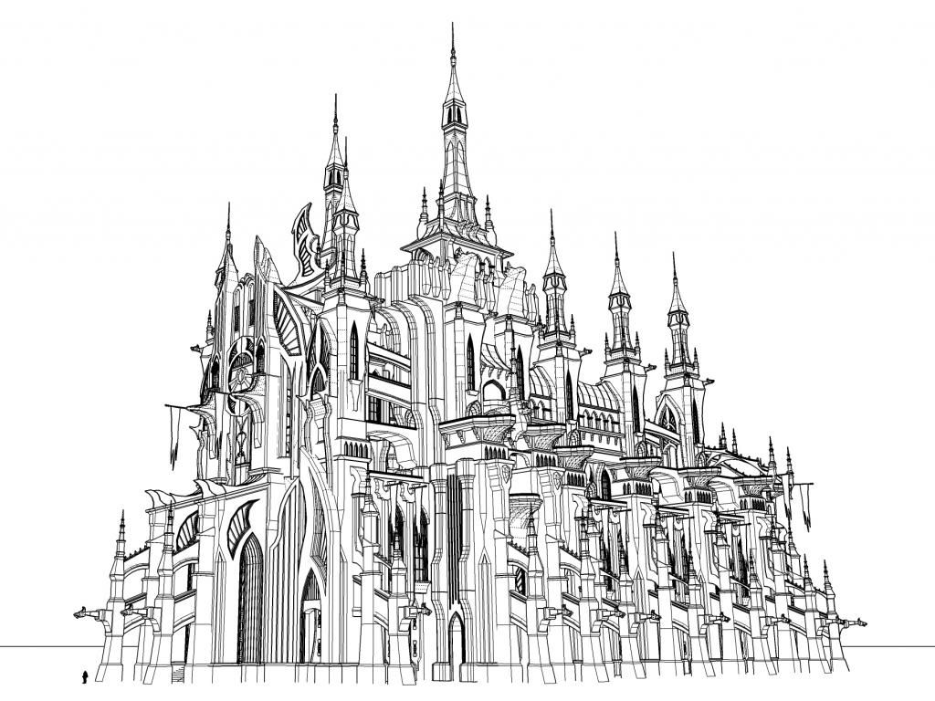
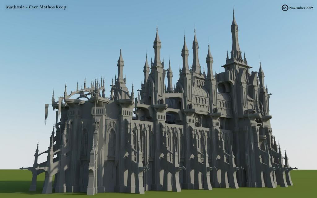
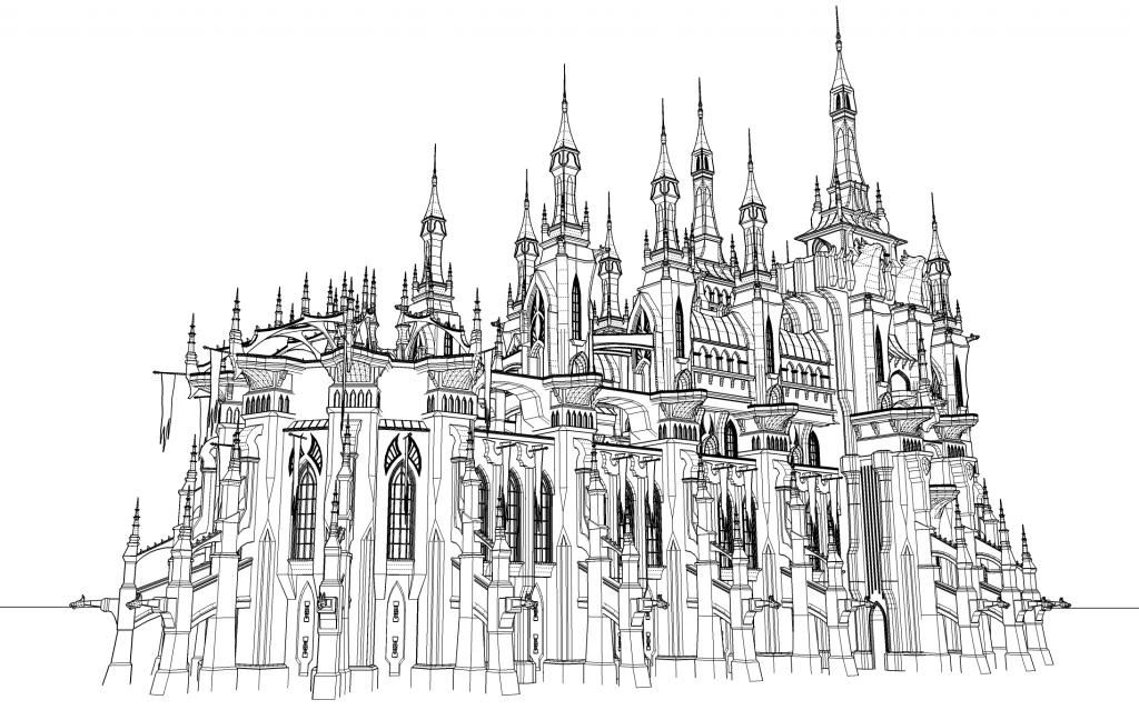
Here's a conceptual model that I did for the game Rift more than 3 years ago. This is one of my favorite and most detailed models.
It is called Caer Mathos and is located in Mathosia. It is a fortress of some kind of evil knight or something. Due to the change of design directions (new stories) and a new art director, Caer Mathos was unfortunately cancelled.
But I really had fun working on it. It took me a couple of days to finish it...J/K
 maybe a few weeks.
I have some bird's eye renders as well as interior concepts that I will post soon.
Cheers!
_KN
Sketchup for Sci-Fi Art:
http://forums.sketchucation.com/viewtopic.php?f=81&t=27030
My interview with Sketchupartists.org:
http://www.sketchupartists.org/spotlight/artists/sketchup-art-in-the-online-game-industry/
My interview with Nomer:
http://sketchupvrayresources.blogspot.com/2012/05/q-and-with-our-featured-artist-ken.html
Texturing Tutorials:
http://www.sketchupartists.org/tutorials/sketchup-and-photoshop/art-of-sketchup-texture-workflow/ -
@ken28875 said:
...This is one of my favorite and most detailed models.
My first thought too

I hope there are some components in there
Nice model!
-
-
Hi there,
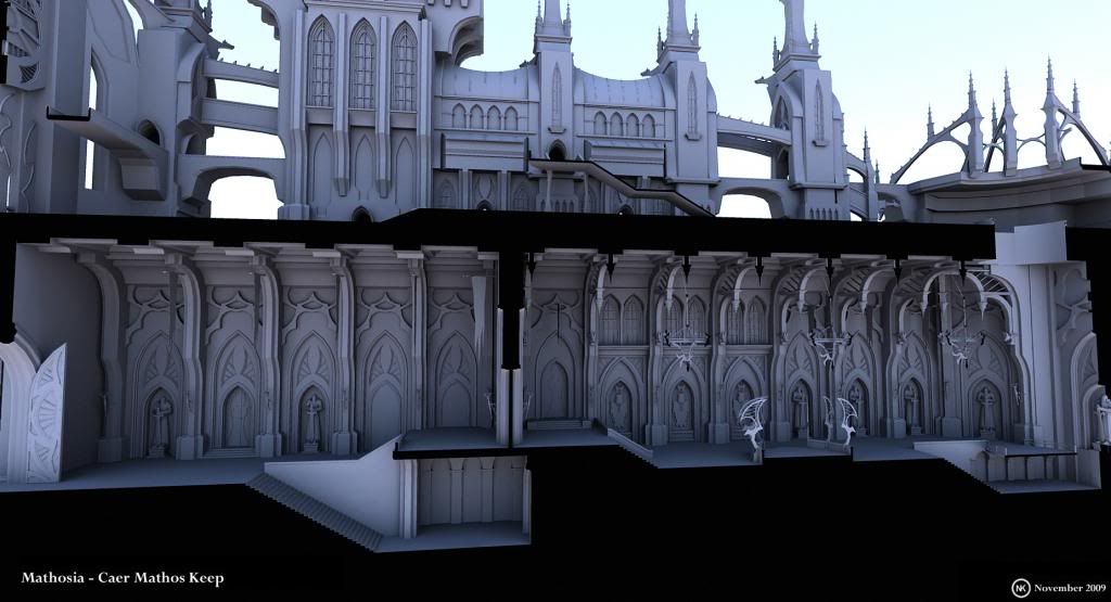
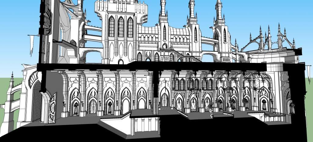
An interior section of the fortress Caer Mathos.
Have a great week!
_KN
Sketchup for Sci-Fi Art:
http://forums.sketchucation.com/viewtopic.php?f=81&t=27030
My interview with Sketchupartists.org:
http://www.sketchupartists.org/spotlight/artists/sketchup-art-in-the-online-game-industry/
My interview with Nomer:
http://sketchupvrayresources.blogspot.com/2012/05/q-and-with-our-featured-artist-ken.html
Texturing Tutorials:
http://www.sketchupartists.org/tutorials/sketchup-and-photoshop/art-of-sketchup-texture-workflow/ -
WoW nice!


I love that Caer Mathos. It does look a lot like Gothic Church. -
@coremaster110 said:
WoW nice!


I love that Caer Mathos. It does look a lot like Gothic Church.Thanks, Karl. I appreciate your
 and kind comments. Yes, it does look like a Gothic Church because I was inspired by images of Gothic Church when I designed it.
Have a nice day!
_KN
-
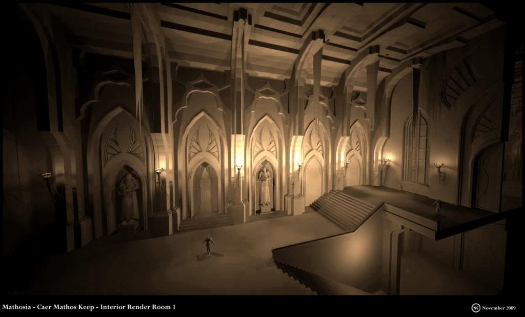
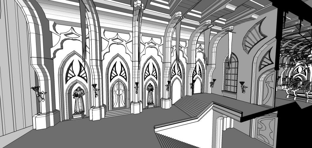
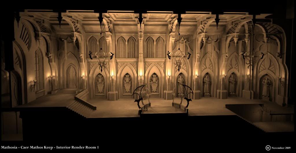
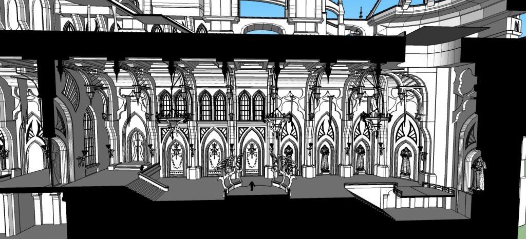
Hi guys,
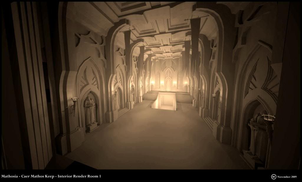
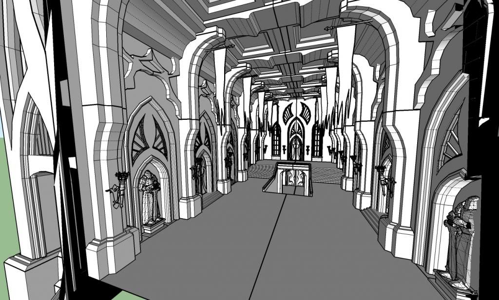
Here are some more interior concepts of Caer Mathos.
Have a great day!
_KN
Sketchup for Sci-Fi Art:
http://forums.sketchucation.com/viewtopic.php?f=81&t=27030
My interview with Sketchupartists.org:
http://www.sketchupartists.org/spotlight/artists/sketchup-art-in-the-online-game-industry/
My interview with Nomer:
http://sketchupvrayresources.blogspot.com/2012/05/q-and-with-our-featured-artist-ken.html
Texturing Tutorials:
http://www.sketchupartists.org/tutorials/sketchup-and-photoshop/art-of-sketchup-texture-workflow/ -
-
@ CoreMaster110: Thanks for your kind "comment, Karl.

Hi guys,
I have not posted some Simcity concepts for a while.
So here they are.
For those who play Simcity, you know you have many options for one building style.
As an example, below I have 3 different designs for the "Chicago Style" buildings.
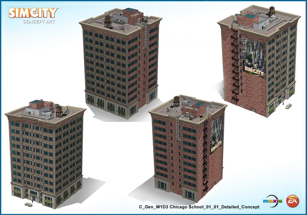
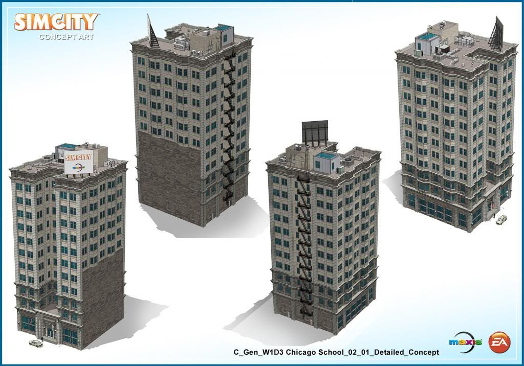
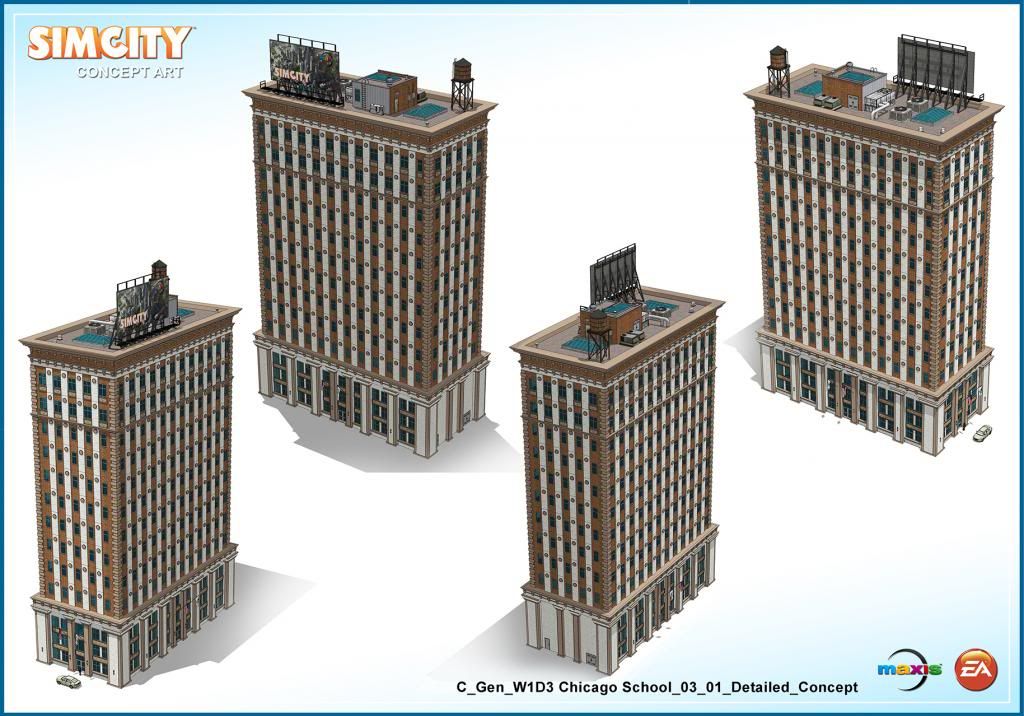
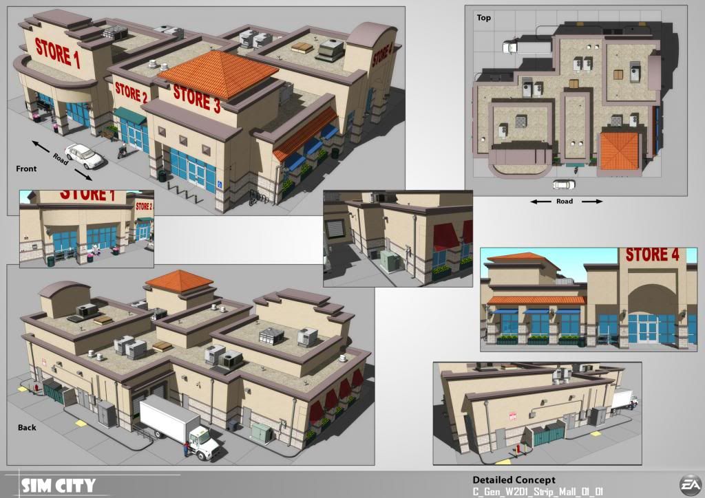
And here is a strip mall.
Have a great weekend!
_KN
Sketchup for Sci-Fi Art:
http://forums.sketchucation.com/viewtopic.php?f=81&t=27030
My interview with Sketchupartists.org:
http://www.sketchupartists.org/spotlight/artists/sketchup-art-in-the-online-game-industry/
My interview with Nomer:
http://sketchupvrayresources.blogspot.com/2012/05/q-and-with-our-featured-artist-ken.html
Texturing Tutorials:
http://www.sketchupartists.org/tutorials/sketchup-and-photoshop/art-of-sketchup-texture-workflow/ -
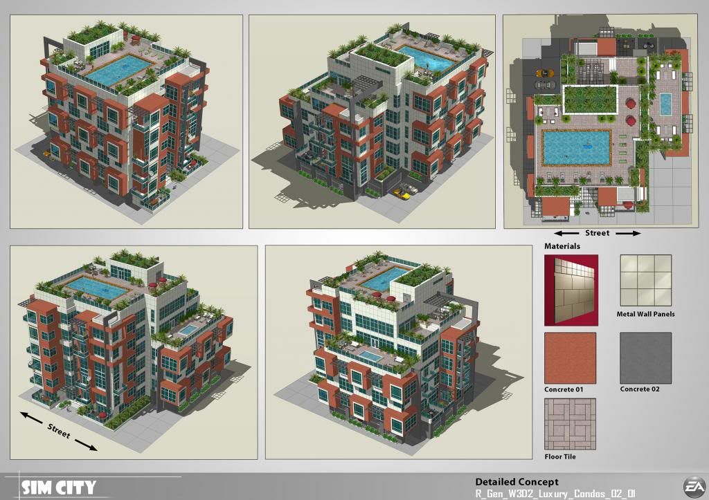
Hi guys,
I have posted this one a few months ago, but the image was really low rez due to Non-Disclosure-Agreement when Simcity was not shipped yet.
So here's a larger size.
Have a great day!


_KN
-
Hello everyone,
I hope you had a great weekend.
I forgot to mention that I have started another contract with Electronic Arts/Maxis, the people behind Simcity.
Indeed, a few weeks ago I got an email from the Development Director with whom I worked on Simcity 5, who said they needed my help with concepting architecture for their next project and offered the job.
It is an unannounced game, and due to Non-Disclosure-Agreement, I cannot say anything yet. But I have been working on it for the past two weeks and I am quite excited about it.
I hope to show some Sketchup models/Renders in the near future.
_KN
-
Sounds exciting. Looking forward to it.
-
Hello! It looks like you're interested in this conversation, but you don't have an account yet.
Getting fed up of having to scroll through the same posts each visit? When you register for an account, you'll always come back to exactly where you were before, and choose to be notified of new replies (either via email, or push notification). You'll also be able to save bookmarks and upvote posts to show your appreciation to other community members.
With your input, this post could be even better 💗
Register LoginAdvertisement


