Coke or Coffee
-
Coffee or Coke, Cigarts or Cigars, Beer or Wine?
Let's hear your answers....
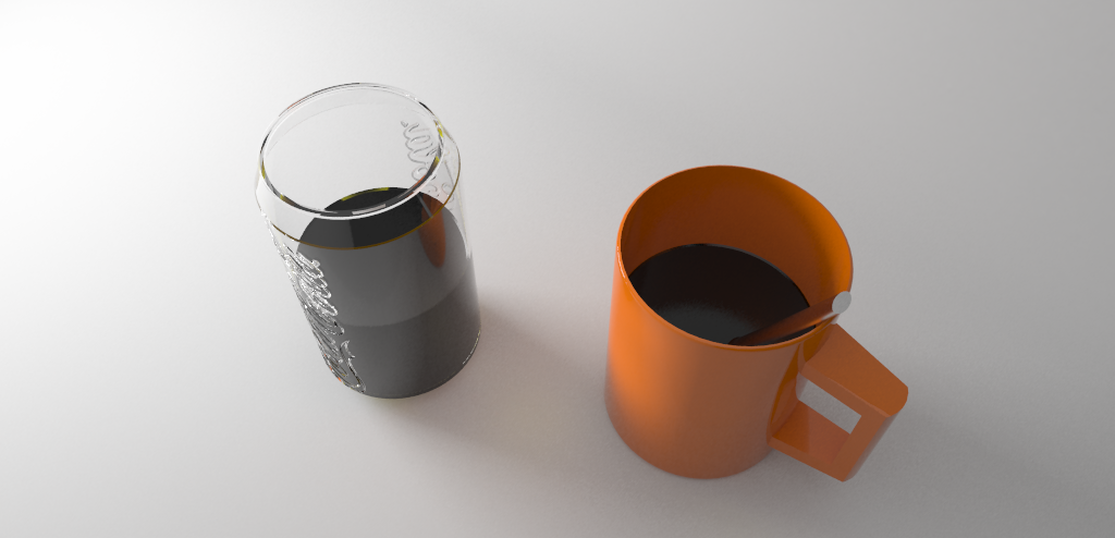
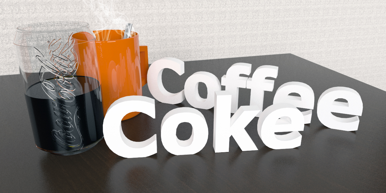
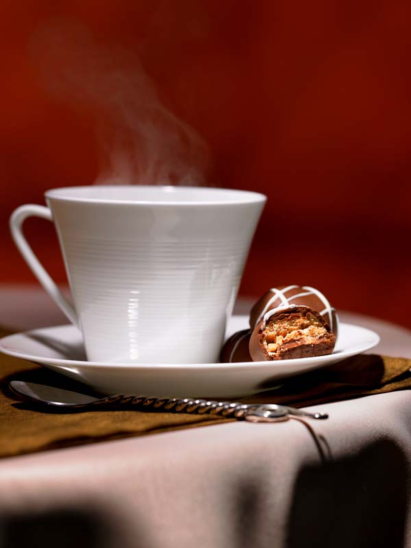
And here some renders I did last week. The Coke-glass-material was kinda challenging...
-
I think you are off to a fairly good start. A few things that stand out:
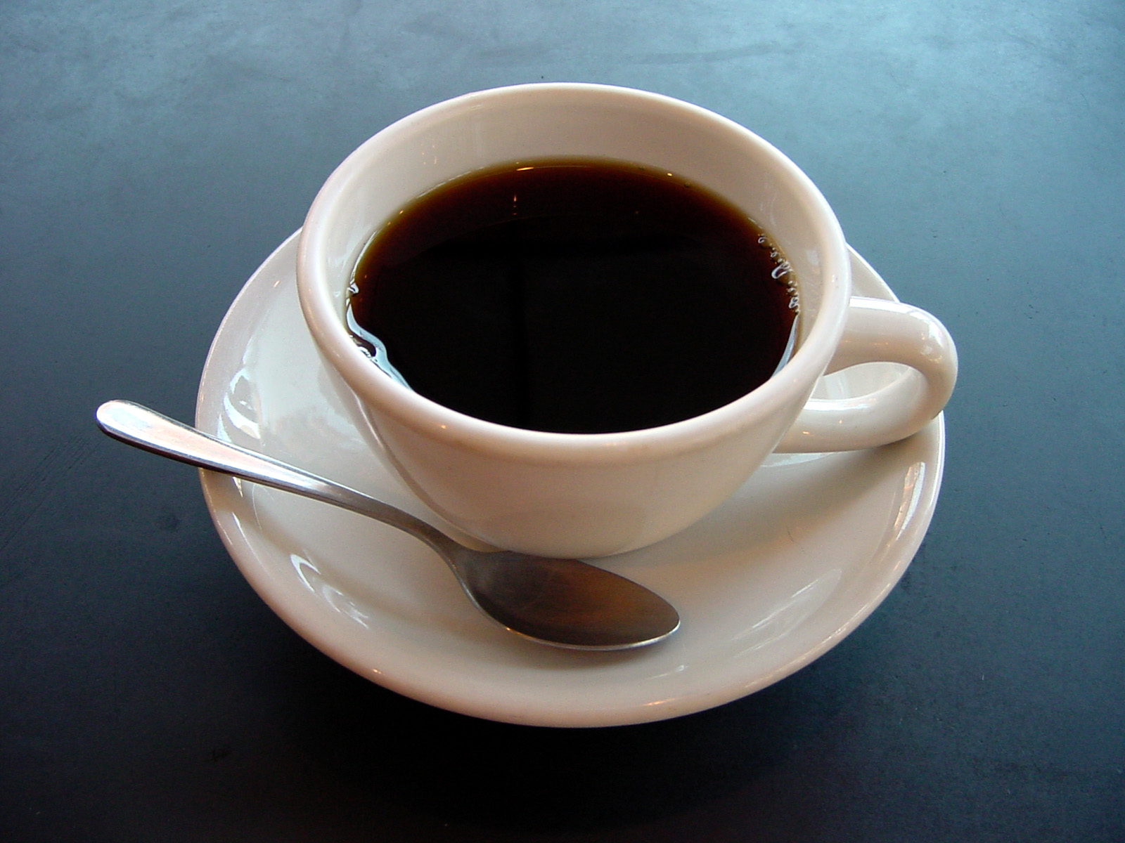
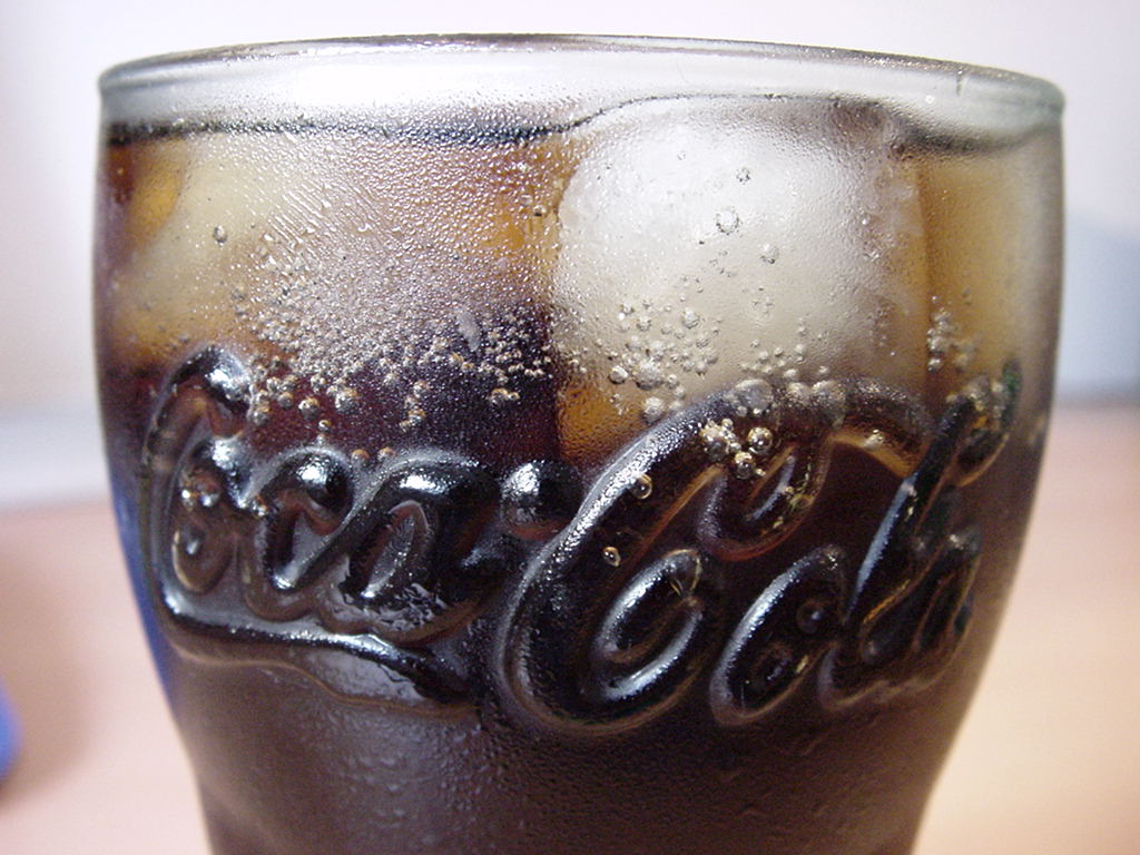
The fluids look to be the same material and in all reality they do look quite different. Coke will have carbonation bubbles (especially coke) and coffee has a bit of transparency at the top but if goes completely dark very quickly depending on depth. Coke has a bit more transparency to it. The coke should also show some bubbles on the top (unless the goal is stale coke)
The glass material is really pretty good as is the mug material. The spoon (guessing) looks odd, not wrong, just an odd shape. Maybe a more traditional spoon design would help it come across as a spoon right away.
The 3D text could use some more segments (subdivision). It becomes obvious with all letters other than the "K" being round more than straight.
The wall material is tiling really bad and could use a better wall material.
The steam looks more like smoke than steam. The color of the steam would be far lighter and more transparent.All in all a great start.
Scott
I have attached some reference images for you.
P.S. My choice would be a good tequila and a cigar.
-
Thanks for your reply,
I knew I would have to work over the coke material! Actually, the coffee is more transparent than it looks, because there's no light on the surface. Bubbles are definitely needed.
And the shape of the spoon is really too simple. For the wall: I was trying to imitate the wall in my room which kinda looks like that.I will try to work on the things this weekend...will post my results.
Greetz, Fritz
-
OK,
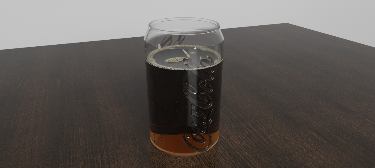
finally got my coke updated, which was harder than i thought. And i got rid of that coke-bumpmap and modelled it myself. What do you think about it? Getting the right materials was 80% of this whole work.
It's this try (render) and error thing....
Tell me what you think about it now....
Greeting from Austria, Fritz
-
Now that looks nice. The carbonation looks great. If you wanted to go the extra mile you could add a little condensation...but that is icing on an already very tasty cake. walks to fridge to get myself a coke. ahhhhhhh!
-
Yum! My vote is coffee! But I'm sure you would expect that from me.

-
I agree that the bubble look great. I think the coke is still a bit to light in color and a bit too transparent. It is surprising how much time can be spent tweaking materials but it is key to the difference of good and great. You are on your way to great!
Good job. I think the scene is not adding to how good the materials are looking. You might want to find something that adds to the image and does not overshadow your hard work.
Scott
-
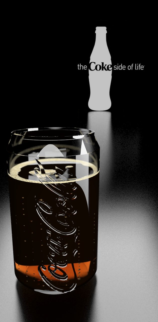
Here'a another setup of my tasty coke...
I think I did something wrong with the render options, it took about 4 hours to render!Greetz, Fritz
-
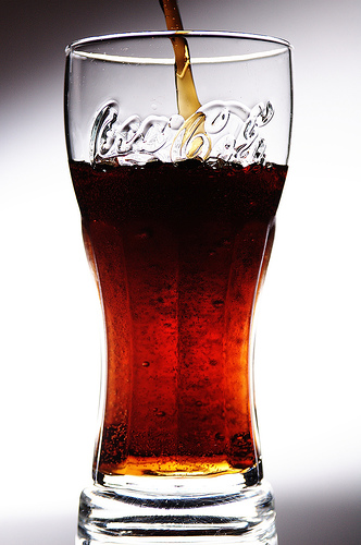
This looks really good so far. Great improvements! I have attached a picture since I think the shader color for the coke is a bit off. It looks to have more red in the base color.
Scott
-
Thanks for your reply, but I think I'll keep it like that.
On my screen the color of the coke you posted looks the same as mine. (except for the pooring-in-thing. And since my environment for this render is completely black it can't be lit up that much.Anyways, I have some other projects running (modelling my home and a car) and the rendering took just too long....
Greetz, Fritz
-
I looks so fu.... perfect. Good ideas. Great work

Hello! It looks like you're interested in this conversation, but you don't have an account yet.
Getting fed up of having to scroll through the same posts each visit? When you register for an account, you'll always come back to exactly where you were before, and choose to be notified of new replies (either via email, or push notification). You'll also be able to save bookmarks and upvote posts to show your appreciation to other community members.
With your input, this post could be even better 💗
Register LoginAdvertisement


