Clip Art
-
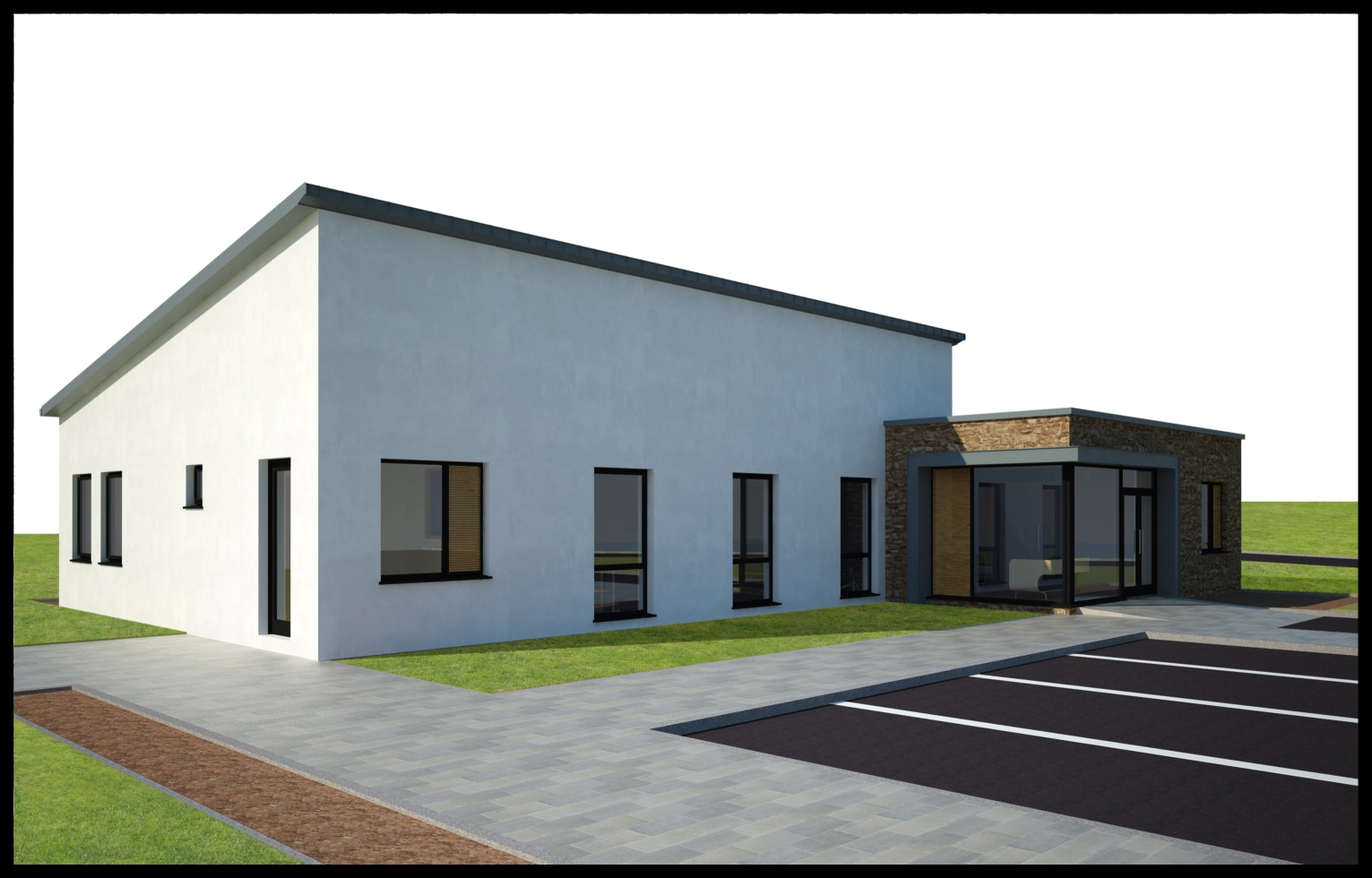
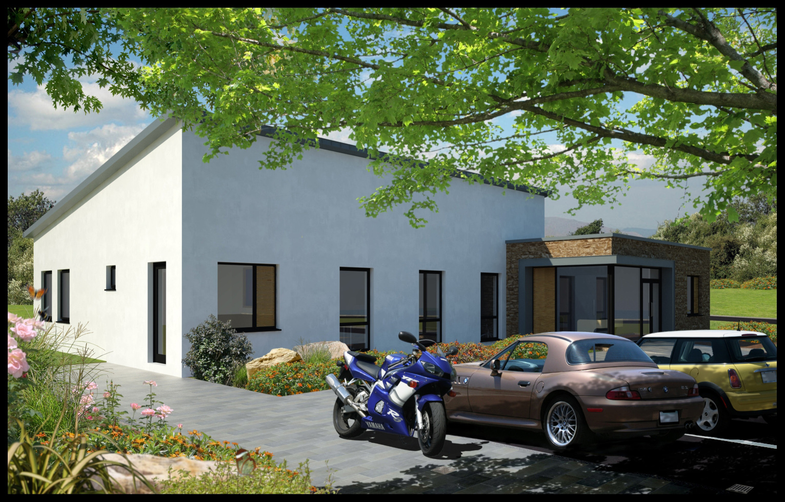
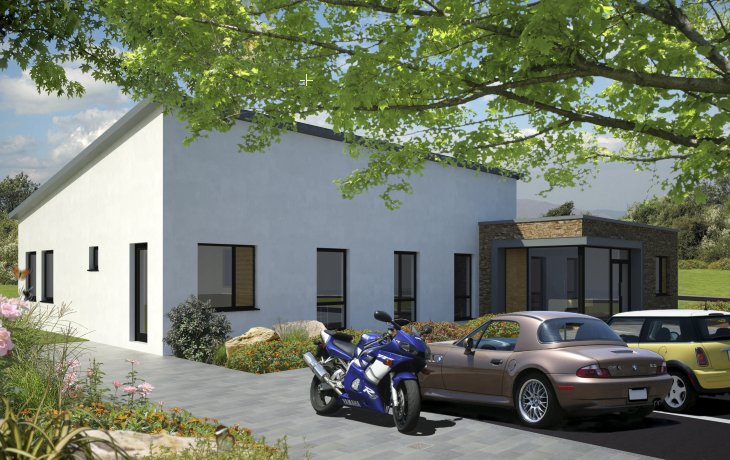
Attached is an exercise in using clip art to complete an image.the building is basic but I used 40 different layers in building up the final image.The hardest part I think is trying to ensure the lighting on the clip art is as near as possible to the original image.As most clip art is lit from a 45 degree angle it helps to light the model the same way.The photoshop file ended up at 70 mb.
-
Beautiful! How'd you do the tree shadows on the cars?
-
Hmmm..
Very interesting stuff, care to do a basic tutorial on the shadows?
and how long did this take?Great stuff by the way.

-
Hey guys,
The assembling of the image in photoshop took about 3 hours.I went through a few options with the clip art before I was happy.The only added shadow is that from the tree.both cars and bike came with shadows.
Regarding the tree shadow,its a straight forward process:1.I copied the tree branch layer and flipped it vertically.
2.I use the fill tool to fill the branch and leaves with a dark grey colour.
3.i used the distort function to change the angle/perspective of the leaves.
4.I copied this layer and moved it up and over so it caught the back of the cars
you can see it in the second image.although the shadow designed to fall on the cars looks like it is has a straight edge on the bottom,this is hidden by the cars5.I reduced the opacity of the layer
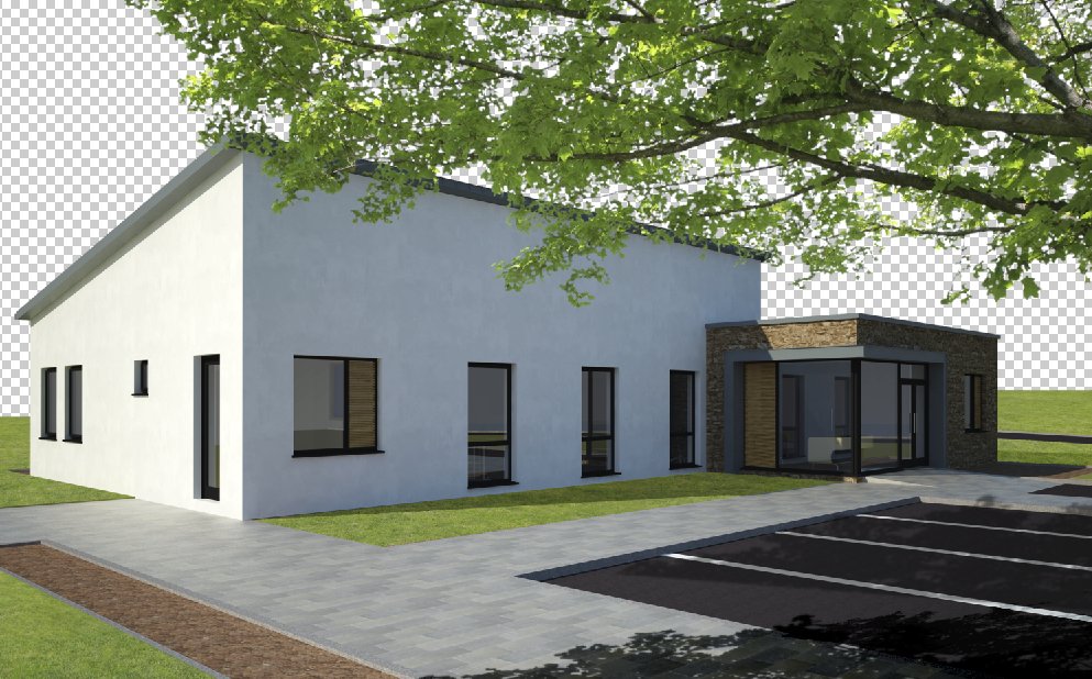
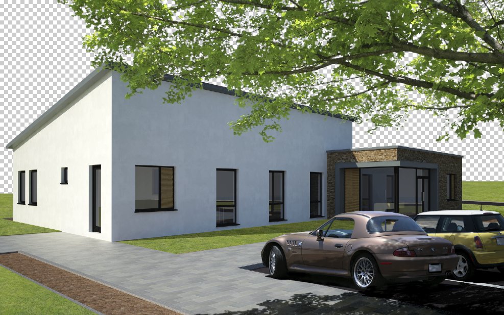
Adding the shadow is a simple process but helps enormously when trying to tie the clip art into the picture.You can see by the bottom image that the tree branch without the shadow looks odd.
I always try and use clip art in my final images as It gives me a lot more flexibility to make changes(also I dont have to wait long for the vray render!)
-
Good image. . . .I would think the trickiest part would be finding cars and stuff like that in the proper perspective. Or did you tweak those too?
-
looks like a photo

nicely done
and yeah where did you get the cars from?!!
-
Foreground framing adds so much to a render by helping to reinforce depth. I only have one small critique. The bending moment on that branch must be incredible which makes me think you used a standing tree and laid it on its side. But it still looks good even if that is what you did.
-
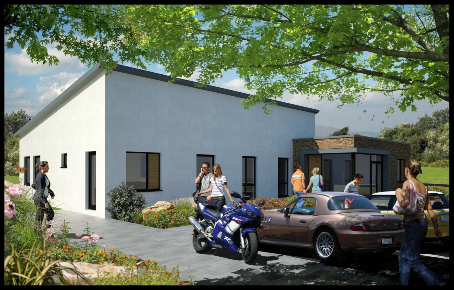
attached is an updated image with people added.
Roger,you're right about the branch in that it looked too large.I have reduced the overhang and it looks better.By the way it is a branch and not a tree turned on its side.it is part of a set I got from got.3d .
Im still not happy with the front car,the perspective at the rear is incorrect but because this is a piece of clip art,I cant distort/change the perspective without messing it up.Hopefully it is not too obvious.(The car is from a set I bought from Realworld Imagery Inc.)
-
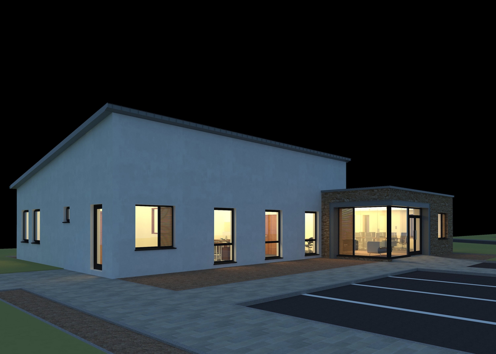
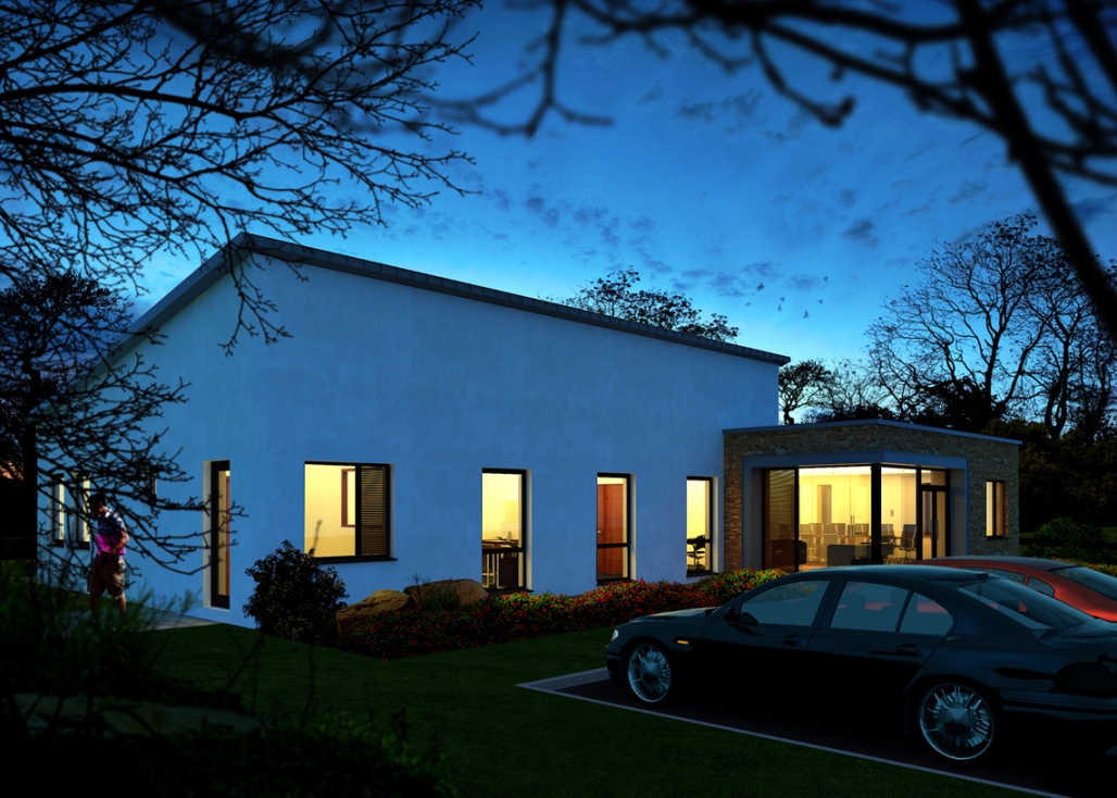
Attached are 2 more images,this time of a night shot.The top image is the original render from Vray,the bottom one the final post processed image.A decision to change the paving at the front of the image to grass was made after the render was complete but it was an easy job to change this in photoshop rather than rerendering(these are low res images,the original image files are 7mb plus).
-
The night shot is great and the grass looks far better. Nice work!
Scott
-
Nice work. The image with people is teaming with life.
Hello! It looks like you're interested in this conversation, but you don't have an account yet.
Getting fed up of having to scroll through the same posts each visit? When you register for an account, you'll always come back to exactly where you were before, and choose to be notified of new replies (either via email, or push notification). You'll also be able to save bookmarks and upvote posts to show your appreciation to other community members.
With your input, this post could be even better 💗
Register LoginAdvertisement


