Tridem's WIP with SU and Kerkythea
-
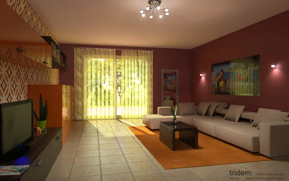
this is a scene wich I've been played around for a while, now I'm just fed up with it


-
I think your renders need a lot of improvement. Specialy on the light and the
textures. You should also not ignore the basics of furniture construction.
-
Since I don't think is all scrap, please be more detailed on what you think was wrong in order I can try improve it... wich texture? and wich forniture? eg the left part is almost exactly my living room

-
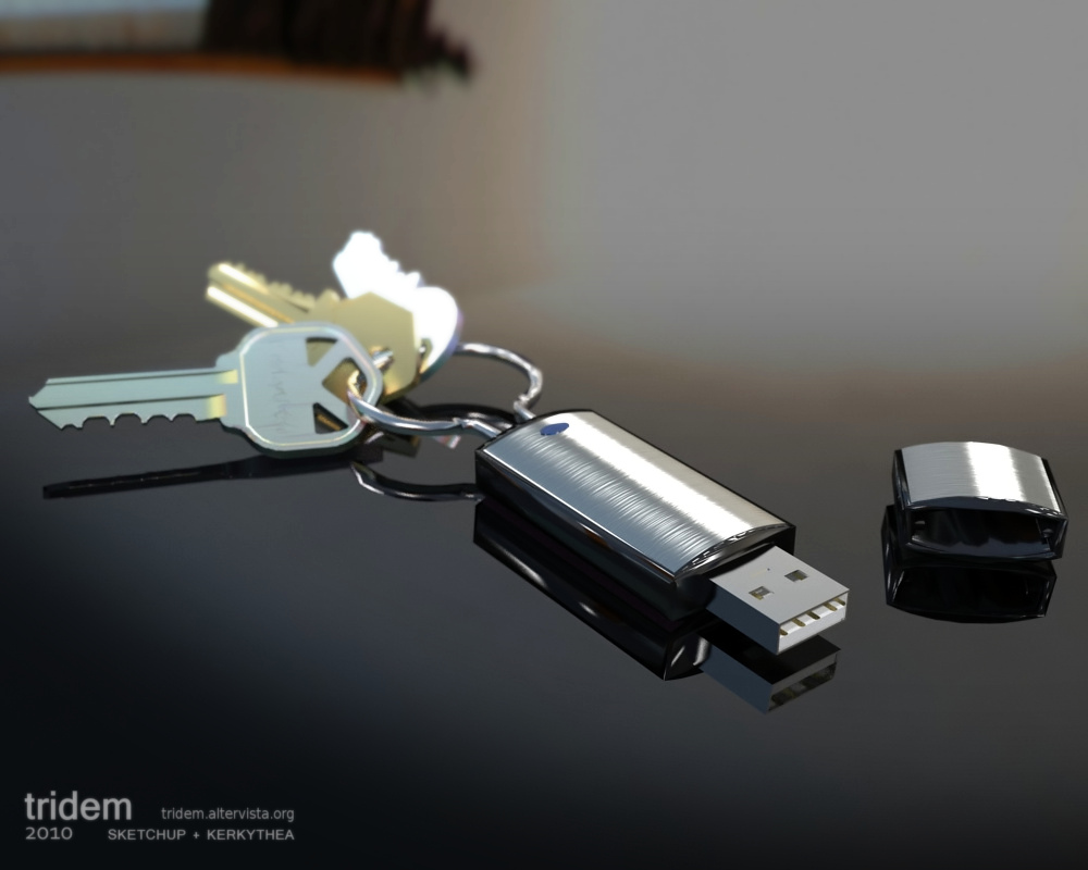
Let's change subject...I did this scene some months ago, but I'd got troubles with the steel brush mapping, now I believe it works somehow

-
@tridem said:
Let's change subject...I did this scene some months ago, but I'd got troubles with the steel brush mapping, now I believe it works somehow
[attachment=0:3sx61sa6]<!-- ia0 -->Keys-wm.jpg<!-- ia0 -->[/attachment:3sx61sa6]
Nice! I think the brushed metal works very well. I don't have any place giving critic because I am not anywhere near the level that you are but I will say this anyway. Just because I have seen enough of your work to think you could do it pretty easy. The plug on the usb seems too perfect. (If that makes any sense.) For some reason my eye keeps getting drawn to it. Perhaps too smooth...not sure. It is just such a great render its a shame to be distracted by it. But like I said...I certainly couldn't anything like this...so what the hell do I know.

Love it!
-
thanks Jeff for so many compliments

You're absolutely right about the plug, I set a bump map since a metal sheet cannot be so 'flat' as a mirror but something has gone wrong and I did not figured out why, I get often problems with UV and scale settings in Kerkythea, expecially with the procedural bitmaps
-
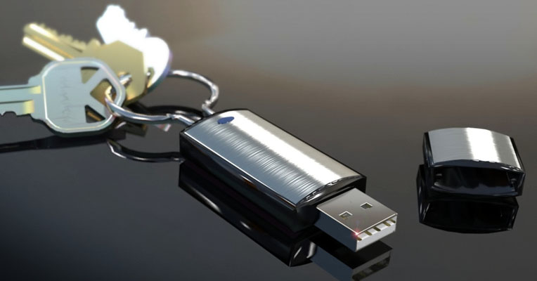
The last render is by far better than the others. The brushed metal material does look nice. It comes off as a brushed metal with a clear coat which is believable. The plug material is a bit flat. Typically this is aluminum and has quite a shine to it. Also try putting some vertical scratches that will give the effect of use. The vertical scratches should be faint but there none the less. The keys are well modeled but have a few issues. The are not laying correctly to me. The tips would usually be touching the table. The material is spot on except for the last one (farthest away from camera). This one is a bit blown out. The table material is not adding to the render as it is reflecting too much. Maybe a wood material which a blurry refelction of something like that would work better.
All in all this is one of your best and just needs some small tweaks to make it damn near perfect. Good work.
Scott
-
Hi Scott, actually I wanted show it like some brand new product rather than a realistic one, so I don't agree about the scratches. Also I like the reflective surface very much.

About the laying of the keys I know it's strange, but I worked around for a while and cannot able to find a better position, I should have been using sketchyphisics to solve definitively.
Thanks anyway, I really appreciated your comments
-
Did you apply any anisotropic scatter to the brushed metal? Don't feel bad if you don't know what that is, I had to look it up too. Aniso means unequal and light hitting a brushed surface will be scattered further in a direction perpendicular to the direction of the brushing.
I also had a problem looking at the USB connector. After checking on some around here, I observed that the corners should be square on the inside and radiused on the outside. They are made by conforming a flat sheet of metal around a very square edged mandrel. The inside of the connector takes on the square edge and on the outside the metal is stretched into a radius. You also need a hot white highlight along the top left edge of the connector which would indicate a radius rather than a sharp edge. I think KT will let you mark edges to be softened or rounded. If not add a white streak in Photo shop. You might also want to add a soft whisper of color (a color different that anything directly in the render) on the upper surface of the USB connector. This will indicate it a reflective surface showing some object off camera.
One way to see of a knife is truly sharp is to hold the blade under a point light source. If you see a long white streak on the edge the knife is dull (the light is wrapping around a radius). If the knife is razor sharp the light streak will be minimal or nonexistent because there is not enough surface at the edge to raise a reflection. Your connector has a knife edge on the outside.
What scale are you working at? One-to-One? I would suggest multiplying all your measurements by 10 or even 100. SU will never be able to do the small radii. I am working on a project with a lot of small parts and SU does not deal well with things in the under 1/4 inch range.
-
Your comments are precious as always Roger.
I always draw in scale 1:1 , I knew little objects may have problems in SU but never tested myself.
I don't believe the scene needs a coloured light (if I understood well...) there's a spherical background with a room image and some point lights as you can see in the plastic reflections so I think the one to fix up is the plug. Having not given it a radius in the edges did was a mistake
I'm almost thinking to rework all the scene from scratch... almost, time it's never enough
-

Luca this is what I had in mind. The picture "equis mile verbe."
Hello! It looks like you're interested in this conversation, but you don't have an account yet.
Getting fed up of having to scroll through the same posts each visit? When you register for an account, you'll always come back to exactly where you were before, and choose to be notified of new replies (either via email, or push notification). You'll also be able to save bookmarks and upvote posts to show your appreciation to other community members.
With your input, this post could be even better 💗
Register LoginAdvertisement


