2 House development (crits welcome)
-
Hi all
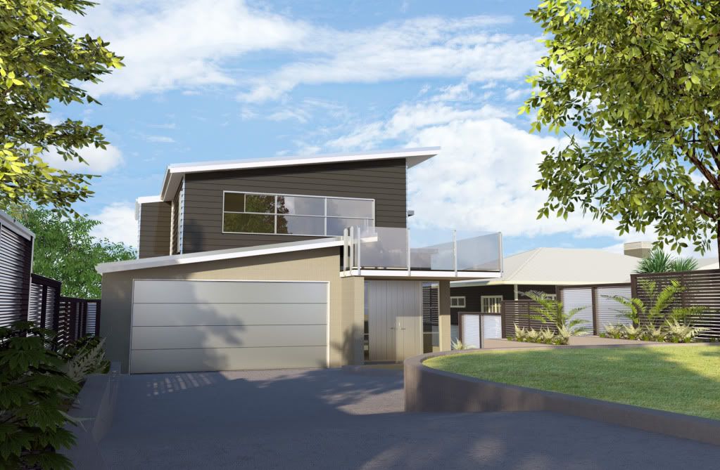
Been a very long time since I have posted anything. Its been a while since I rendered anything.This is a 2 unit development, which the client wants to sell off the plans. I spent far to long compared to the money it was paying. But all in the name of learning Vray.
Would love any advice. All crits welcome
the Job is due end of tomorrow (Southern Hem)Thanks
jonathan
-
Looks pretty goodto me - only crit is that the second image looks weak on the right hand side and the two buildings seem to merge - seems that the roof on that building isnt a strong enough colour to stand out that little bit - other than that good images.
-
your work is in a different league of quality now

-
damn...whats there to critique?? these are awesome... first image especially.. awesome.
-
I agree with Jason, really nice renders...

-
Great renders Holmes
-
Very nice render, great atmosphere to it.
One crit off the back... bottom image has a glass pane missing (top left)
-
Great work. Really has an atmosphere.
Tiny critique:
The perspective and camera angle have the wall skewed from vertical. It doesn't really bother me, but I thought I'd point it out. Or maybe the wall is angled.
-
They are pretty nice renderings and design as well...I agree with Dale regarding the vertical distortion is too much for 2 story dwelling...for this particular view in my opinon should be very subtle.....there is a free application where you can play with some film exposures to get them even more realistic looking.
Could you post your setting for the glass..do you have a single plane or it has thickness?
good job!!
Fernando
-
i havent read through all of the responses and I apologize if i am repeating anyone, but i really like this. I think the biggest think that needs attention is the driveway...i think it needs to be "dirty-ed" up a bit. it just looks too perfect and kind of dominates the images (especially the first one). Or maybe crop some of it out of the image. But i really like the rest.
-
@solo said:
Very nice render, great atmosphere to it.
One crit off the back... bottom image has a glass pane missing (top left)
Its not very clear,but thats a slidding window. (very practical in a sudden summer down pour)
@fernando lino said:
They are pretty nice renderings and design as well...I agree with Dale regarding the vertical distortion is too much for 2 story dwelling...for this particular view in my opinon should be very subtle.....there is a free application where you can play with some film exposures to get them even more realistic looking
Could you post your setting for the glass..do you have a single plane or it has thickness?
good job!!.)
The glass is in the ASGVIS download section, its called clear_glass Archetectural. I just use an emissive backdrop/billboard to get better sky reflections.
-
@dale said:
Great work. Really has an atmosphere.
Tiny critique:
The perspective and camera angle have the wall skewed from vertical. It doesn't really bother me, but I thought I'd point it out. Or maybe the wall is angled.So so true Im changing that right now. Thanks for the advice.
@steelers05 said:
i havent read through all of the responses and I apologize if i am repeating anyone, but i really like this. I think the biggest think that needs attention is the driveway...i think it needs to be "dirty-ed" up a bit. it just looks too perfect and kind of dominates the images (especially the first one). Or maybe crop some of it out of the image. But i really like the rest.
Good point. I'll try and dirty it up. Would you do that in PS or add another dirtmap to the diffuse / blend. If that makes any sense.
Thanks to everyone else for leaving your comments. Always appreciated
-
I liked the renders, but I was somewhat disturbed by the skies in both images - they seem somewhat harsher than the rest, maybe too blue or something. Or is the light to the clouds coming from a different direction than the buildings - I don't really quite know, but they looked somewhat artificial...
Anssi
-
The cg work is very good. I too would use a 2 point perspective, and eliminate the converging perspective lines, do something about the black window (per solo's reference), and create spatial separation between the building, and the renders background elements (for example in the second render, lighten the background landscape elements on the left, and darken the background building on the right).
If the renders are to be used for marketing, you might want to add pictorial sizzle. People (especially children if selling to families), cars, stuff in the driveway, exterior lights on the building, etc.
I like the foreground trees:-)
-
I did this quickly on my netbook
(13" screen and 1.2 MHz Atom chip)
I am not sure how good or bad it is, so forgive me for intrusion. I thought that original render needed a bit more contrast and sorting out verticals.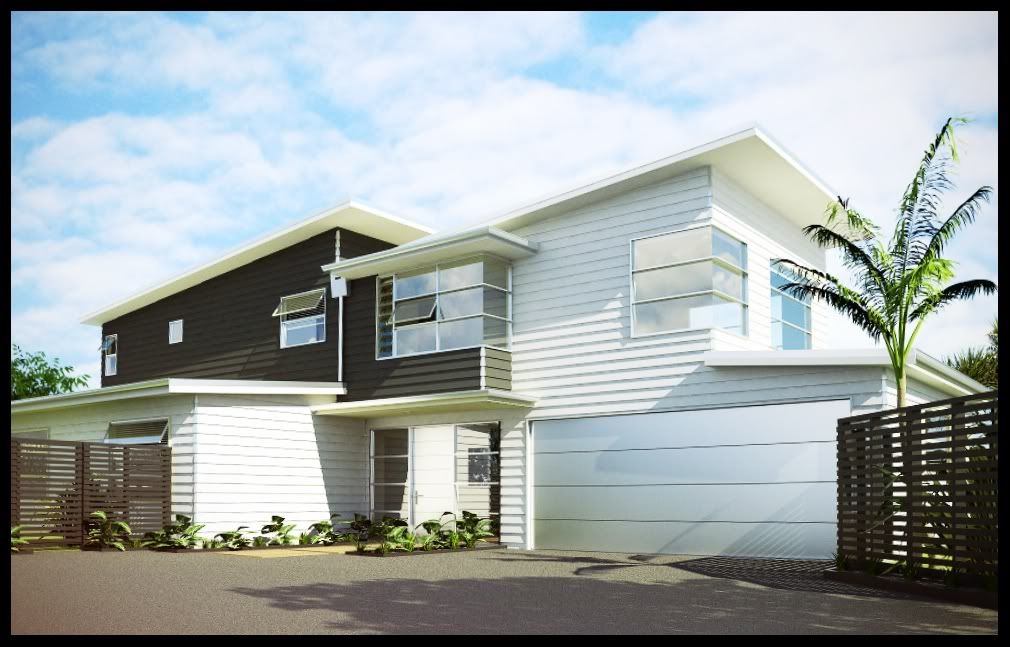
-
just didnt have much time today to include all your suggestions. Got to much on.
I couldnt touch the second house because SU keeps crashing. I think it may have to do with it being modeled ages ago on SU5
Anyway heres a revamp of the first house. Wish I had more time and money to play with it more.Cheers Sepo for taking the time to play around with that image.
I know perspective is still not right. Found changing between 2pt perspective and playing with the FOV realy difficult. But in the end the client loved it.
Hello! It looks like you're interested in this conversation, but you don't have an account yet.
Getting fed up of having to scroll through the same posts each visit? When you register for an account, you'll always come back to exactly where you were before, and choose to be notified of new replies (either via email, or push notification). You'll also be able to save bookmarks and upvote posts to show your appreciation to other community members.
With your input, this post could be even better 💗
Register Login


Advertisement