sketchucation logo sketchucation
    • Login
    ℹ️ Licensed Extensions | FredoBatch, ElevationProfile, FredoSketch, LayOps, MatSim and Pic2Shape will require license from Sept 1st More Info

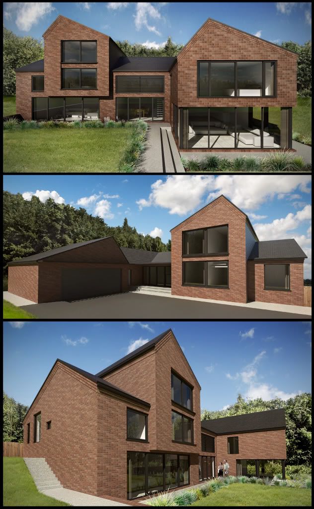
    External Visuals [WIP]
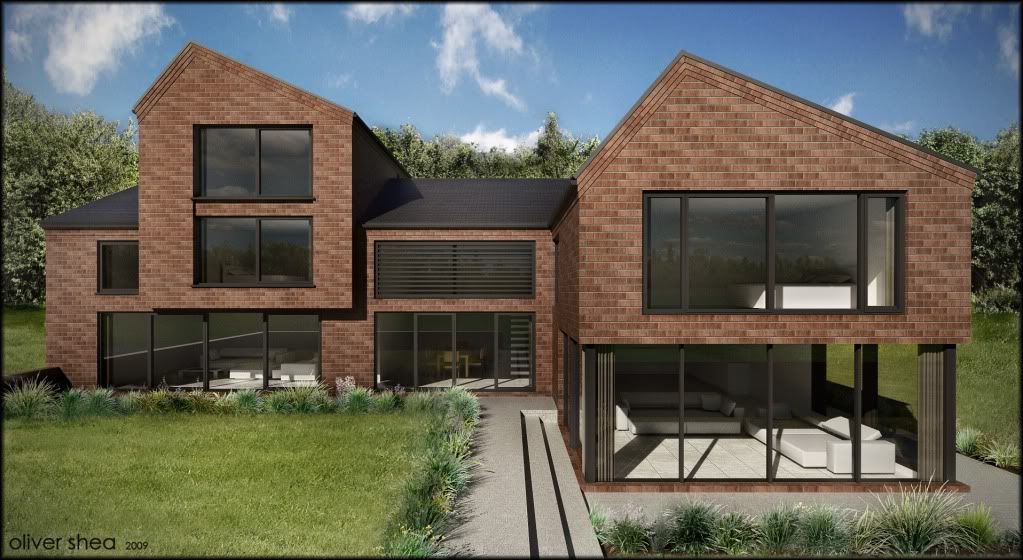
    Scheduled Pinned Locked Moved Gallery
    23 Posts 8 Posters 1.1k Views 8 Watching
    Loading More Posts
    • Oldest to Newest
    • Newest to Oldest
    • Most Votes
    Reply
    • Reply as topic
    Log in to reply
    This topic has been deleted. Only users with topic management privileges can see it.
    • olisheaO Offline
      olishea
      last edited by

      hmmmm....

      oli

      1 Reply Last reply Reply Quote 0
      • olisheaO Offline
        olishea
        last edited by

        thnaks a lot james. I haven't drawn everything to (exact) brick dims yet...its almost there but not quite. theres been about 10 revisions! also the texture isn't stretched to standard brick dims eitehr its like 3 mm out at the moment. I know some of the fenestration is unsettling to this elevation in size and relative orientation but I can't do anything about it....its really frustrating-this could be an absolute killer of a house. but then again the client is blown away and loves it! you can't win either way! πŸ˜†

        oli

        1 Reply Last reply Reply Quote 0
        • RichardR Offline
          Richard
          last edited by

          Yeah man! Doing those high box features out of brick just seems heavy and depressing - Oli I can feel your pain! I must say in situations like that I just tell the clients "NO I'm not doing it, whether you like it or not, just no!".

          Mate you have a funny halo around the background trees (like bloom πŸ˜„) and that brick map just looks a bit plastic not sure why!

          The grass looks great!!!

          Well done Oli!!

          [BUILTBRAND.COM.AU](http://builtbrand.com.au/)

          1 Reply Last reply Reply Quote 0
          • olisheaO Offline
            olishea
            last edited by

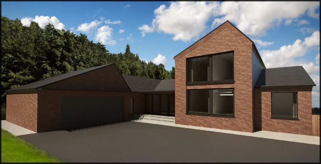
            Hi people here is another angle:

            http://i654.photobucket.com/albums/uu269/olishea/visual_north-1.jpg

            oli

            1 Reply Last reply Reply Quote 0
            • S Offline
              sepo
              last edited by

              This second image looks a bit dark. You have lost definition on the left side of the building.

              1 Reply Last reply Reply Quote 0
              • FrederikF Offline
                Frederik
                last edited by

                The shadows on the tree line in the background doesn't match the sun position in the render...
                The ground material seem too flat...

                I'm sure that a mixture between NPR and the render will compliment this scene much better... πŸ˜‰

                Cheers
                Kim Frederik

                1 Reply Last reply Reply Quote 0
                • olisheaO Offline
                  olishea
                  last edited by

                  well this is north elevation. this whole side would be in shadow but I kinda faked it so some of it was in sunlight. maybe I shoulda done it with sun off for more overcast appearance. I cant do a NPR render because its in a set of two other (more) realistic renders. cheers for comments they help me improve!!

                  oli

                  1 Reply Last reply Reply Quote 0
                  • RichardR Offline
                    Richard
                    last edited by

                    Yeah mate what is happening in the shadows there?? Could be someone hiding!


                    visual_north-1.jpg

                    [BUILTBRAND.COM.AU](http://builtbrand.com.au/)

                    1 Reply Last reply Reply Quote 0
                    • olisheaO Offline
                      olishea
                      last edited by

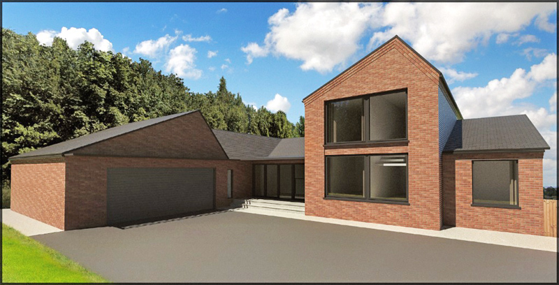
                      Here is the final of the three images:

                      I couldn't spend longer than a couple of hours on it I'm afraid so please excuse the mistakes here and there!!

                      I think the images look great as a trio on a drawing sheet, in isolation they are not so spectacular. Remember these are just for planners to get an idea of the building form. I think I went a bit OTT, again!

                      http://i654.photobucket.com/albums/uu269/olishea/p3.jpg

                      oli

                      1 Reply Last reply Reply Quote 0
                      • dermotcollD Offline
                        dermotcoll
                        last edited by

                        Hi Oli

                        They look pretty good to me - and if they get the house passed for the client then Job done!!
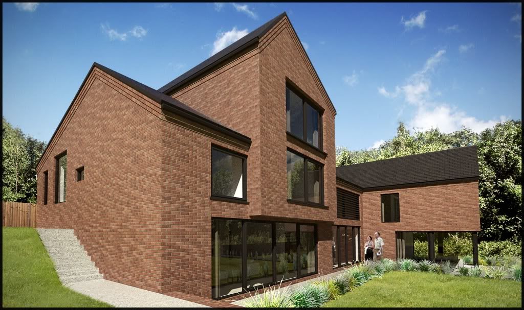
                        When you burn your arse - you gotta sit on the blisters!!

                        1 Reply Last reply Reply Quote 0
                        • olisheaO Offline
                          olishea
                          last edited by

                          and all 3 together:

                          frederik: perhaps now you can see why I couldn't do just one NPR image on this sheet, it would stand out too much.

                          http://i654.photobucket.com/albums/uu269/olishea/planning_3_visuals.jpg

                          oli

                          1 Reply Last reply Reply Quote 0
                          • holmes1977H Offline
                            holmes1977
                            last edited by

                            Great images

                            I really want to walk with bare feet through that grass.

                            Exaggeration makes a dull story better.

                            1 Reply Last reply Reply Quote 0
                            • RichardR Offline
                              Richard
                              last edited by

                              Still needs some shadows and highlights filtering on that middle one mate! Still so dark!

                              [BUILTBRAND.COM.AU](http://builtbrand.com.au/)

                              1 Reply Last reply Reply Quote 0
                              • olisheaO Offline
                                olishea
                                last edited by

                                its cool i've done it to the printed version cos it was too dark πŸ˜„ so thanks for pointing it out! I didn't have time to re-render 😒 but they look fab on paper!!

                                cheers holmes......but keep off the grass 😎

                                oli

                                1 Reply Last reply Reply Quote 0
                                • holmes1977H Offline
                                  holmes1977
                                  last edited by

                                  lol nice..........sunny day, grass on the grass..... not forgeting the bare feet 😎

                                  Exaggeration makes a dull story better.

                                  1 Reply Last reply Reply Quote 0
                                  • 1
                                  • 2
                                  • 1 / 2
                                  • First post
                                    Last post
                                  Buy SketchPlus
                                  Buy SUbD
                                  Buy WrapR
                                  Buy eBook
                                  Buy Modelur
                                  Buy Vertex Tools
                                  Buy SketchCuisine
                                  Buy FormFonts

                                  Advertisement