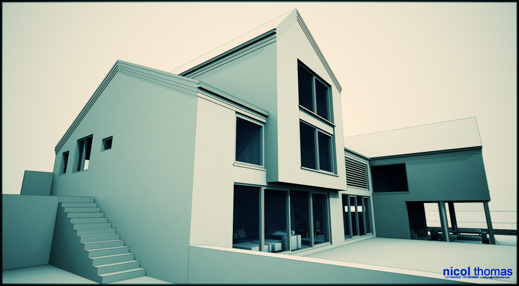
Quick and dirty clay renders
-
by strange do you mean completely unnecessary and pastiche!! I can't believe client asked for it but ah well its not my money.
thank you Sid...this is going in for planning next week so it has to be very precise and clear.
Cheers dermot....i will eventually do some proper internals.
-
I believe the title should say: Crisp and clean clay renders...

GREAT work, Oli...
@olishea said:
OK podium uses KT engine and so does twilight....so I'm afraid there wouldn't be much differenceif any between the two.
I fully agree with you...
-
"by strange do you mean completely unnecessary and pastiche!! "
Yes and Yes.
-
Sorry Olli, I am to blame for the thread hijack.

But I also realise that this forum has a problem.
It has become impossible for an 'ordinary' forum member (read: without affiliation to commercial software) to share a testimonial on using a particular software.Somehow it just triggers all the commercial people to come and 'defend' their product.
Well guys, your products were never under attack.I seriously have had enough.
Either this is a forum or it is something else.Users can't have opinions anymore or share experiences in good trust. A real shame!

-
No Chris, I only said I shouldn't - in my "position". Not even that mustn't just shouldn't.
-
Fight! Fight!
Nice renders, Oli!

-
I am not blaming you csaba or other moderators. i know you try to keep your integrity.
I am not blaming the commercial people either as I can understand the jumpiness.What I wanted to adress is the general climate that has been created on this forum that doesn't allow users to evaluate software and share an opinion in good trust anymore.
Well done SCF management!
-
I do not mind either way Chris...although nowdays I try not to get into who's father is stronger and viral marketing.
-
I know what you mean and I don't want to get to that debate again.
But it is just sad that this is the result.
People can't even tell anymore which software they use, for crying out loud. -
Don't worry about it biebel, somebody had to say it. it pisses me off too.
You can hijack my thread all day long mate I've learnt so much from your work and you don't even know about it!
I have said this before: "You can not polish a turd"
You could make any render engine produce these results but lets face it guys.....does your client ever say "wow is that vray?" haha
[edit] thanks for compliments people but you know what I didn't even add reflection to the windows haha

I'll post textured externals when I'm done
-
"before anyone asks and starts a render war!!"
This will be the name of my new thread
-
haha
here is another version with that 'toy camera' image editor (free from here : http://www.pentacom.jp/pentacom/products.html)
if you download it make sure you get all the versions cos you get some cool filters. works for mac and pc.
This took about 30 seconds!

-
Both programs are brothers, with their mother being the Greek goddess Kerkythea, and brothers should not fight.


And I agree that you did a very neat work, Oliver. My models are a mess compared to yours.
-
Great mood in this one. I am thinking you do not really need any reflections...kind of raw and beautiful as they are.
-
I prefer the new toycamera version, its much faster but most importantly, has this zuiko lens simulator. Anyway it costs 10$, just for this small watermark, you can delete it after all...
-
thanks mate you are the mood man. it needs more shading devices I can imagine it getting quite uncomfortable in the summer. I think it'll help break up the brick a bit too. and sid....ive made absolutely sure they are dark grey powder coated window frames this time! thanks to you and bigstick there! any RAL you recommend?
by the way the windows are huge like this because they have an awesome view of an open valley and no houses to look in. so privacy not really an issue to this elevation.
-
i didn't realize the watermark was so small....anyway you know what I'll buy it I've used it enough times and they deserve at least 10 dollars for it
 but maybe not if they start wanting all that western union money transfer bull.
 -
Oli, you could also try "Poladroiding" (not a typo) your image:
It's free and available for OSX. The current version is a beta, so save your work before trying it.
-
Oli I personally have preference for RAL 9007 . Just make sure you get sample from the manufacturer as RAL colours tend to vary. This one is mild metalic.
I know ...I know they should be the same but they are not.Cheers Ecuadorian for the link
 ....it seems to produce similar output like Toycamera.
 -
Miguel, toycamera is superb. Try it. Especially on decolorized or clay-render style scenes.
Edit: after all we hijacked oli's thread.
Hello! It looks like you're interested in this conversation, but you don't have an account yet.
Getting fed up of having to scroll through the same posts each visit? When you register for an account, you'll always come back to exactly where you were before, and choose to be notified of new replies (either via email, or push notification). You'll also be able to save bookmarks and upvote posts to show your appreciation to other community members.
With your input, this post could be even better 💗
Register LoginAdvertisement


