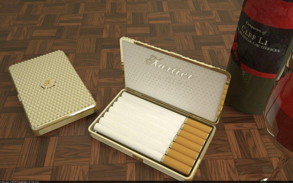
A little gift for the arrival! :) A little drink and a smoke
-
One more view


-
Great render, only thing I can crit is color of wine, needs to be darker, or if a Rose then lighter.
-
Hey SOlo!
Well i know about the wine, i was too lazy to change it while i was rendering it, and somehow never managed to do it in post processing too.
And i would take this opportunity to say that the stuff up at your website is really inspiring, and not just sketchup, or modelling, or rendering, ialso the creative intellect that reflects in the sophisticated execution is really commendable. I hope i would be able to achieve a stylistic approach of the same level!Btw, i am an architecture senior student up here in India

-
Thanks for the gift, shwetabhseth - Nice renders! I'm curious, what render engine did you use?
@shwetabhseth said:
...creative intellect that reflects in the sophisticated execution is really commendable.
LOL, that made me laugh, but its pretty accurate

-
Hey Dozer!
Well the render engine is Vray 1.4 - Skp6@shwetabhseth said:
...creative intellect that reflects in the sophisticated execution is really commendable.
LOL, that made me laugh, but its pretty accurate
 [/quote]
Well sorry but i do get a little wordy at times! ....i try hard not to do this but the more difficult things are explained better in such a way!
-
you could almost sell this as a photo if you misalign the individual smokes just a bit.

-
Very, very nice shwetabhseth.
I would agree on the wine in the glass color being a bit off, and the white of the cigarettes being too washed out.
But the care you took for the inside lid is awesome.
-
i believe thats a 3Dwarehouse object. is it yours? its well done.
-
great image. cheers, i'll take one of those smokes and spark it up right now. I'll drink the wine later, too early now.
-
@cyberdactyl said:
Very, very nice shwetabhseth.
I would agree on the wine in the glass color being a bit off, and the white of the cigarettes being too washed out.
But the care you took for the inside lid is awesome.
Thanx!
 well i was lazy to change all of these. the washed out white of the cigarettes was something i tried on but somehow couldn't find a way around! not even post processing
@xrok1 said:
i believe thats a 3Dwarehouse object. is it yours? its well done.
Yup all of these are 3D warehouse objects and the models are stunning really! if you want i could hunt for the links and send em out to you. i did these back in May or June!
@olishea said:
great image. cheers, i'll take one of those smokes and spark it up right now. I'll drink the wine later, too early now.
Well, what would you prefer then if not the wine?

-
cuppa tea actually!!
-
cheers Oli....
......remind me to send you a a fine bottle of red from our famous Barossa Valley...!!!

-
nice subject, my compliments.
apart the wine colour, you could improve the table material, feels like plastic.. maybe some bump mapping or more accurate reflections. and, finaly, is the bottle empty? is not elegant to see if you know what I mean, better always half filled
cheers -
Hey Gareth - Where's my bottle of wine

@tridem- I never actually thought about the floor looking plastic, and now i realise it when you say it! I agree a bump map would do wonders!
The bottle is actually HALF full, you can figure it out if you look at the bottle above the glass and below it, you would notice the color difference, it probably is not apparent because the wine level (air media to wine threshold) is behind th wine in the glass!
Hello! It looks like you're interested in this conversation, but you don't have an account yet.
Getting fed up of having to scroll through the same posts each visit? When you register for an account, you'll always come back to exactly where you were before, and choose to be notified of new replies (either via email, or push notification). You'll also be able to save bookmarks and upvote posts to show your appreciation to other community members.
With your input, this post could be even better 💗
Register LoginAdvertisement


