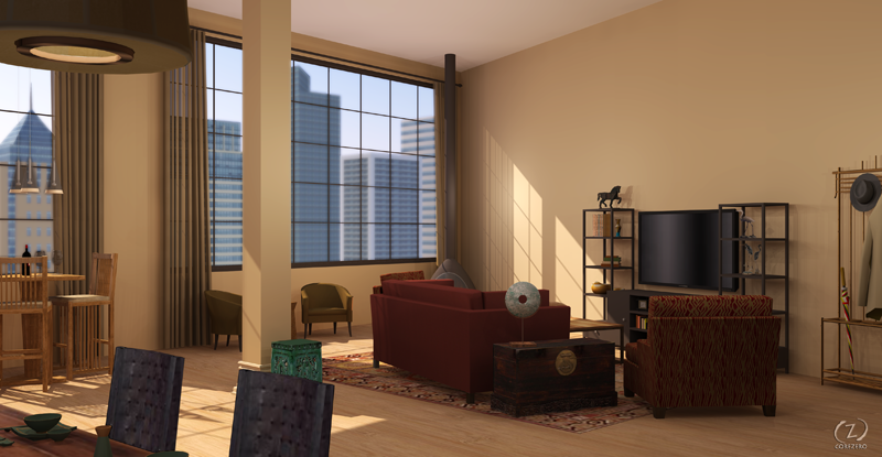
[WIP] Interiors -will be my first PR renderings
-
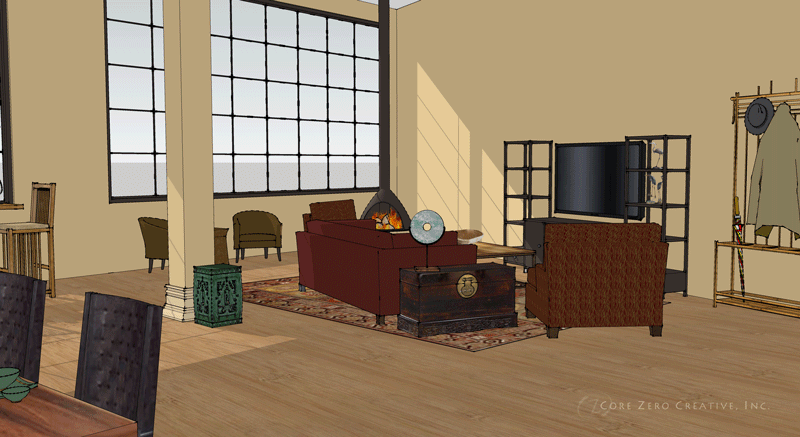
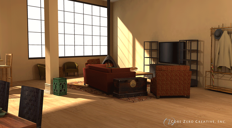
Latest update on the living room....
Questions...
- Why is the texture on the green stool near the column look checkerboard?
- Still having trouble lighting the room.
- I'd like to have DOF on the skyline. I'm thinking would be better to do PP. How would you do it?
- The walls at the ceiling line look "dirty". Why?
-
this looks good... well done
-
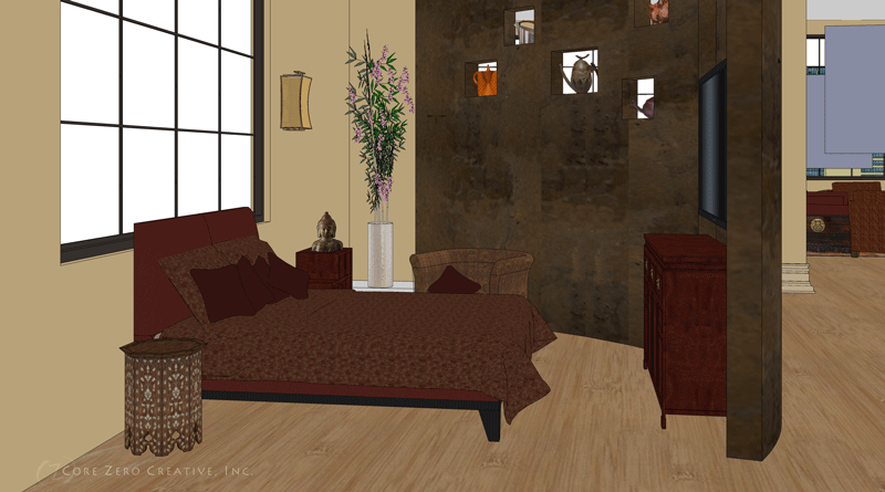
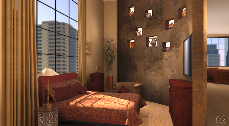
Another pass on the bedroom. (still working on textures and hoping to find some Cherry Blossoms for the corner.
-
The walls look dirty.....colour banding.....up your quality or use noisy setting.
Blurred skyline......use black&white.xml to make a mask of the render and then place blurry photo in photoshop (black solid, white void)
Lighting the room: try podium soft spotlights at regular intervals ( i recommend around 1500-2000mm grid, personal preference).....normal omnis within a light fitting have sharp unrealistic shadows, as exampled in the close up of your bed. Search podium forum for soft spotlight-TBD had posted an example. Avoid tuts3d's soft spotlight as it has an LEM in (unless you have a fast computer)
If you set the opacity of the omni group to zero.....the omni will no longer cast shadows......just produce light only (this will stop the triple shadows problem behind the bed)
The green checkerboard texture problem: Right click texture, reset position (even if it looks correct). If this doesnt work.....reverse faces back and forth and retexture....or delete offending face, recreate and retexture.
-
Tianne.
Remember to think like a photographer! A photogrpaher would likely have some lighting rigs place behind and out of scene to add illumination. Often a large light panel behind the camera can provide enough light to saturate the scene!
You will tend to get some dirt type marks around the corners of rooms when using raytrace renderers due to the limitations of the calculations (all techno stuff and beyond my complete understanding)
BTW I would as Oli suggests add the exterior PP as it is seemingly a bit blue!
-
congratulation for your improves and effort!!
-
Thank you everyone for your replies.
@Richard, that is exactly how I'm trying to approach it, just having difficulty getting the mechanics of Podium to what I think it should be doing. I'm not blaming Podium, it's purely user novice.
Here is my latest attempt....
![Podium using "old" settings](/uploads/imported_attachments/wVqn_20091104184620_1h13m11s.png "Podium using "old" settings") -
Tinanne it looks great though wanting just that tad more light in the foreground. Post pro with PS shadows and highlights filter will likely pull it out!
I've just prepared my own first proper interior (lots of exteriors) with maxwell
http://forums.sketchucation.com/viewtopic.php?f=81&t=23313 - here is the scene structure I used after a lot of preliminary lighting tests, panel emitters are the boxes at the bottom of the image. Not suggesting it's perfect just sharing thoughts! BTW the beauty with maxwell is the multilight feature that allows all emitter powers to be edited during or after the render is complete. Very handy! -
Tinanne: Try saving your Podium renders as .hdr and then opening them in the free Picturenaut to adjust exposure and gamma.
-
Hello Tinanne,
Like Richard says add a little more detail i.e. where the floor meets the wall (is there a wood base). The important thing too will be attaching the right textures and colors to the sketchup model. If you have good tecture and color the rendering will be good. I havent used podium but I'm sure you can get some nice results. You have a great start with the model.
-
Miguel and Richard, thank you. I will look at both of these links.
Here is the latest for the bedroom. Why do the textures get all funky?
-
Without looking at the SU viewport, I don't know what you mean by funky. If you refer to projected textures looking distorted, when rendering with Podium you need to right click > Make Unique texture to correct them.
-
On the side note it is very interesting how same adjectives in same language have different meaning over the pond. In England funky has positive meaning similar to cool, but in US it means quite the oposite.
-
@unknownuser said:
On the side note it is very interesting how same adjectives in same language have different meaning over the pond
LOL, you are right, over here they say "I lucked out" and it's a good thing.
...I don't geddit.. crazy yanks. -
Or when you say that "the movie was a bomb!"
Oh, my, here I am hijacking a thread again. -
I know ... I know. LOL. I learned hard/funny way the difference between US and GB version of funky and in process scared to death my friends from US.
I wanted to take them out for dinner to a new funky restaurant. They were adamant that they were not that hungry. This confusion lasted for an hour till my clever wife spotted that they would freeze every time I mentioned funky restaurant. My US friends were too polite to admit directly that they were not that keen to eat in what they thought to be "funky restaurant"Edit: Sorry about hijack....
-
tinanne, these are beautiful Why don't you post these fine renders in podium forum too?
-
Sepo - I'm Irish as you know and fairly clued up on transatlantic speak but you've lost me!!!
Tinnane - great development of your renders - i've been following it as I'm a student of this too.
-
lol,,,,which bit Dermot?
-
lol,,,,which bit Dermot?
Advertisement