My first V-ray render
-
Hey!
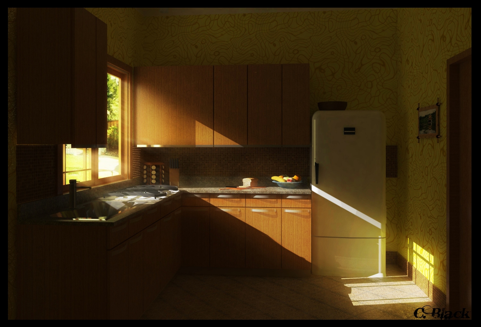
I just started learning v-ray for SketchUp to add some more realism to my little hobbie. So this is my first render, a small kitchen lighted in the morning sun. I really love the mood I got in the end. Added some god rays, adjusted curves and put some blur here and there for pp in photoshop. C & C apreciated


-
Great Image Speaker. I also really like the mood
-
The wallpaperer should be shot.
Besides that it's a great first render. -
i agree about the wallpaper, but the mood is great!
-
heh.. Ok maybe it really wasn't the best idea, but this time I'll just blame it on the lack of alternatives I had
 I guess I should start drawing my own wallpaper or bringing my lazy ass up to start looking for something rather than staying with what I have already
-
The mood it's awesome. You could make the shadows softer(GI/Skylight/M/Sky- search sun size, and make it 4 or 6)but not necessarily

Congrats! -
Thanks for the tip stefan! I could't figure this myselfe, so I just blured the edges of the shadows a bit in PS.
I chopped a bit off the top of the image so the grain on the ceiling wouldn't be visible. Any ideas how to lose it?
-
Well, it's not obvious, but some screen-shoots of your vray settings will help us to figure what could be done. Basically, it's about sampling, but could be many "tiny" things.
Stefan -
very nice. i like the lighting
-
@speaker said:
I just started learning v-ray for SketchUp to add some more realism to my little hobbie. So this is my first render...
I'm speechless...

I've never managed to get good results with VfSU (some might blame me for not trying hard enough, but I still see many people having trouble with lightning, materials etc.) but if I take a look at some of the first renders I made, they're far from being as good as yours...

-
Thanks! I wasn't expecting so much comliments

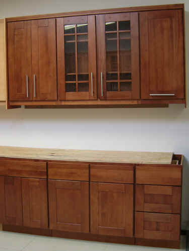
I was wondering if is there enought detail or would it look better with the cabinet you can see in the attachment to replace the one by the window. And should I use a solid color for the walls, or maybe I could just add a filter to this one to lower the opacity of those lines?

Hello! It looks like you're interested in this conversation, but you don't have an account yet.
Getting fed up of having to scroll through the same posts each visit? When you register for an account, you'll always come back to exactly where you were before, and choose to be notified of new replies (either via email, or push notification). You'll also be able to save bookmarks and upvote posts to show your appreciation to other community members.
With your input, this post could be even better 💗
Register LoginAdvertisement


