Desert Trading Post...Something is missing
-
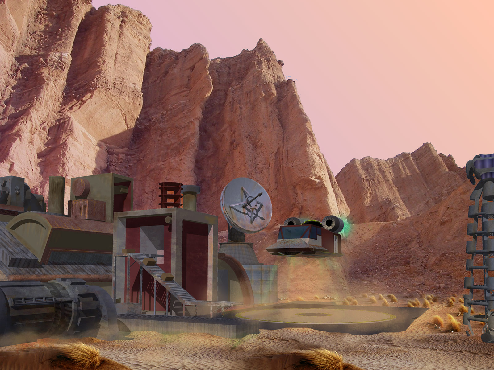
I have posted a few things recently that I have been very happy with and I tried to do the same with this model, Find old work I had done and put it into a scene for some perspective (I am putting together a portfolio and I wanted to show some non-landscape design stuff). I started down the path with this on and am just not happy with it... please let me know what you think needs added subtracted or adjusted to make this one work... all comments appreciated.
Thanks
Bob


-
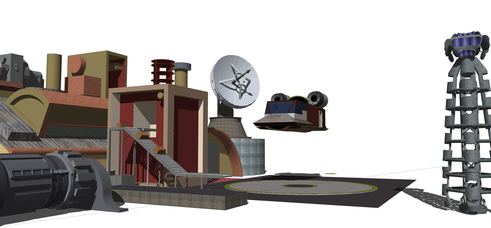
Bob, the first thing that struck me was the shadows, even though the bottom image shows them better, the integrated one has them muted, if you see the rock image the sun is bright thus the contrasting shadows are more apparent.
Secondly I'd try adding more detailed textures as the image it is compiled with has very fine details which causes a conflict as the foreground/focus is less detailed. -
I kind of agree with Solo.
Very nice scene and model and concept.
However, the intricate detail in the background canyon really contrasts with the hard edge foreground model.
The rustic textures on the model suggest that the sharp edges on the man made stuff need to be softened. Let me quickly add that I am not in any way an experienced software renderer.
Hope these comments help toward the final product. -
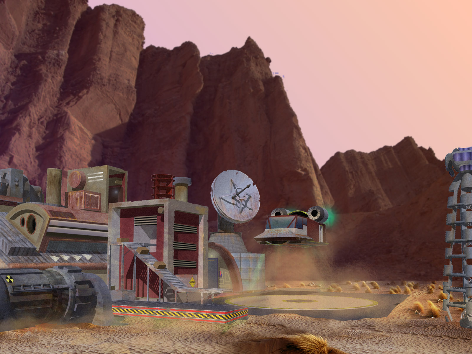
So I took your guys thoughts and applied the following techniques:
darkened and blurred the cliffs
brightened the foreground
added more detail to the structure (symbols, paint, portholes, etc)it's getting there, any more thoughts?

-
That is a step in the right direction, but possibly bring back some of the background brightness. You know it is a matter of degree or balance. Again the starkness, or sharp edges of the installation in the foreground seem to need some softening. For instance, let some soil obscure some of the platform with the caution stripe--or don't. It's your product.
-
Nice what you've done. But there is a problem bigger than shadow intensity. Is about shadow direction !!
 See, in the background image, the light falls from right-front, and in the model is from back-left.
-
Yep - shadow direction is wrong
 Also, in a desert environment, I'd expect the structures to have been coloured and stained by all the dust in the air - and generally look a bit more weathered. Try adjusting the colour to a more pinkish-orange hue, to integrate the buildings better into their environment.
Hope this helps,
Andy
Hello! It looks like you're interested in this conversation, but you don't have an account yet.
Getting fed up of having to scroll through the same posts each visit? When you register for an account, you'll always come back to exactly where you were before, and choose to be notified of new replies (either via email, or push notification). You'll also be able to save bookmarks and upvote posts to show your appreciation to other community members.
With your input, this post could be even better 💗
Register LoginAdvertisement


