Another Internal Render
-
Hi people,
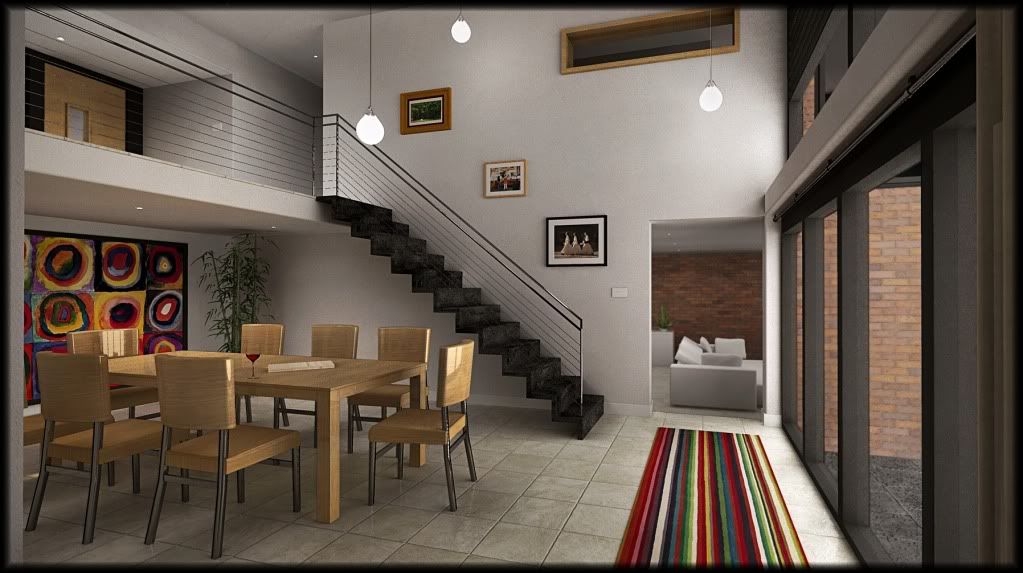
Here's another version of a render I've been working on.
Made quite a few changes, mostly to do with the lighting. I wanted nice soft shadows instead of the sharp ones I had before. Also added some extra details here and there, including curtains yay!and vertical vericals for a change.
Render time 22 hours


 (cos of the emitters)with Podium
Let me know what ya think.
Cheers.

-
Looks good, except for the three pendant lights; they dont' look natural - more like three 2D white circles.
-
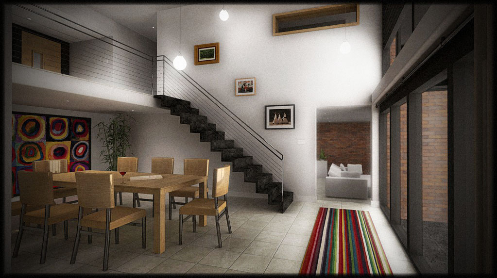
Nice... I like the curtains hehe. This image looks brighter to me. Did you change anything? maybe converted to sRGB?
-
oli,
you are becoming too good for us. stop it right now...
-
It was already sRGB, so was my other I was just viewing it in imac colour profile.
Thank you Edson! I can't tell you how much effort ive put into learning Podium and Photoshop these past few months. Lots of late nights put it that way.
Yeah I had a prob with the pendants, its the best I could get them in the given time.
I didnt use any sunlight, just a big emitter outside the windows and soft spotlights. So I had to make two renders so I could see outside through the window, one with emitter, one without. also did a line overlay on the table/chairs cos details were a bit lost.
Am re-modeling the whole house so will be posting all the externals soon, rendered in podium of course.
-
really a solid looking interior. I'd agree with the lights seeming a bit off, mostly the one on the right side. Only other thing I'd suggest would be a strip of rubber going along the perimeter of the glass along one side where it meets the frame. Should give the illusion of having double pane glass there rather than a single pane butting up against the frame.
-brodie
-
nice one, i had to fake the glass too cos of emitter. i was wondering what i should do, cheers.
-
Great work Oli. Is it a design choice that there are no balusters? It looks a bit odd.
-
I hate to crit anything about your render because it is lovely.
But: the wooden chairs seem to be over glossy compared to the other surfaces in the scene.
Great render though and I do like the vertical verticals.
Ed -
no, please do crit my renders, i wont be offended haha.
fred: i only noticed last min, theyre on a hidden layer i forgot to render them, although they are not on every step. the wires would sag horribly if there werent any. ill just photoshop some in im not doing it all again lol. thanks for the comments

-
Lights are
"Looks good, except for the three pendant lights; they dont' look natural - more like three 2D white circles."
sRGB problem etc.
How about this if you don't mind? Always a pleasure to PP fine renders.
We're not talking about attachment preview cos SCF discards the color profile.

-
Great render Oli...


-
Mate I'll throw some crits in for you! One's never sure on the SCF - many take offence and I think that's why we so so many good renders spoilt by bloom effects, no one is willing to tell anyone it looks crap!
Mate really nice job on the render!! I agree with others regarding the lights! Brodes is spot on about the rubber strip around the window, even a recess outside the plane might work.
For me the floor is a bit glossy and over bumped, and the chairs way to glossy mate!
Looks like you could have used better map to the exterior brickwork.
Given that you have likely been using the unbiased option to render this (not fam with Podium) the bulb geometry I'd imagine is throwing your render times up so high, they probably need image lighting rather that a direct emitter, though bit of PS will get you quickly back from here!
Look forward to the next from the oven!
Hey and don't forget to feel welcome to throw back crit, only way we get better! Without it we would all have blooming renders! lol!

-
about crits....ive had the harshest crits you can possibly imagine at university so these comments really do not offend me whatsoever. public crits are the worst with like 50 people watching and participating in your utter embarassment!
yes bloom is crap. although i only added a very slight ammount in PP to disguise the noise from the emitter. Blooms instantly makes your render look fake and dreamy.
podium doesnt have biased/unbiased options or hdr lighting. so unfortunately you get what you are given sometimes. I really didnt want to use an emitter but the sharp shadows I normally get are killing me. yes chairs are very glossy thank you haha also there is no preview of how your material would render so that is also killing me. But apparently Version 2 addresses all these problems.
exterior brick work is arroway texture but it keeps rendering funny.

trhanks for crits, please keep them up its the only way to learn!
-
Is it the camera field of view that seems to be distorting the chair seats on the left and the floor in the foreground? (Sometimes this is intentional.)
By the way, I have a poster copy of the big mural on the left side. Looks good in its place in the image.
Overall, good work.
-
yeah fov is quite high but it looked better. I have a print of the painting too! I also did my own version with plaster and acrylic on hardboard, looks awesome!
-
love to see what this looks like (and render time) rendered in the new Twilight if you care to compare.
i'm sure if you could post the file someone else might make the compare for you.BTW, awsome model and render. the biggest thing i see is if the chairs aren't supposed to be faux wood (vinyl) then i don't know why they would be that shiny?
-
for brick you might try going to ACME or Belden's websites. They both have free software to create your own brick and it looks fabulous.
-brodie
-
it dosn't appear that that software is available any more. (free anyway). every link i try is dead!
-
very odd, I just tried them both and got errors as well. I'm sure they're still available and free, it's basically a marketing tool for them to sell their stuff to architects. But the websites do indeed seem to be having some temporary issues. Might not help you this time but I'd definately try it again later.
-brodie
Hello! It looks like you're interested in this conversation, but you don't have an account yet.
Getting fed up of having to scroll through the same posts each visit? When you register for an account, you'll always come back to exactly where you were before, and choose to be notified of new replies (either via email, or push notification). You'll also be able to save bookmarks and upvote posts to show your appreciation to other community members.
With your input, this post could be even better 💗
Register LoginAdvertisement


