Foro romano (Final render)
-
Thanks for all of your ideas! I appreciate it a lot!
I dont know what kind of background will put in this render!Let's see next details...

-
Well, this is a remodelled Death Star interior, right? Gok Wan let loose in partnership with Anne Marie!
You must have Tatooine in the background!
-
@john.warburton said:
Well, this is a remodelled Death Star interior, right?
Sorry, but it is not inspired in a Death Star interior but in a render of Solo (the moderator)
Ask him! Last image render: http://solosplace.com/renderings.aspx


Bye!
Great week end to all people! Peace!

-
Detail:

-
Shadows....

The moon...

-
I am sorry, but that's not a roman building

First of all, those are not roman columns. I recommend you to read something about vitruvius http://en.wikipedia.org/wiki/Vitruvius
And you have the ideal columns (and all the roman architecture) here:

Project Gutenberg
Project Gutenberg is a library of free eBooks.
Project Gutenberg (www.gutenberg.org)

I know that you didn't make this model seriosly, but if you enjoy reading about that, you have the sources there.
By the way, the romans with toga, are 3D models?
-
i think that the shadow is too hard! Make it softer! Grat work indeed.
-
@pichuneke said:
I am sorry, but that's not a roman building

Sorry!
 I dont care too much about historical representation!
@pichuneke said:
I recommend you to read something about vitruvius http://en.wikipedia.org/wiki/Vitruvius

Project Gutenberg
Project Gutenberg is a library of free eBooks.
Project Gutenberg (www.gutenberg.org)

Thanks!
@pichuneke said:
By the way, the romans with toga, are 3D models?
No, they are all planes! The 3d people like the decurions have too much polys. The scene has now more than six millions of polygons and it is a lot for my little notebook...
-
@andeciuala said:
i think that the shadow is too hard! Make it softer! Grat work indeed.
I make ever a try at night of my scenes (to see how to ameliorate the lights); it was not a "serious" render...
Thanks!
-
Two more details:


-
It seems that this model is annoying and reiterative, sorry!

Black and white (Just for fun):

Volumen luminoso (I dont know how to say in english, sorry):

Volumen luminoso and shadows:

Now i am preparing the background...
-
I do not have time to respond all to your questions
 so there are the images of the background


-
Finished:

Goodbye
-
Well done ....is that background image HDR map?
-
-
@artysmedia said:
@sepo said:
is that background image HDR map?
No, i dont use HDR maps! Don't know how to use!

So you should've asked: "is that background image HDR map? and if not, what is it and how did you make the background?"

Very cool scenes actually. I love them and they came out extremely exciting (despite all the crits about real or not real Roman columns
 )
) -
@gaieus said:
what is it and how did you make the background?"
You can see what is the background some steps back...
 A photo with sky, clouds, etc... an SU island model and some steampunck transport ships...
@gaieus said:
Very cool scenes actually. I love them and they came out extremely exciting (despite all the crits about real or not real Roman columns
 )
)Thanks! I prefer these columns style than the other styles...
 It is a mixed eras scene.
-
@artysmedia said:
Thanks! I prefer these columns style than the other styles...
 It is a mixed eras scene.
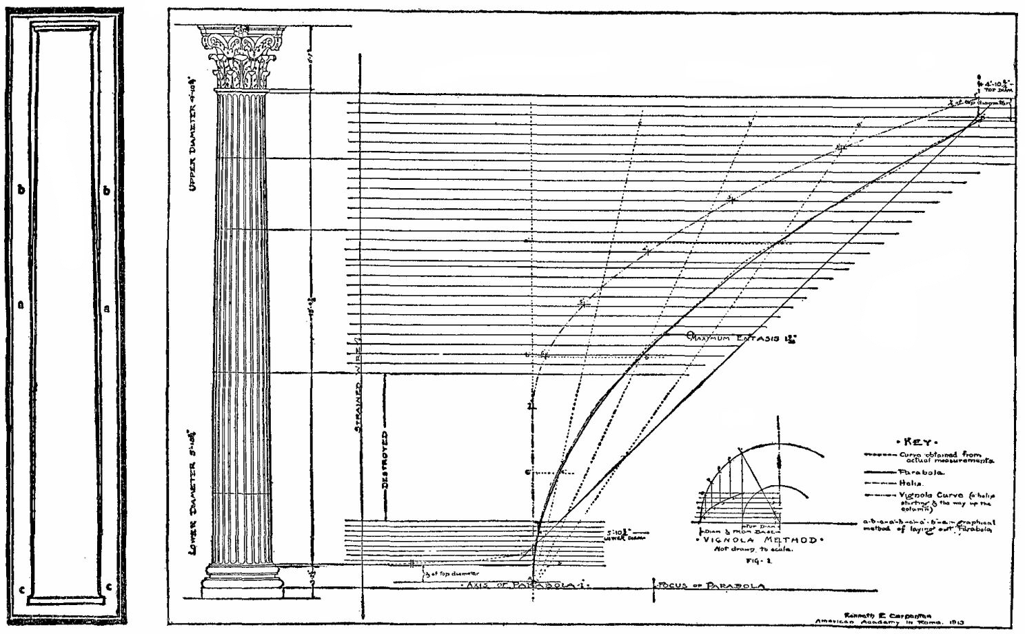
Well, definitely "mixed"; that enthasis(taper) of the columns would be extreme even for an archaic, Doric Greek column.
But that's the point; it's not for an archaeological reconstruction but for a fantasy scene which happened to come out successfully.

-
@gaieus said:
it's not for an archaeological reconstruction but for a fantasy scene which happened to come out successfully.

Well... what can i say...?
thanks! -
artysmedia, I have to convince you to start a personal serious project of archeological reconstruction...

If I could make a model with half of the quality of this:
I would be very proud of me.
Hello! It looks like you're interested in this conversation, but you don't have an account yet.
Getting fed up of having to scroll through the same posts each visit? When you register for an account, you'll always come back to exactly where you were before, and choose to be notified of new replies (either via email, or push notification). You'll also be able to save bookmarks and upvote posts to show your appreciation to other community members.
With your input, this post could be even better 💗
Register LoginAdvertisement


