Tower blocks
-
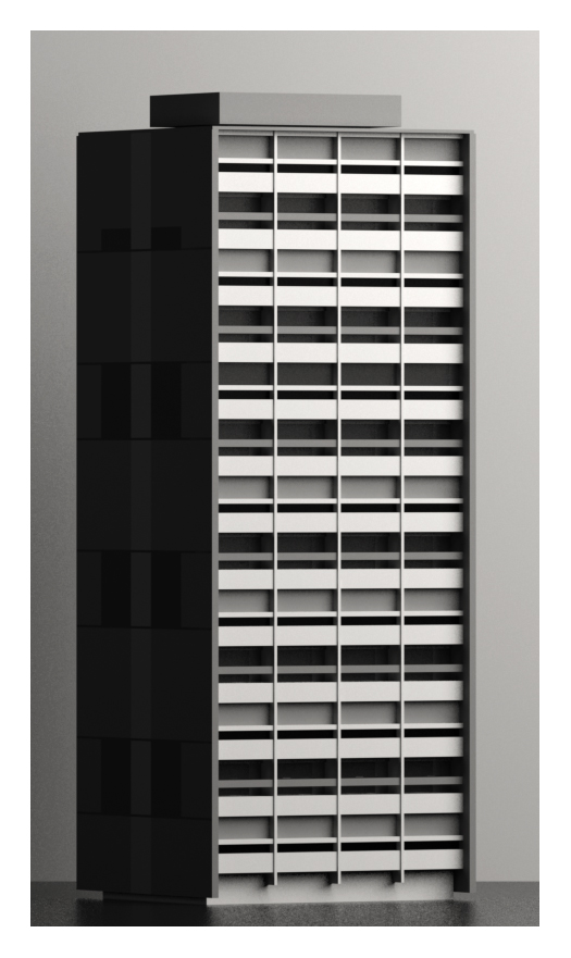
Not too sure about this one. Have been staring at this for hours now. Can't tell anymore whether to ditch it or not.

-
@unknownuser said:
Not too sure about this one. Have been staring at this for hours now. Can't tell anymore whether to ditch it or not.
I vote "NOT"

I like the design and the render, maybe if you do stick with it you might even improve on it,
weet nooit wat er kan gebueren als je inzet heeft.
one crit i have, seeing the name of the picture,
the d.o.f. is a bit to much on the other tower, at first i thought it was a blurry reflection of the tower, but then realized it's another tower behind. maybe lessen the d.o.f. or remove it completely,
because of you're style, it would be darker than the front tower making it blend in the darkness. -
Sorry for bumping this thread. Did some tinkering. Used Modo for this. I like it - though it wouldn't have hurt the image if I understood Modo's renderer better.

-
Second one is much better (in my humble opinion) Nice

-
hi stinkie,
why have u chosen this particular subject? nice render (2nd one) although if u cropped the first one i think it would look better. i like how u can just about see the tower behind, kinda sinister.
-
I think the first one is too dark to me, but all two are very good buildings!
-
@kwistenbiebel said:
Second one is much better (in my humble opinion) Nice
Thanks. I agree. But then I would, wouldn't I?
@olishea said:
why have u chosen this particular subject?
I've had a keen interest in second-rate modernist architecture (and art) since my early teens. No internet prOn, back then. Tough times. On a more serious note: some modernist architecture provides the wannabe De Chirico with all the building blocks he needs.

@olishea said:
if u cropped the first one i think it would look better. i like how u can just about see the tower behind, kinda sinister.
Tried that already, as I didn't want to see hours of rendering go wasted. Still kinda sucked.
@artysmedia said:
I think the first one is too dark to me, but all two are very good buildings!
Thanks.
-
nice render mate......one question, what was your workflow from SU 2 Modo?
because I am also learning Modo, but importing SU files are a hassle due to the triangulation, so you end up with way to many polygons that you don't need, if it possible to make some kind of tutorial i would apreciate it a lot, seeing that you got a very impresive result out of the SU2MODO procces.again really nice images, as always, can't expect anything less than "great" from you mate
-
Thanks.
The Luxology forum has a search box.
This looks like a useful thread:http://forums.luxology.com/discussion/topic.aspx?id=35060&show=sketchup
-
I like both the images however if the building were not in the center of the frame it would feel more comfortable.
Hello! It looks like you're interested in this conversation, but you don't have an account yet.
Getting fed up of having to scroll through the same posts each visit? When you register for an account, you'll always come back to exactly where you were before, and choose to be notified of new replies (either via email, or push notification). You'll also be able to save bookmarks and upvote posts to show your appreciation to other community members.
With your input, this post could be even better 💗
Register Login


Advertisement