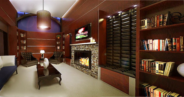
East 8th Hotel
-
These renderings are actually from my girlfriend's project, but she let me post them anyway. They are of a boutique hotel in Pittsburgh that she did for her senior project. Her and I actually had all of our classes together and graduated together the same day, with the same degree (Haha). But she designed and modeled everything on her own....I just helped take her through the rendering process, because she is still learning v-ray and it was easier and more effective for the both of us to work on the rendering process together. I am very proud of her and I love the way her design turned out...I hope to post some more shots later on, but they still need some more post production work. Hope you all like them and any questions, feedback, or critiques are greatly appreciated by the both of us.
-steelers05
Library

Bath

Spa

-
great work - it is very difficult to photograph and render interior spaces like that. A lot of good details and attention to material choices! I noticed that the floor in the last render seems a little intense on the reflection and bump though - not as subtle as some of the surfaces in the other renders
-
wow,nice design and rendering.and so lovely "couple" of you

lighting make me feel warm and I enjoy it.best regard,steelers05! -
That is god damn amazing. The lightwork is great, compliments to the chef!
-

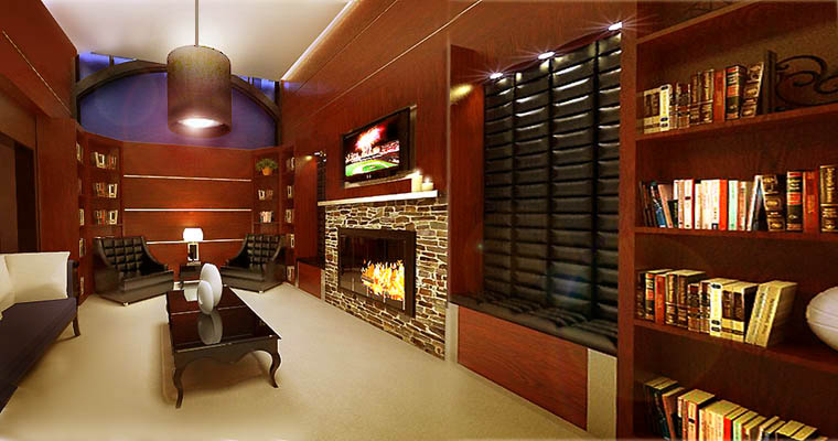
I just thought I would throw this up for comparison.
Two problems I consistently run into in both photography and rendering are small dark paneled rooms. The beauty of exotic woods that we can see with our eye is often lost in the contrast of the media.
Also I have been faced with rooms so small that only a wide angle viewpoint will show the scope of the contents and design. As a designer with a photographic background I don't see wide angle views as being strange. However, I have had clients and artist friends who see them as distorted. That opens up some strange arguments as wide angle views and telephoto views taken from the same position have identical perspectives. The cropping is different but the perspective remains the same as long as the viewpoint is the same.
An artist friend of mine swore that one of my interiors was incorrect, but few people understand the process of seeing. Our field of view for sharp vision is extremely small. Far less than the 35 degrees that SU uses as the norm. Try reading a line of type on your screen without moving your eyes. Most of us can only see four or five words at a time that are sharp enough to read. We scan a scene and mosaic the details in our memory, but we never truly see a wide angle. Some people accept it and others go crazy citing incorrect drawing. They don't realize that wide angle views would look OK to them if human peripheral vision was not so completely blurred.
Our brains are wired to interpret what our eyes see to fit the physical world around us. In photography (with view camera controls) and photoshop you can cheat extreme wide angle to conform to the ways our brains perceive the physical world.
I have made both changes in this revised image (a bit sloppy to be sure but quality takes more time). I am curious about how everyone reacts to these modifications (given the fact that the execution of my revisions could be better).
-
thanks for all the feedback guys, i will make sure my girlfriend sees all the positive words. These are some of my favorite interior renderings that I have done and it is more of a compliment to her design and modeling than anything.
mirjman: I agree with the flooring, it seems to dominate the picture a little to much in that lower right hand corner and a little less bump could really help I think
Roger: I definately understand and have had similar experiences with what you are saying. Honestly it is even hard for designers who do not do any type of modeling/rendering work to understand concepts like this. I always get architects/designers at work questioning things about camera angles and such, but I think all of us as artists have more of understanding of the way things appear and the difference there is between that and the way things are in reality. But we can also get a little blinded by our perceptions of the world and overlook how most people see things and forget that we are working with clients who may not necessarily have an eye for such things. Its something that kinda goes back and forth. As far as your changes: I like the changes you made with the wood. Its make the space feel a little "cooler" or blueish but I do think it brought out a little more contrast with the wood. The flare to me is a little too distracting. with the perspective/field of view, did you try changing anything? Because I am not sure if I notice cropping or anything like that?
-
Compare the steepness of perspective in the backwall and how strongly the near coffee table leg reaches forward into the scene. With a traditional view camera I could dothis by swinging the back of the camera relative to the front lens board. In the digital world, I just play with the perspective and distortion in photoshop. I did have to crop the book case a little bit, but did not feel that was critical.
You are right, the lens flare can be distracting. More than anything else I wanted to pull out the tufting that was lost on the black chairs and the the grain of the wood.
In one render I did for a developer, the room was so small, I had to delete the wall behind the camera so I could see any significant amount of the room. It is a common problem with small interiors. Probably the worst case I ever faced was when doing interior photos of RV campers. After placing the camera in about the right spot, it was physically impossible to get the photographer behind the camera. I had to do all the fine adjustments using a polaroid back that could be slipped onto the back of the camera. Today, I would use a video feed to a laptop.PArt of this art is the art of compromise between competing factors controlling the scene. It is what makes this business fun.
-
nice work bro, nice materials, i just dont like the camara angle on 1st render and the last one has too dark areas, other than that good job bro!!

-
Roger: Now that you explain what you did, I definately see it. I actually cant believe that I missed those things, but they do enhance the picture in a different way. If you are up to continue playing with the image, I would be interested in seeing the same concpets, but with a warmer tone. The designer aka "my girlfriend" wanted a warmer/cozy feel and that is part of the reason the original has that darker tone, but it would be cool to see your improvements combined with the original intended aura/atmospher
Teo: Thanks again man, always nice hearing your feedback.
-
Warmed it up a bit but kept the cooler version in the skylight and the black furniture.

-
definately more of the look she was going for, very nice and thank you for all the tips and work you put into the images. I will show here and she wat she thinks.
Hello! It looks like you're interested in this conversation, but you don't have an account yet.
Getting fed up of having to scroll through the same posts each visit? When you register for an account, you'll always come back to exactly where you were before, and choose to be notified of new replies (either via email, or push notification). You'll also be able to save bookmarks and upvote posts to show your appreciation to other community members.
With your input, this post could be even better 💗
Register LoginAdvertisement


