DWanimations | Concept Architecture, Minimal design
-
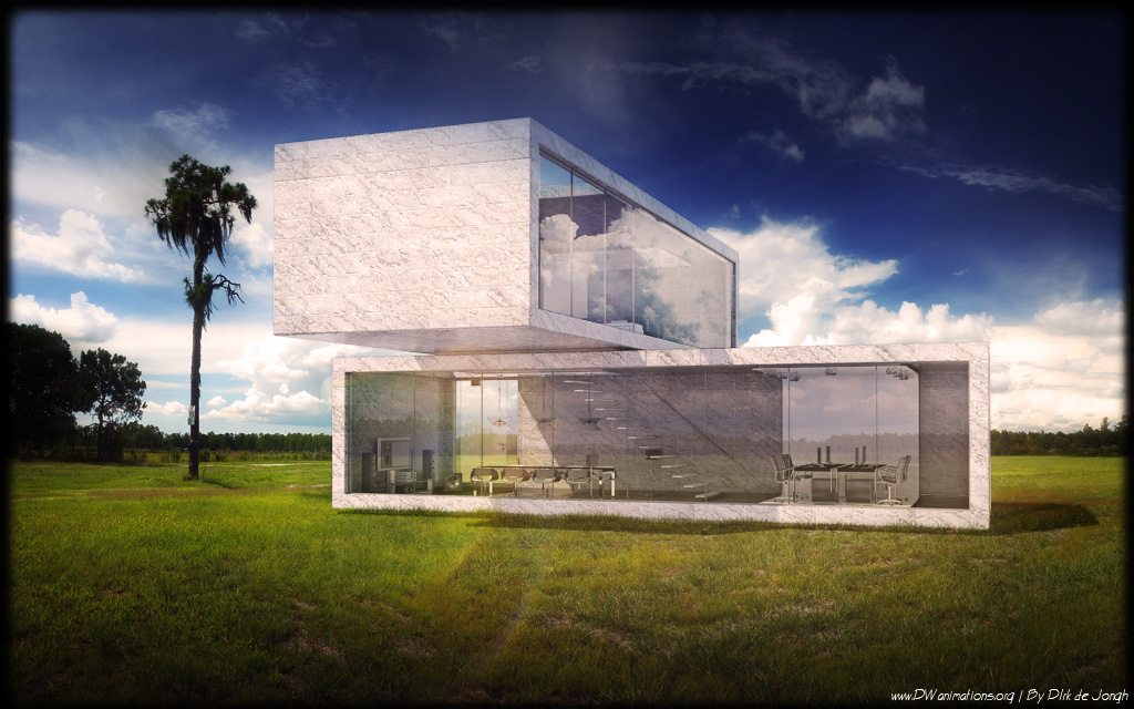
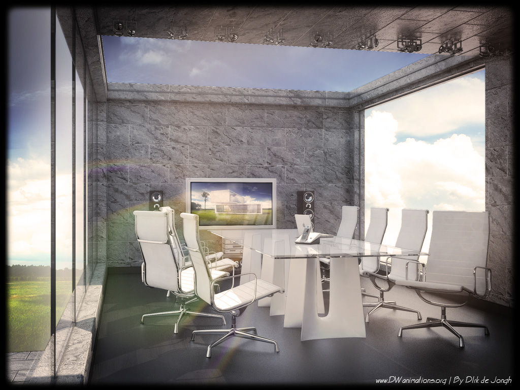
Hi this is an int and exterior design complete in house design by DWanimations. Inspiration by Taokai
Hope you like it C&C welcome
-
very nice but a little plain.. should put in some curtains or blinds...
-
The beuaty is outrside the building. Don't want to put anything near the edges of the windows - or entirely blocking the windows to distract the eye from looking outward. Thats my thought. Very Nice Dirk!,
Chris
-
i hope you read my comment at asgvis about the background. here on the second image is the same, this time to horizon of the background and the model were far too off.
-
Hi cris pleas explain.... what did i put near to the windows?
Hi lucifer1101:
I had curtains in first but I found them to distracting so I got them out...

nomeradona:
Thanks yeah I see now.... the background is to far off indeed... I was working late yesterday
till 2 at night, I think I wasn't to sharp anymore... ..
I read your comments on ASGVIS... What are your suggestions to improve the blend whit the background -
if you are asking on the background..
lessen the saturation and also increase the lightness if the background that you are using and also the color balance. this is the quickest way.but if you will ask me frankly, i will re render your scene. in order to attain good contrast in vray you can lower down the multiplier of your sun (the default is 1 right?) make it lower than that and then adjust your camera setting.
also if you want to use the same background, you better consider your lighting direction, both the model and background has different lighting direction.
-
@unknownuser said:
very nice but a little plain.. should put in some curtains or blinds...
This is modern architecture where less is more. Now we are on a good way to nothing is everything.
 Now that I mentioned it, I always like to see it but would never like to live in it.
By the way Dirk, Nice renders.
-
Can't say I like these kind of houses. They basically require you to either have a gigantic piece of farmland to build it on, or accept that everyone can see everything you do once it's dark. The bathroom ideas these days are the worst. A small, uncomfortable-looking bathtub in the middle of a huge room with floor to ceiling windows and a total lack of privacy. Sorry to say, but in my eyes this is just cutting edge for the sake of being cutting edge, and only a handful of people could live comfortably in a building like that.
Rant aside, the presentation is very nice.
-
sorry to say... Tis is not to live in this is a volume / material study....
Huggkruka
I see some frustration in your text.... instead of saying what you don't like, make an impression of what you do like that would be much more interesting for me than tis text
... I cant wait to see it. 
-
I don't think I've ever seen an actual house with this much transparency in an urban environment hehe. Nice render though!
-
Hi Dirk, you misunderstood me. I was commenting on Lucifer's comment:
@unknownuser said:
very nice but a little plain.. should put in some curtains or blinds...
I was explaining how its important to design it like you did and NOT put in blinds because that would clutter the clean lines of the architecture and would prohibit the eye from sliding passed the glass and outside to the surroundings.
In short, I was defending your lack of blinds.
Chris
Mateo, I had a chance to spend quite a bit of time in Richard Neutra's home and I got to make a detailed model of the whole thing. WOW! I was surprised how much I enjoyed spending my time there. Though to be fair, his home is not really super minimal. Just sleek or something. It DOES have curtains. But they hide VERY VERY well. All the vertical support posts are painted dark chocolate brown so as to not attract attention. Its a gorgeous home! and its open to the public for tours in the Los Angeles area).
-
On a presentation aspect, I think its fantastic.
A little over the top in regards to contrast and reflections, yet I find it part of the appeal.
I'm a big fan of your artistic render style.
Hello! It looks like you're interested in this conversation, but you don't have an account yet.
Getting fed up of having to scroll through the same posts each visit? When you register for an account, you'll always come back to exactly where you were before, and choose to be notified of new replies (either via email, or push notification). You'll also be able to save bookmarks and upvote posts to show your appreciation to other community members.
With your input, this post could be even better 💗
Register Login


Advertisement