My early attempts at rendering --pls help
-
Excellent, I looked there early on but that is what I needed to look at again.
I found better ground textures so its not so flat looking.
thanks again
-
love to see an update.
-
Yes, me too. Very nice.
-
Its getting better but the wall is still too bumpy bumpy for me.
I warmed it up a bit in PS too.
-
"Autobump" in IRender uses the texture itself as a bump map. This produces interesting, but incorrect results. A true bump map is a separate image in which the grey scale represents the ins and outs of the surface. When you use an image the light and dark almost never correspond to the ins and outs of the actual material. If you happen to have a "true" bump map, then you attach both the bump map and the texture image to the same material as separate images.
Here is a good example. This is a "true" bump map for a stone surface.
The shades of grey represent the depth of the surface.
Here is the effect of applying this bump map to a cube.
Notice how the light angle modifies the effect of the 3D depth of the bumps.
The "bump" image does not resemble the actual appearance of the stone at all.
-
I see the scene is progressing very nicely
The image to use as bump map ie a gray scale image can be imported in the second texture position in the advanced material editor,(via advanced button) but make sure the base colour is off for the bump texture, adjust bump to suite. Here is link to accustudio with tut for auotcad version which is very similar to sketchup version.Basically you would start at the third image down the page, ie Material editor which in IRendernXt, you can get to via the advanced button on the material editor.
The image below was created by using standard stone pavers walk from sketchup, and creating gray scale jpg images to use as sue doe bumps in PS for each.
The one on left bump of +2 the on on right -2.
-
I found another link here on additional info on bumps in IrendernXt
-
Thanks everyone,
Straight SU for comparison.
Doesn't do too bad on it's own ...
-
i actually like that one better!
please share your grass, its awsome.
-
The grass was by Gaieus! it is in the warehouse here http://tinyurl.com/2k6een
It looks great close up, its pretty heavy for big scenes.
-
why can't i see the faces of the grass in you're SU shot?
-
You just got to get really, really, close...
Plus I had the light turned down, it helps to hides things,just like in real life.
-
this is how mine look?
-
I think it is a transparent png, and your machine isn't reading it as transparent.??
Ever have trouble with any of the png 2d trees? (Ones not cut out?)
-
That is not .png version. Here it is.
-
thanks thats better. i wonder why the 3Dwarehouse one doesn't have the .png in it?
-
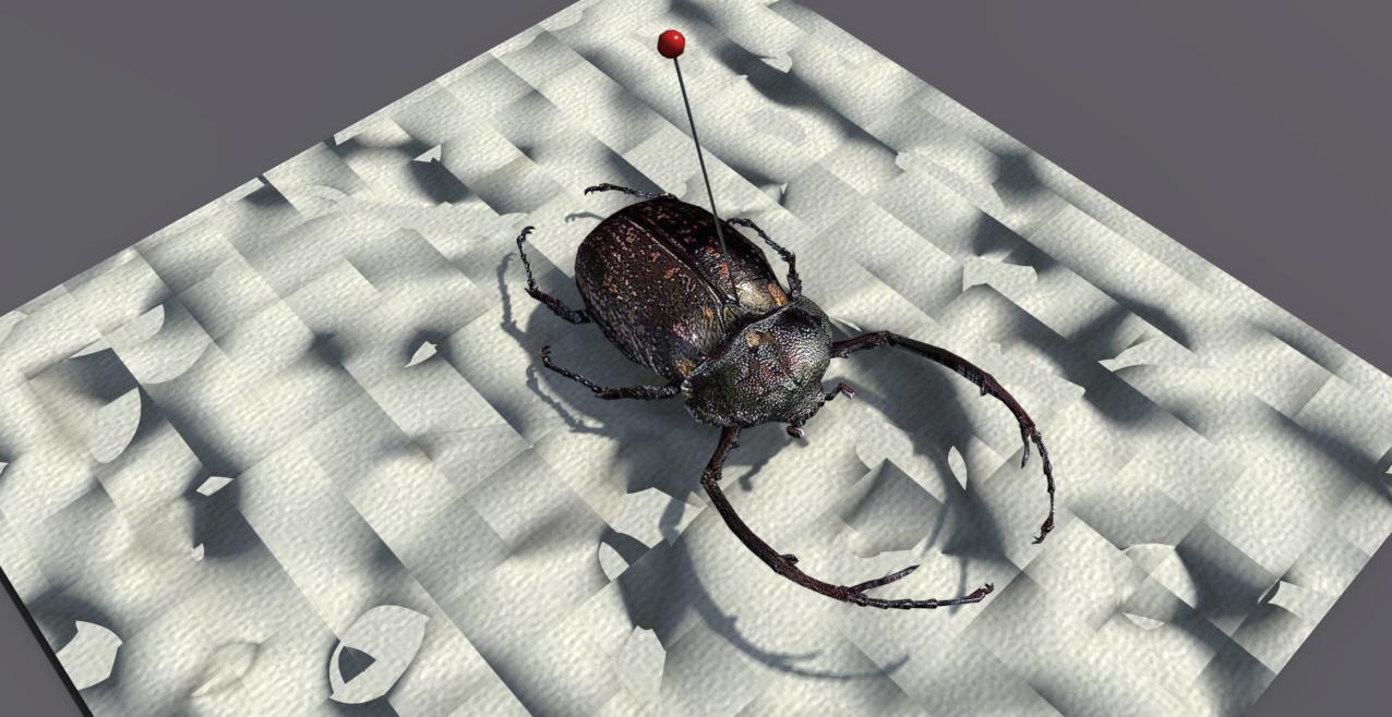
I was playing with the most amazing bug model made by the extremely talented Urgen.
I did something to the texture and the renderer went crazy, I really like the way this looks. (And I started to draw bugs.
Advertisement