Need recommendations on a project
-
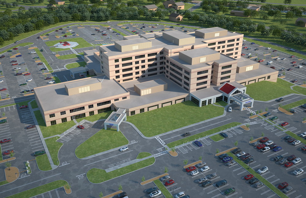
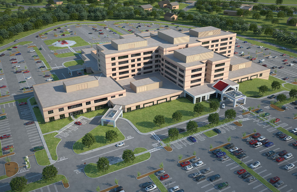
Here's a low res version of a building I'm working on. At this point it's just coming out of Maxwell. I feel like it needs a bit more tweaking on the modeling/rendering side before it's finalized enough to begin post-processing. Any suggestions?
One of my main concerns is that I don't really find it to be a great camera shot. Any ideas on how to shoot it better (I think the camera has to be in this general location though, later I'll be doing some ground level shot(s)) would be appreciated. Or if you think there's a good method in photoshop to add focus that would work too. The main entrance is the canopy on the right side which sort of feels like it's a bit too dark?
Also, what do you think about the cars? Too many? Should the colors be different?
From this angle I can't think of a good way to add any foreground element which I'm not real comfortable with. I think it's way too high for any vegitation and probably too low for clouds or anything like that. Hrm...maybe I could photoshop in the back of an eagle's head in the lower portion so it looks like you're riding it.
I've also got some texture issues I need to fix but I'm not sure how well you'll be able to tell w/ the low res version.
Any other ideas or recommendations are appreciated. Thanks,
-Brodie
-
try using a wider angle camera, then moving a bit closer... the extra perspective looks good with buildings
-
Brodie that's one big Wow!
Maybe just that noise map on roads is too wisible too bright I don't knov but something is confusing me Everything else great! Good improvements!
-
My first thoughts would be to darken the wall texture a little and add a junction between the outer wall of the building and the grass.
Perhaps move the camera down and left a bit and maybe even increase the FOV a little to make it a bit more dramatic.
Wit regards to the cars, i reckon keep the ones in the front of the building but thin it down behind the building, you dont want to distract the viewer away from the building too much.
I dont think you particularly need a foreground element, youd be better of going in to the building a bit more, as it is the subject of the pic after all.
-
Good suggestions.
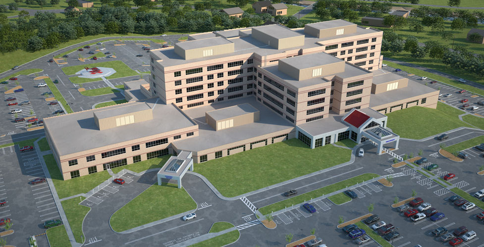
This one was actually a bit more zoomed in than I started with. I wanted to make sure and give enough context that it felt like the huge building it is. But I think what Sir and Remus suggested could be interesting. I'll see what happens if I squeeze in a bit and increase the FOV. That could still give me the feel I want and focus on the building a bit more.
Remus, I agree that the building meets the grass too abrubtly. What sort of "junction" do you mean? I can't change the building design but perhaps bushes and such could help. I was at least going to work with that in photoshop so smooth the transition a bit.
Aidus, Yeah, this is by far the biggest project I've ever worked on. It's been quite a learning experience! You're spot on about the asphalt map. That is one of the textures I need to tweek. I like the variation but it's way to dramatic which makes it look splotchy. The other one that you probably can't see in the low res image is the map on the roof. I made a really large map for variation but it was taken from a low res image so you can actually see the pixelation
 Actually, the model is even way bigger than you think. It stretches out to about 1 square mile. Eventually I'm planning on doing a 3d max animation with it so I wanted to be able to zoom out to provide even more context.
Thanks guys,
-Brodie
-
@unknownuser said:
Remus, I agree that the building meets the grass too abrubtly. What sort of "junction" do you mean? I can't change the building design but perhaps bushes and such could help. I was at least going to work with that in photoshop so smooth the transition a bit.
I was thinking along the lines of a few shrubs as well
Perhaps some flowers as well if you can afford the polys. -
Brodie, in my opinion the number of cars is okay - they illustrate the context, and who knows it might make the client decide to add some trees to that parking lot. Your rendering appears absent of people, which is odd considering how busy the building is.
-
@daniel said:
Brodie, in my opinion the number of cars is okay - they illustrate the context, and who knows it might make the client decide to add some trees to that parking lot. Your rendering appears absent of people, which is odd considering how busy the building is.
Daniel,
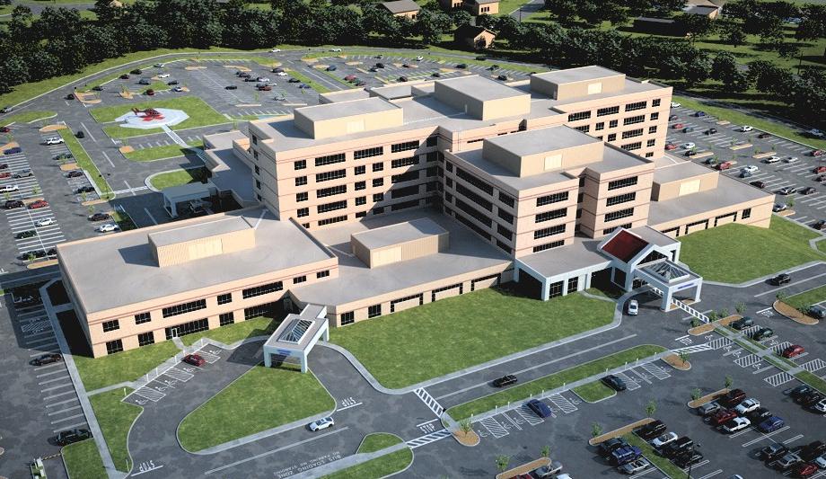
Thanks for the comments. Yeah, it's quite a huge pad of pavement they've got there. Some more shade never hurts. Actually, I did go back and add some large trees to the front to cover up some of that green space and added some bushes. I played with changing the FOV as had been recommended but ended up going back to what I had originally.
As for people, I typically put them in during post-processing. I've just finished with my updates and am about to click render one last time. I'll let it run over the weekend and then do my PP on Monday. I'll come back and post the final image when I get done.
Thanks all!
-Brodie
-
Hey Brodie: nice work if you can get it...and you did a really nice job with it!
Here's my two cents or so:I'd at least triple the number of cars: a busy important building would surely fill all that parking space (though the sat and contrast of some you've used could be reduced?).
I'm having trouble not noticing the black window material: it doesn't mentally blend into the building for me...forgive me if this is an issue you deal with in PS?
That bold line across the top of the image, the edge of the clearing/parking, adds a wonderful dynamic effect to the composition...I like it a lot! But I think having the roof just hit it doesn't solve the spacial problems such an element can create. Lowering the camera would allow the building to stand boldly in front of that line would help IMO (see lousy quick example below, sorry, I also thinking feathering out the trees a bit on the left would help too?).
Lowering the camera would also "fix" the relationship of back parking to front: they use too close to the same amount of the image real estate for my taste...?
Best, Tom.
-
Perhaps you might think of ways to reduce the texture in the render around the building. While a little dark for my taste, here is a very rough post process that highlights the building, and darkens the field around the building in order to illustrate the point. Perhaps you could try less contrast on the driveway, and repaint the striping with a less white color.
-
Wow, nice crop! Reposted my image.
-
honoluludesktop,
Good thoughts on making the building stand out more. I'll work on that in photoshop. I'm thinking to blur out the distant areas in the back slightly as well which should help bring the focus onto the building. As for the road material, you've picked up on something there I noticed as well. I changed the map and adjusted it so the variation is much more subtle now. I'd considered adjusting the white material but in the end I decided to leave it for now with plans to adjust it in photoshop later - good catch though
. Thanks for taking the time to show me what you were talking about by adjusting the image in PS.Tom,
This is actually a project we already have. In fact I think they've begun construction if I'm not mistaken. So this image is as much to sell our firm and it's capabilities as anything else. That's one of the reasons I liked this view so much - it really shows off the scale of the project. It also meant I had a full set of working drawings to go off of! Beats little pieces of buff paper, but then you almost have to put in all the details - blessing and a curse
Yeah, I can't argue with the black windows. I think the material looks better when it's reflecting the sky than the ground, when you can differentiate the spandrel from the visible glass. But this is sort of where I ended up. Any thoughts on what you might do to it in post-processing?
It's a bit too late to lower my camera angle but I love what you did there with lowering the trees. I might have to take a crack at that and see how it looks. What did you do there, looks like you just took the top have, minus the building, and scaled it down. About right?
Thanks,
-Brodie
-
Basically, yeah, I think...I just cut around the top of bulding (extending the mask over to the edges each side) and erased everything above; then overlayed that on the original and moved it up till I got the relationship I wanted to the trees I wanted to explain; and cropped out the bottom of the image. But you can't really do that and show anything beyond the building acurately ...you'd get tarred and feathered by the powers that be :`) Look closer at some of the relationships I left and you'll have a big laugh.
-
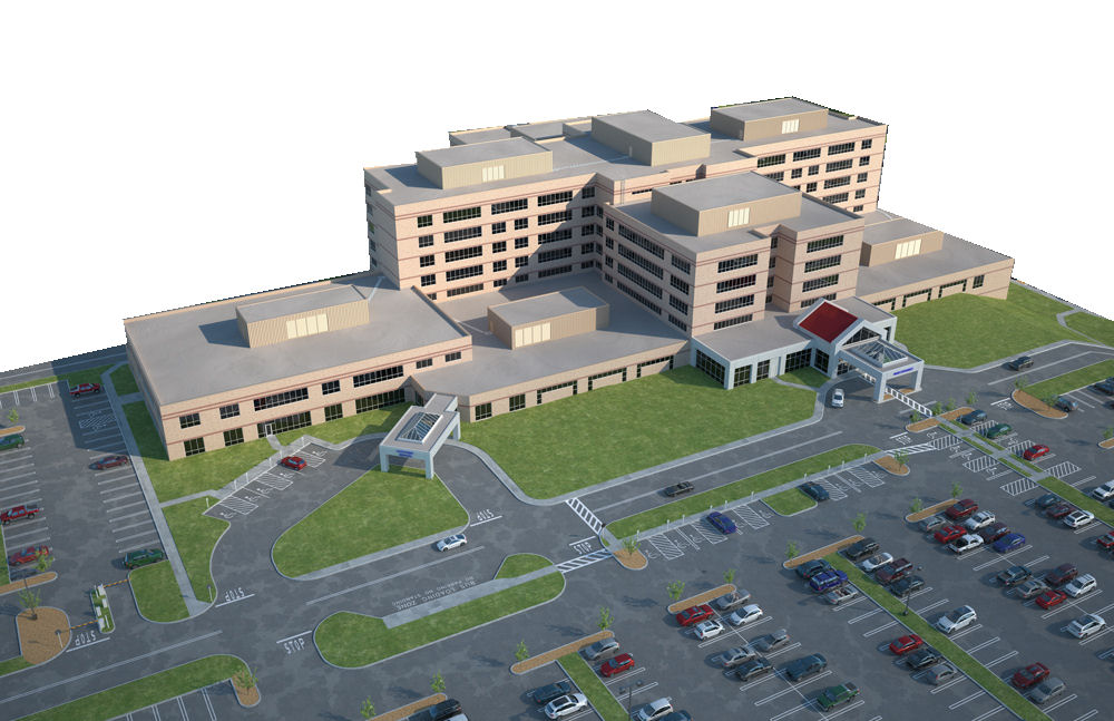
this definitley looks like a great start..... i agree, that you could add a 'little' more detail to the building....and it would make it look that much better.
right now, it seems like the parking lot is more detailed than the building
 great job with the striping, but i'd tone it down a little bit..like previously mentioned. cars look awesome to me, only thing i'd do is lose the red ones...they are drawing my attention...but the rest blend in great and add to the image...
 -
Ok, all done. Let me know what you think. Below the pics are links to the full resolution versions.
Rendered Output
https://dl.getdropbox.com/u/384281/FINAL%20output.jpg
Post-Processed
-
Mate
I agree with Toms first crop of the image, the extent of foreground is distracting. The post worked image really adds a lot in my opinion! Though I think you have dirted up the front of the building on the left a little too much.
For me the carpark pavement in the post image looks great now, though as mentioned the lines may have been a little less white.
For me the real biggy is the lack of any light from the windows which would be present in a late afternoon shot.
The dark line to the image as Tom mentions created by the shadow cast from the line of trees I feel could be broken by not maintaining such a harsh line to the layout of the trees.
Now all in all considering the size of this project and the extent of the parking / mapping there this is superbe work mate, you should be really proud!!
Hello! It looks like you're interested in this conversation, but you don't have an account yet.
Getting fed up of having to scroll through the same posts each visit? When you register for an account, you'll always come back to exactly where you were before, and choose to be notified of new replies (either via email, or push notification). You'll also be able to save bookmarks and upvote posts to show your appreciation to other community members.
With your input, this post could be even better 💗
Register Login


Advertisement