Phase 2...
-
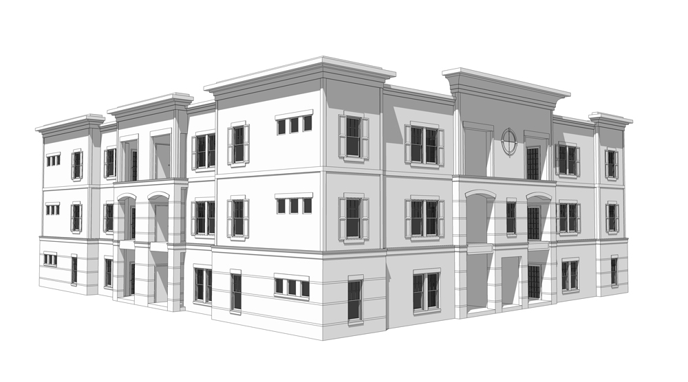
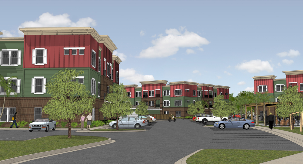
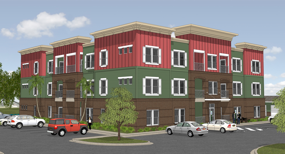
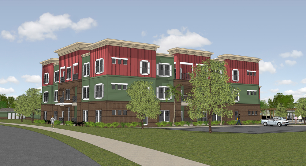
This is phase 2 of an apartment complex we're working on. It's a work in progress so I will be updating soon...

-
Nice David. Are you planning on rendering it?
-
I hope to but I have some other projects on the table. So we'll see...
-
Finally got to finish this project...
Edit: I forgot to thank Solo and Tom for their wonderful contributions to the Sketchup Community!


-
David, despite your recurring abhorance for signage, like all your other models it looks great. I would suggest maybe darkening your shadows a bit, to give it some extra "pop."
-
What signage are you talking about Daniel? I have the handicap spaces marked and signed, what else do you want?
-
excellent work of modeling and composition

need some renders to see even more!! -
Just giving you a hard time, David. however, I was refering to the pole-mounted handicap parking signs. I think you might find when you add them that they may detract from the building entrance; you might consider moving the accessible parking spaces down so they aren't directly in front of the building entrance.
-
Wow, looks really nice!

-
Haha, all right Daniel. Well wouldn't they detract from the building entrance in real life? Plus, the client would probably notice me moving them knowing my luck but I do understand where you're coming from...
Thanks SixtiiSvn!
-
As much as rendering would add more flash to you imagery, theses are great and really show off the theme of the project, the detail in the architecture, and the wondeful sense of place... Great job.
Hello! It looks like you're interested in this conversation, but you don't have an account yet.
Getting fed up of having to scroll through the same posts each visit? When you register for an account, you'll always come back to exactly where you were before, and choose to be notified of new replies (either via email, or push notification). You'll also be able to save bookmarks and upvote posts to show your appreciation to other community members.
With your input, this post could be even better 💗
Register LoginAdvertisement


