{Spanish Home
-
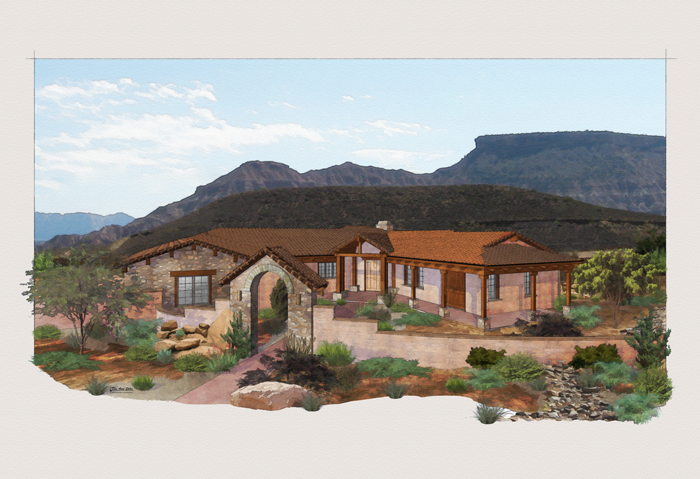
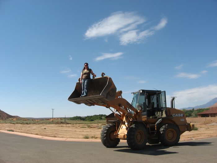
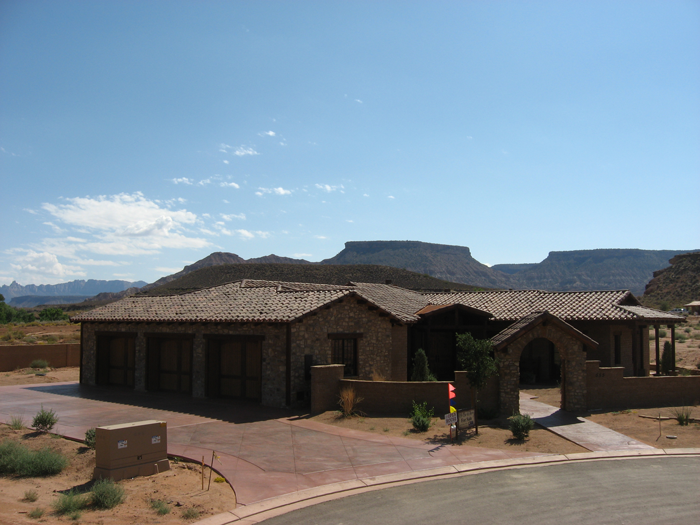
Here is another one from the series of 26 I did. I want to revise this background also. I think it got a little too dark in this version. I'd like to do another one with a background that is not so overwhelming. Taking pictures of this site was a fun experience. The client wanted me to get a view from higher up, so he loaded me in the bucket loader. I took pictures for my kids to prove it.


-
Nice warm colours ....but the perspective does not match the background. The background picure is, I presume, taken from the ground level and the model from above.
-
Tina,
I always find everything you do very inspirational, and this one is no exception. I can't tell you how often I visit your site to study your use of color. You have a such a wonderful eye and the outcropping plants are a great touch.
Would you mind sharing what program you do your post processing in, as I often wonder?
-
Thank you everyone for your comments. I'm sorry I didn't look at this sooner!
I'll keep an eye out for the backgrounds not matching the perspective. Good eye, I didn't even notice.
-
I missed this one before. Great work Tina. I love your rendering style. It reminds me of my grandmother's watercolor paintings. 4 of which I have on my walls.
-
Thanks Boo. I keep staring at this one. I'm going to redo the background that have a sunset. The colors in the building seem to have a "glow". I'll upload if it turns out!
Hello! It looks like you're interested in this conversation, but you don't have an account yet.
Getting fed up of having to scroll through the same posts each visit? When you register for an account, you'll always come back to exactly where you were before, and choose to be notified of new replies (either via email, or push notification). You'll also be able to save bookmarks and upvote posts to show your appreciation to other community members.
With your input, this post could be even better 💗
Register LoginAdvertisement


