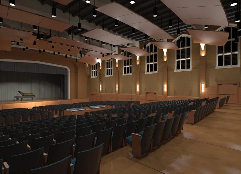
1920s High School Auditorium Renovation
-
This has been a fun project... designing and rendering. A renovation of a 1920's Auditorium in a High School here in Wisconsin, USA

If you're rendering in Kerkythea in MLT at high resolution, the rendering may take a while... so while you wait, you can save the image out in-progress, and use the partially-rendered image's lighting and reflections to kind of do a 'mixture' of SU and KT... as shown in the combo shot above.
All the best to you!
-
Absolutely stunning... did you use the IES lights or did you use a different method?
-
Hi Bubba, thanks!
Almost all IES, yes. stage spots are not. -
Awesome work, I love the mix media one most.
-
Can you give us a little more info like how long it took to render, what settings, etc...?
-
Very cool! I need to give that SU/render combo a try. Nice effect.
Always nice to see project from my part of the world. -
Bravo!
-
Wow I love the last one! Fantastic work!

-
@solo said:
Awesome work, I love the mix media one most.
Thanks guys...

I thought it has a comic book feel that a client might like never showed them that.
actually I showed them a digi-watercolor of a similar looking image, and they preferred the straight SU version out of the three I couldn't believe it.
it's a fundraising image.
re: settings... just hit render with MLT... I have a quad, left it overnight, next morning had that.
actually hi-res is here.I've made a couple tweaks, and will update with 'final' soon.
-
As a realistic image the third one really puts you in the room. As an architectural rendering the combo is most beautiful IMHO. Great work!
-
thank you for your comments!
I have fixed the poor job I did earlier placing the downlights, and it's in the middle of rendering a 2800px view... here's a sneak preview.

-
Outstanding, Fletch.
-
Amasing work Fletch,
I realy love the combo
-
that is really an amazing render. you could have fooled me with it!
-
Very realistic and the color combination are very good...love the brown and black.
allanx
-
Amazing work Fletch.

-
Nice work fletch
-
Thanks guys,
Here's my 'final' ... as if they are ever 'final' right?...(actual render is 2800px wide, I will spare you.)
I added some people, clients like to see people.

-
Great work man. Drfinately one of the better kerky renderings I've seen on here. Keeep it up
-
Fletch, this is one of the best models/renders I have seen so far on this forum. everything seems to be right, lighting, materials, colours... I am very impressed (and a bit jealous
 )
)
Hello! It looks like you're interested in this conversation, but you don't have an account yet.
Getting fed up of having to scroll through the same posts each visit? When you register for an account, you'll always come back to exactly where you were before, and choose to be notified of new replies (either via email, or push notification). You'll also be able to save bookmarks and upvote posts to show your appreciation to other community members.
With your input, this post could be even better 💗
Register LoginAdvertisement


