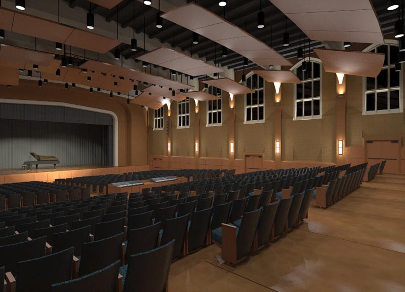
1920s High School Auditorium Renovation
-
As a realistic image the third one really puts you in the room. As an architectural rendering the combo is most beautiful IMHO. Great work!
-
thank you for your comments!
I have fixed the poor job I did earlier placing the downlights, and it's in the middle of rendering a 2800px view... here's a sneak preview.

-
Outstanding, Fletch.
-
Amasing work Fletch,
I realy love the combo
-
that is really an amazing render. you could have fooled me with it!
-
Very realistic and the color combination are very good...love the brown and black.
allanx
-
Amazing work Fletch.

-
Nice work fletch
-
Thanks guys,
Here's my 'final' ... as if they are ever 'final' right?...(actual render is 2800px wide, I will spare you.)
I added some people, clients like to see people.

-
Great work man. Drfinately one of the better kerky renderings I've seen on here. Keeep it up
-
Fletch, this is one of the best models/renders I have seen so far on this forum. everything seems to be right, lighting, materials, colours... I am very impressed (and a bit jealous
 )
) -
Excellent work!!!
 , very well by the kerkythea!!
how long it takes to finish this last? image, done at source MLT? in that type of machine work? because at the beginning of the year got the idea of changing mine and I need a guide, more or less than that team would be better to work on large projects with kerkythea.
thanks -
awesome work...hi 5


-
Fletch, very impressive! I just started using Kerky and I've been a little frustrated with it. Maybe because I haven't read all the way through the manuals, that might have something to do with it

You're my hero! I want to create mixed renderings with K, just as you did in the beginning. Wish me luck!
-
thanks Honey Dear

 and all
  ,
,Here's another project we completed recently in our office... an animation.
For a good rendering it's fairly simple - you only have to have 4 things...
Good looking materials, I start usually with materials from KT's website... then switch out the diffuse color with the image from SU... if necessary. Maybe I will tweak the bump map (like for the floor above)
Good lighting - For lights, I only put lights where they would actually be in the space! I don't usually put fake filler lights anywhere. But if I do, it's in a manner that a real arch. photographer would approach it... I didn't do that in this image. I downloaded the IES information for the lights that I used, and loaded that info into the lights, so that they are projecting the light exactly as thy would in real life. This helps me do lights accurately and quickly. I love Visalighting.com they have the IES info AND SketchUp models for all their lights.
A good render engine - For render methods I love KT because you can pick from many methods - this image was done overnight on a quad core with MLT (Metropolis Light Transport) and is very accurate light (physically). I also often use PM+FG (photon-mapped+field gathering) when I'm in more of a hurry.
It's important to have an accurate model. If you start out with a bad model, it will be difficult to make a good rendering. (note door hardware... missing exit signs
 )
)Kerkythea supports net rendering, so for a small office situation it's very good!
-
Thanks a bunch Fletch! I only scanned through some of the material for now, but wow, there is a lot of information in both of those posts. I am looking forward to doing animations with Kerky. I have to admit, I am going to have to read this stuff slow. It all sounds like Chinese to me!
-
Wow.
All I can actually say. Now I really need to learn kerkythea.
Very beautiful, all of it, it just looks so real, and the composite one was stunning.Ouch- if sketchucation had a karma system, some would be heading your way now...
-

thanks!
you golf Sleaford or fish the Wash much?
-
Stunning work, Fletch. Are the windows blacked out?
-
they are glass - back-painted black... owner request.
Hello! It looks like you're interested in this conversation, but you don't have an account yet.
Getting fed up of having to scroll through the same posts each visit? When you register for an account, you'll always come back to exactly where you were before, and choose to be notified of new replies (either via email, or push notification). You'll also be able to save bookmarks and upvote posts to show your appreciation to other community members.
With your input, this post could be even better 💗
Register LoginAdvertisement


