Which image do you like best?
-
Please help me with some insight on your preferences...and of course I'd love to hear any comments on how to make them better, but especially the reasons why you don't like any of them. (I can take it :`)
-
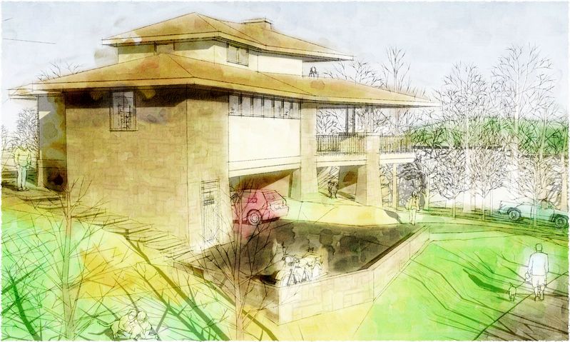
Personally i think the second image looks too washed out.
-
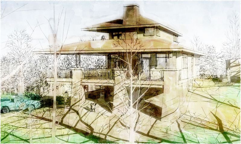
I picked the right one.

-
Mateo, you're a hoot!
-
-
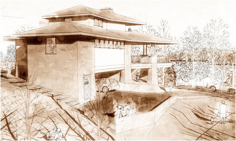
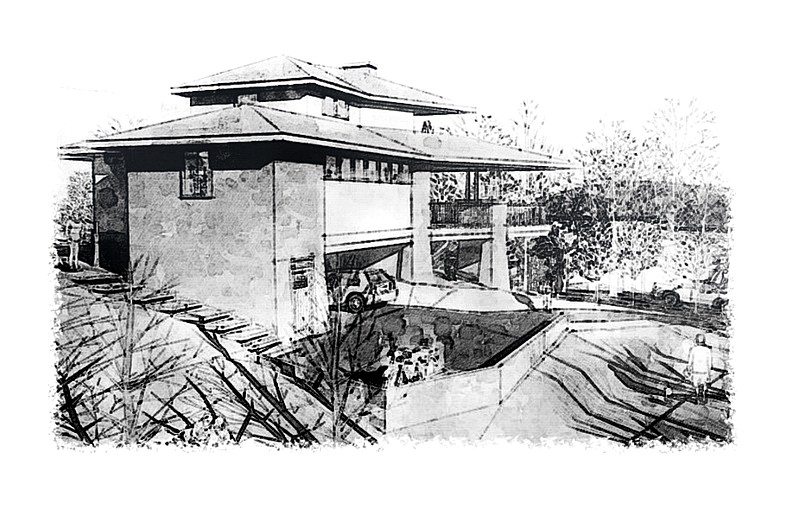
For what it's worth (perhaps nothing) I like the monochromatic one 32.4 times more than the brightly coloured ones. In general I'm not a fan of the almost fluorescent colours.
Great looking model -- and I really-really like that sepiatone look for it.
Regards, Ross
-
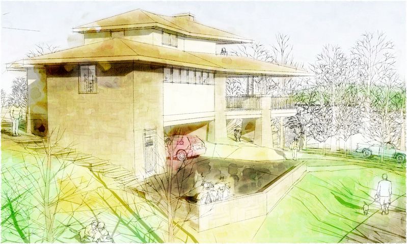
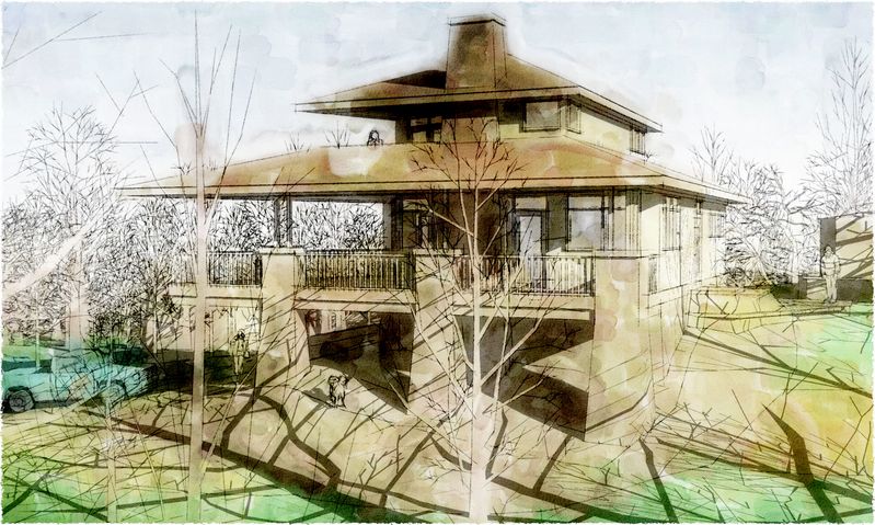
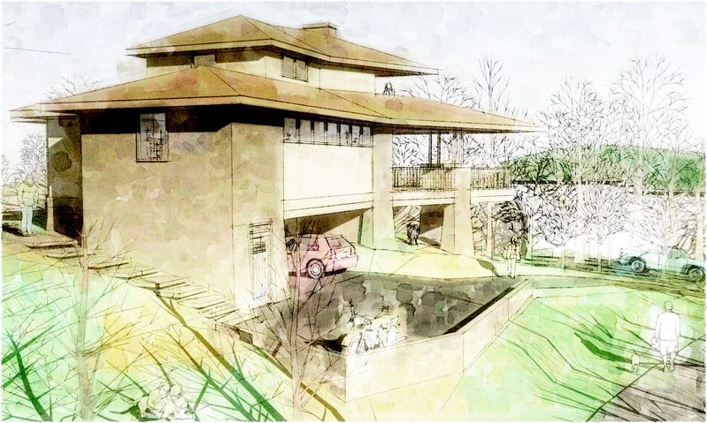
Ross, worth a lot...thanks! These better? Far enough? Anyone else agree? Disagree? (Now this is what I'm talking about! :`)
-
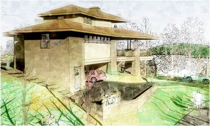
Or these? (Thanks in advance.)
-
Much more pleasing to my eyes! I think I like the first set more because the skys seem a little more saturated. Both sets are pleasing.
Just a little suggestion --- when you save images of such watercolours be sure to leave a margin of white space beyond. More than you've done. It's just like matting paintings -- it makes it easier for the viewers eyes to virtually dive right in by giving the paintings a buffer from the other colours/distractions.
-
Tom - I hope you don't mind that I had some fun doing some postprocessing on your image and have posted it here. I've tried to move it into an monochromatic inkwash look. Some of the things I played with were lightening the sky so the image merges with the whitespace of the 'paper', darkening the foreground to give more emphasis to the foreground-to-background depth. I did the processing in Xara Xtreme Pro - vector illustration software that is pretty friendly to bitmaps.
Regards, Ross
-
I agree, the first bunch definately. But the BW is also great.
-
@tomsdesk said:
Ross, worth a lot...thanks! These better? Far enough? Anyone else agree? Disagree? (Now this is what I'm talking about! :`)
I like this batch the most. The tree shadows are a little distracting to my eye. But then again, I'm due for another eye exam.
-
As my art guru would say you need to have good bone structure in a picture. Good structure makes image easy to understand. Your house is not clearly set apart from landscape. Use light and dark to set it apart. Here is my quick light and dark study of your image:

-
It is very impressive work, but I always come back to the question: What's the purpose for the graphic. (Insert almost anything to replace graphic.)
Artistically, I like the sepia tones and the softer images, but if it were a concept for a house I might have built, I'd need to be able to see the lines more clearly and to see how the lines of the house fit into the lines of the landscape. Natural colors will change and the architectural colors can be chosen further down the road.
I also doubt I'll ever park a pink car in my drive.
 But like my comments above, that's just my personal preference.

Hello! It looks like you're interested in this conversation, but you don't have an account yet.
Getting fed up of having to scroll through the same posts each visit? When you register for an account, you'll always come back to exactly where you were before, and choose to be notified of new replies (either via email, or push notification). You'll also be able to save bookmarks and upvote posts to show your appreciation to other community members.
With your input, this post could be even better 💗
Register Login


Advertisement