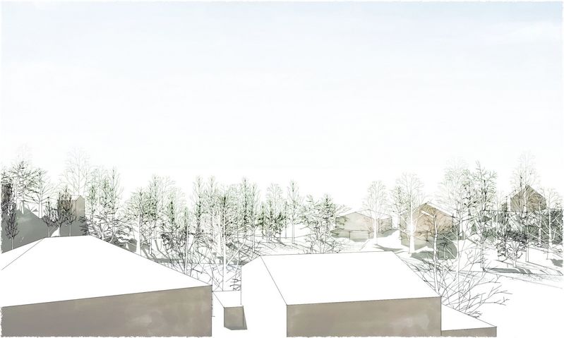
Quick studies...
-
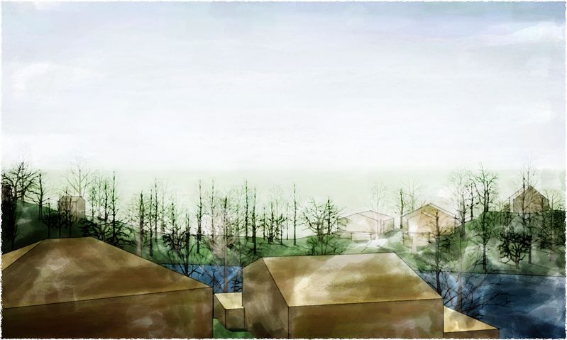
...of current model: I was pleased with all of these for different reasons. Any suggestions on how to fix any or all?

-
Tom,
They all look great. Maybe some more detail on the front houses. -
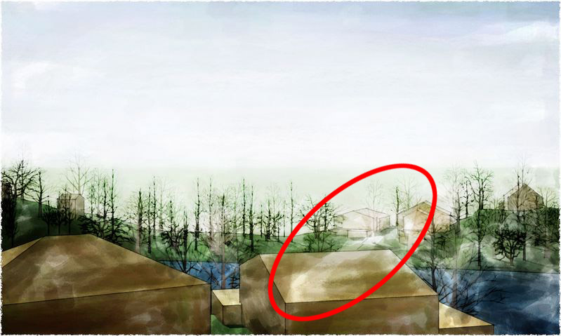
beautiful! i love the first one- it feels chilly. Maybe you can use a tree in the foreground instead of so much shadow in the front left building? also there is one very unrealistic stroke in the third shot that is overreaching its color and scale boundaries (see below)
I would be interested to hear more about this project
-
definitely loving the contrast in the first one..
-
Thanks, Guys. More on the project here: http://www.sketchucation.com/forums/scf/viewtopic.php?f=81&t=12687
Mateo, I plan to detail out the actual project, so the buildings shown here are intended to be obscure.
Mirjman, thanks for pointing that out...I had actually noticed it and thought it was a nice path into the background: but now I see it acts more like a crooked floor, chuting the eye back too fast. So I beefed up the ridge and dark-to-light fade beyond it...enough? Too much?

-
nice correction - much more subtle
-
Tom,
This may sound odd, but the first image is by far and away the strongest IMHO.
Love the simplicity and the muted colour palette. Less is more

Really nice. More please.
Andy
Hello! It looks like you're interested in this conversation, but you don't have an account yet.
Getting fed up of having to scroll through the same posts each visit? When you register for an account, you'll always come back to exactly where you were before, and choose to be notified of new replies (either via email, or push notification). You'll also be able to save bookmarks and upvote posts to show your appreciation to other community members.
With your input, this post could be even better 💗
Register Login


Advertisement