Stormhouse
-
...a hobby-project (that's more truthful but less grand-sounding than calling it "theoretical" architecture) I undertook for a number of reasons. I've submitted it to a competition, and plan to send it off to another in the fall. The design will be refined (or potentially put through a mangle), of course, over that time. And I plan on trying out a variety of different approaches to rendering...none of them being photorealistic. Photorealism (or perhaps reality) is not something that interests me on my own time.


Higher resolution images at Picasa here.
The current model is entirely SU without any Rubies other than that tube-along-path one...although previous iterations of the "project" have been hand-drawn, modeled/rendered in Blender, and most recently modeled/animated in Rhino.
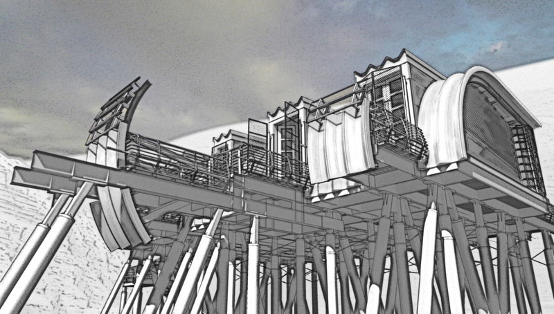
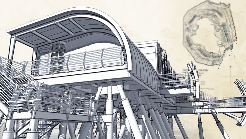
In order to make the last deadline, these particular images are of course SketchUp 2D output layered in Photoshop CS3 XT with a bit of GIMP for certain areas...I have a new copy of Piranesi which I'm planning on using for the interiors, but for some reason the Piranesi interface isn't "clicking" with me and to beat the clock I resorted to my old standbys.
General site in GE (the project is actually "sited" in a version of this location described in an 1829 survey...so much for reality):
EDIT: The attached KMZ file now contains the 1829 map as an overlay...to get this to work properly, download the ZIP and rename the file type to ".kmz", then open it from Google Earth. Why, incidentally, can't we upload KMZ files without renaming them? They are only a customized type of ZIP to begin with.
-
Dear Lewis,
Would you write a few words about the project's brief please. The title Stormhouse suggests a refuge of some kind. Is this the case? The only storm houses I can think of are in Bangladesh where the division between land and water is a variable dictated by tidal surges in the Bay of Bengal and the monsoon rains.
Regards,
Bob -
Excellent!
-
Sorry for the dead img tags in the first post...thanks for bringing it to my attention, Bruce. Google apparently won't let you link to an image hosted in a Picasa webalbum...kind of a shame, as I could use Picasa to batch update, resize, and reload any changes. (It would work in preview, but not in the post!)
-
@lewiswadsworth said:
Believe it or not, there is a certain "market" (in an intellectual sense, if not a financial one, anyway) for such things in the profession (...)
As there is amongst artists.
Keep 'em coming, Lewis. I'd like to see you have a go at using a photoreal renderer. Curious about what you'd come up with.
-
I've always been fond of the theoretical, and I'm familiar with the Pavillion for Oblivion fro PushPullbar.
Nice imaging and imagining Lewis. -
I would be interested in your outcome/satisfaction with Piranesi. I experimented with it a year or so ago, and I really wasn't that happy with the outcome, although some of the dedicated followers sure do nice work. (the name Wang comes to mind)
Now confessing that I probably didn't give it a fair chance.
Keep us posted on your thoughts and outcomes if you would. -
INTERESTING DESIGN
-
Thanks, Eric, Stinkie and Dale. I'm seeing a lot of flaws and bad choices in these things now, as usual once I've sent things off.
@unknownuser said:
Keep 'em coming, Lewis. I'd like to see you have a go at using a photoreal renderer. Curious about what you'd come up with.
...but photorealis one of things I do when people pay me...I have three different licenses to VRay, for instance. It's not my idea of fun, although of I admire those who can do it really well (like Solo, KB, and Silverlight, among other luminaries here).
The stylization of the images above reflect some of my recent interest in the approach to architectural depiction in certain dark and surreal graphic novels that were recommended to me by Frenchy Pilou on another forum.
Still, one of the other reasons I developed this model was to experiment with software that might be of use in illustrating architecture. I usually don't have the leisure for experimenting when working for someone. So there are other renderers and tools on my list. But Piranesi cost me a considerable sum, and I'm determined that is at the top of learning curve now.
-
Thats very cool, i really like the look and feel of the building, you seem to ave captured an essence very well

-
@watkins said:
Dear Lewis,
Would you write a few words about the project's brief please. The title Stormhouse suggests a refuge of some kind. Is this the case? The only storm houses I can think of are in Bangladesh where the division between land and water is a variable dictated by tidal surges in the Bay of Bengal and the monsoon rains.
Regards,
BobI did write some craziness about this that went with the submitted images:
A kind of visual notion for a waterfront structure like this came to me almost 8 years ago while I was walking in the "flood-danger zone" outside of Providence's Fox Point hurricane barriers, and eventually I figured out what my imagined structure was for...it's another elliptical little dark fantasy like this one. Believe it or not, there is a certain "market" (in an intellectual sense, if not a financial one, anyway) for such things in the profession, and every year there are a certain number of (generally disparaged) competitions for "unbuilt architecture" or "fantastic architecture."
I should add that most of the real projects with which I have been involved would not be worth the bandwidth for me to show them here...boring labs, dormitories, and federal facilities...nothing worth thinking about or remembering.
Here's a Picasa web album of a variety of older versions of this beast, including an embarrassingly naive hand-axon-drawing from a long time ago.
-
I do. But you gotta, at least in my opinion, vary the line width. Right now, the images are too "Tintin", if you know what I mean. While I'm at it: the sky pic's too much, imho.
-
Great work Lewis .... maybe a movie / animation might be on the cards?
Mike
-
That would be kind of challenging, Mike. It's worth a shot...I'll add it to the ever-increasing list of things I want to experiment with.
Photoshop Extended can do movies after a fashion, but Piranesi can't...
-
Thanks. I'll have to think about how to do the line business...maybe by applying a depth of field mask onto the shadow-only layer before I start the rigmarole of creating the photocopy effect. I could also start with wider profile lines, and hit their layer with a DOF if the Styles window isn't helpful enough (EDIT:Piranesi will do this with edges.) There are profile-only and lines-only output layers, but the latter rarely survives into the final render.
I was just looking at some of Schuiten's drawings, and his profile lines stay fairly consistent in width from near to far, but the contents (including edges, shading, and colors) tend to disappear with distance.
-
Nice model.
Reminds me of Fallout and Mad Max. -
I'm amazed. Your entire workflow is just gorgeous. There are many design elements which I like a lot. Thank you for sharing this.
/matteo
-
Gorgeous
-
Well, thanks guys. That cheers me up quite a bit. I was just going through the typical bleeding-edge architecture and 3D modeling sites last night and thinking to myself that I was completely out of step with everything...both trends in design (generative-script-driven stuff is everywhere) and in modeling/rendering (parametrics/BIM and ever-more-life-like variations on raytracing).
I hope to have some time to elaborate this project further and try some other rendering processes soon.
-
The way I made these images with PS and GIMP, I developed the "fake bad photocopy" B&W parts first, and only later blended in the colors (there weren't any real textures in the SU file, at least on the building portion of the model). I was really tempted to consider a couple of these "bad photocopy" versions done with just a little color, but I didn't have the nerve to submit any of them.
So here are two saved "out-takes" of two of the above pictures. Does anyone prefer these to the final versions in my first post? I'd like to know before I undertake any new images in this "style", assuming I do this again.
Hello! It looks like you're interested in this conversation, but you don't have an account yet.
Getting fed up of having to scroll through the same posts each visit? When you register for an account, you'll always come back to exactly where you were before, and choose to be notified of new replies (either via email, or push notification). You'll also be able to save bookmarks and upvote posts to show your appreciation to other community members.
With your input, this post could be even better 💗
Register Login


Advertisement