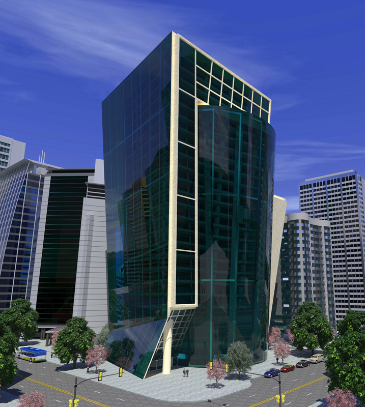
Big building downtown
-
just playin'
working on getting rid of the patterned concrete on the street and sidewalk...
also thinking about playing with some depth map to de-emphasize the surrounding buildings - I don't like the way they crowd the featured building. better yet, maybe I can figure out a perspective that doesn't need the other buildings and yet doesn't feel like the main building is sitting by itself out in a field. hmmmm...
c&c welcome and appreciated.
peace!
Nick

-
Nick,
You could try to blur the surrounding buildings. Don't really know how this would look but it is an idea. Yea, the street and sidewalk need to get the seamless textures because it looks pretty bad right now. You should also tone the the sky a little too, it just seems to be to blue. I like the building and the feeling this rendering gives... so once you fix those really minor details it should look awesome! Good job bro!PS - How long did it take you to model all those buildings and are you using Kerkythea for the rendering?
-
wow!!!
-
very good modeling, I congratulate you, maybe work a little more textures of the street and sidewalk, only that
-
Nick, the rendering looks great. I wouldn't change the setting - it puts it in context. The position of the subject building and it's higher level of detail keeps the focus on that building. A few things to look at improving:
The paving patterns (road and sidewalk) are not tiling too well.
Is the structure of the background building on the extreme right reflective? It appears as if it is diappearing at the top.
GET RID OF THOSE AWFUL PINK TREES (I HATE THAT COLOR). -
Really nice render, its got a very clean look about it nyet youve still managed to include a lot of detail.
-
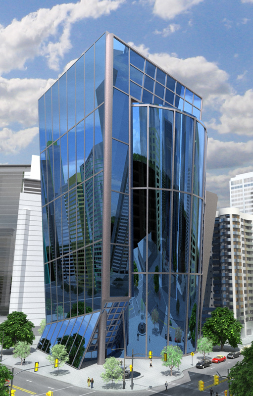
another shot... thanks for the input - great suggestions.
-updated glass tex thanks to Rayman on Kerky forum.
-updated other textures here and there
-dialed down concrete and asphalt textures to de-emphasize the bad patterns I was getting before
-added a little dirt to the streets in PS
-changed color of pink trees (I agree, they were ugly - also distracting/cluttering down there)
-slight blur and fade on background buildings (bg buildings from FormFonts)

-
Wonderful job! I think it looks soo much better then the original one you posted!
-
Looks fantastic.
-
Nick, Great render, well done

-
Beautiful work. My only comment would be the building is a bit unrealistic with the large sheets of glass. Those would need to be broken up into smaller chunks. That is the only thing holding this render back from being very realistic in my opinion.
Nice lighting and materials now that the pink trees are gone.
Scott
Hello! It looks like you're interested in this conversation, but you don't have an account yet.
Getting fed up of having to scroll through the same posts each visit? When you register for an account, you'll always come back to exactly where you were before, and choose to be notified of new replies (either via email, or push notification). You'll also be able to save bookmarks and upvote posts to show your appreciation to other community members.
With your input, this post could be even better 💗
Register LoginAdvertisement


