sketchucation logo sketchucation
    • Login
    ℹ️ Licensed Extensions | FredoBatch, ElevationProfile, FredoSketch, LayOps, MatSim and Pic2Shape will require license from Sept 1st More Info

    Big building downtown

    Scheduled Pinned Locked Moved Gallery
    11 Posts 9 Posters 969 Views 9 Watching
    Loading More Posts
    • Oldest to Newest
    • Newest to Oldest
    • Most Votes
    Reply
    • Reply as topic
    Log in to reply
    This topic has been deleted. Only users with topic management privileges can see it.
    • B Offline
      bubbalove
      last edited by

      Nick,
      You could try to blur the surrounding buildings. Don't really know how this would look but it is an idea. Yea, the street and sidewalk need to get the seamless textures because it looks pretty bad right now. You should also tone the the sky a little too, it just seems to be to blue. I like the building and the feeling this rendering gives... so once you fix those really minor details it should look awesome! Good job bro!

      PS - How long did it take you to model all those buildings and are you using Kerkythea for the rendering?

      "Success consists of going from failure to failure without loss of enthusiasm." - Churchill

      1 Reply Last reply Reply Quote 0
      • ely862meE Offline
        ely862me
        last edited by

        wow!!!

        Elisei (sketchupper)


        Before no life was done on Earth it was THE LIFE ITSELF...GOD
        Come and See EliseiDesign

        1 Reply Last reply Reply Quote 0
        • R Offline
          rcossoli
          last edited by

          very good modeling, I congratulate you, maybe work a little more textures of the street and sidewalk, only that

          THREEDIMENSIONSWEB dot COM

          1 Reply Last reply Reply Quote 0
          • DanielD Offline
            Daniel
            last edited by

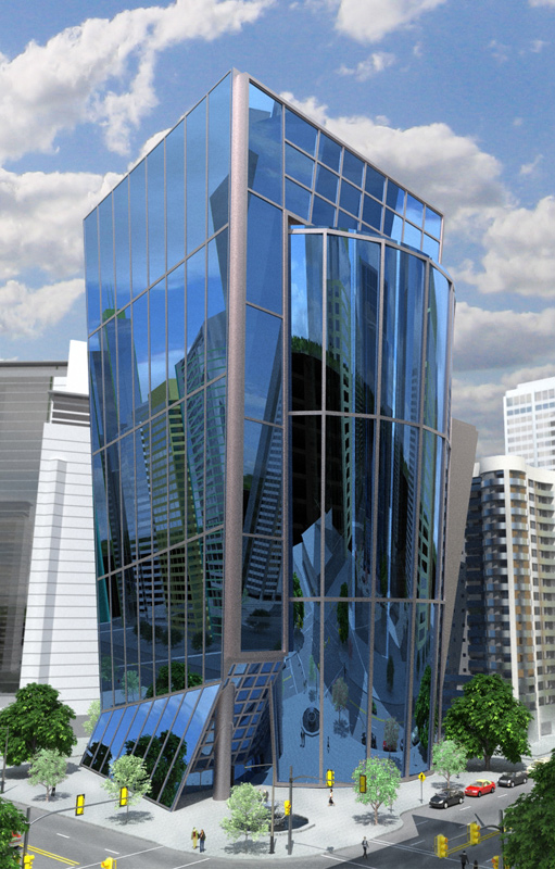
            Nick, the rendering looks great. I wouldn't change the setting - it puts it in context. The position of the subject building and it's higher level of detail keeps the focus on that building. A few things to look at improving:
            The paving patterns (road and sidewalk) are not tiling too well.
            Is the structure of the background building on the extreme right reflective? It appears as if it is diappearing at the top.
            GET RID OF THOSE AWFUL PINK TREES (I HATE THAT COLOR).

            My avatar is an anachronism.

            1 Reply Last reply Reply Quote 0
            • R Offline
              remus
              last edited by

              Really nice render, its got a very clean look about it nyet youve still managed to include a lot of detail.

              http://remusrendering.wordpress.com/

              1 Reply Last reply Reply Quote 0
              • N Offline
                Nick W
                last edited by

                another shot... thanks for the input - great suggestions.
                -updated glass tex thanks to Rayman on Kerky forum.
                -updated other textures here and there
                -dialed down concrete and asphalt textures to de-emphasize the bad patterns I was getting before
                -added a little dirt to the streets in PS
                -changed color of pink trees (I agree, they were ugly - also distracting/cluttering down there)
                -slight blur and fade on background buildings (bg buildings from FormFonts)


                1.012-web2.jpg

                http://www.nrwiesneski.com

                1 Reply Last reply Reply Quote 0
                • B Offline
                  bubbalove
                  last edited by

                  Wonderful job! I think it looks soo much better then the original one you posted!

                  "Success consists of going from failure to failure without loss of enthusiasm." - Churchill

                  1 Reply Last reply Reply Quote 0
                  • DanielD Offline
                    Daniel
                    last edited by

                    Looks fantastic.

                    My avatar is an anachronism.

                    1 Reply Last reply Reply Quote 0
                    • M Offline
                      mateo soletic
                      last edited by

                      Nick, Great render, well done 👍

                      [Concept Illustrations](http://concept-illustrations.com/)

                      1 Reply Last reply Reply Quote 0
                      • S Offline
                        ScottPara
                        last edited by

                        Beautiful work. My only comment would be the building is a bit unrealistic with the large sheets of glass. Those would need to be broken up into smaller chunks. That is the only thing holding this render back from being very realistic in my opinion.

                        Nice lighting and materials now that the pink trees are gone.

                        Scott

                        Love the fact that some HATE my avatar.....

                        1 Reply Last reply Reply Quote 0
                        • 1 / 1
                        • First post
                          Last post
                        Buy SketchPlus
                        Buy SUbD
                        Buy WrapR
                        Buy eBook
                        Buy Modelur
                        Buy Vertex Tools
                        Buy SketchCuisine
                        Buy FormFonts

                        Advertisement