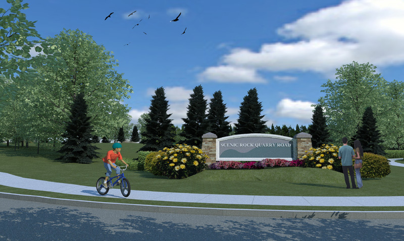
Landscape render Kerky
-
Landscape project...

-
Very nice. I love the tree reflections on the ground. The birds are a nice touch too. That kid better watch where he is going however.
-
I'm not really feeling all those evergreens... maybe it is just me? Otherwise I think the image looks fantastic!
-
Thanks,
@Bubba , I tend to agree with you on the evergreens. If I understand you correctly you mean the look of 3d tree vs 2d tree.
I need to find some good tiff files for evergreens. These were 3d which look strange when fully rendered. The plants and flowers are a face me images in su. -
Looks great. The only thing that bothers me about the cedars is that they are so dark compared to the other trees. Also, the couple on the right looks different from the bike rider, style-wise.
-
poppin' the wheelie. feelin' the flow.

apart from the cartoony kid and some very subtle color/tone adjustments (people a bit washed out, leaves upper left a little light, grass repeating pattern), this is a very realistic base to start with. The flowers and sign, etc look great. That's the focal point of the image. The evergreens are maybe a touch dark, but I think they look good in the image overall. That's what I think of when I see a big fancy sign in the "front yard" of a big business or golf course or whatever - maybe it's a regional thing...
peace!
Nick -
Really nice composition (maybe some more contrast in the other trees would offset the dark of the evergreens: which do set off the sign quite nicely) highlighting the subject while giving a good feel of the setting.
And/but...
(just playing the cranky client here :`)
...first thing I noticed about the subject matter was the daisies the size of magnolia blossoms (or is that another flower I don't know?).
Hello! It looks like you're interested in this conversation, but you don't have an account yet.
Getting fed up of having to scroll through the same posts each visit? When you register for an account, you'll always come back to exactly where you were before, and choose to be notified of new replies (either via email, or push notification). You'll also be able to save bookmarks and upvote posts to show your appreciation to other community members.
With your input, this post could be even better 💗
Register LoginAdvertisement


