Uni Project SU output / Renders
-
Hi, haven't had much of a chance to post new work up for a while so heres some of my latest stuff from a uni project.

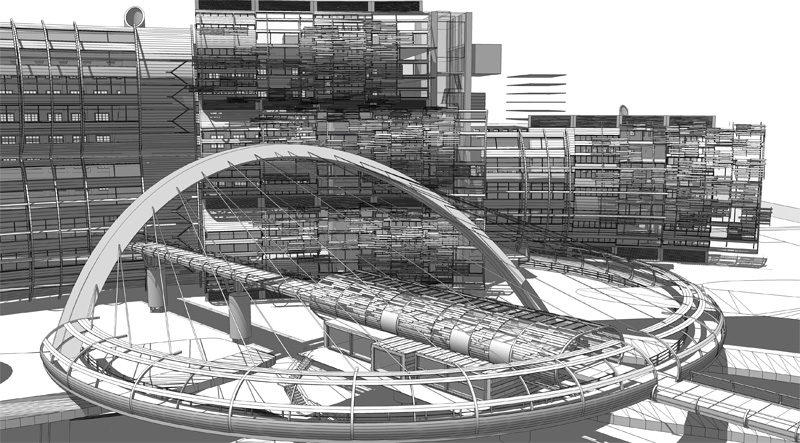
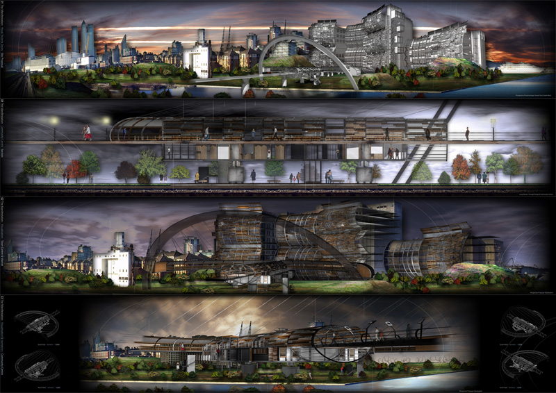
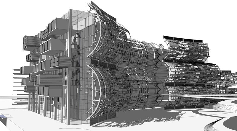
The proposal shows a new facade system added to a large old mill building connecting to a new pedestrian footbridge with integrated community centre and market promenade.

-
Raw Su render put onto photomontaged background of site
-
Section (raw su render without edges) with people/trees added in photoshop
-
Artlantis render onto background image
-
Artlantis + Su composite Render of Community Centre
If its of any interest ill put up some more SU output of the model file
C&C Welcome -
-
I'm no fan of the actual architecture, but those images look splendid. Yes, please, do post some more!

-
Nice model, I like!
What kind of building is it? -
I hope you've added the grayscale image with your presentation. It gives you so much information while the renders [though very cool effect] give little to no info on the building.
Nice project

Hugo
-
that looks really good! how long did it take you do this? it looks very detailed.

how did you do the facade system? can you post an .skp file of the project? just want to learn how you model this and like to render this myself.

please post some more pics

thanks!

-
WOW!!!! Simply wonderful!!!
-
how did you computer survive that?
mine would have been on fire if i tried to model that.
nice work
pav
-
Nice work indeed, Archi...more for me too, please!
Pav: would have been my brain on fire...my computer would have simply feigned sleep until I gave up and let it off the hook :`)
-
@tomsdesk said:
Nice work indeed, Archi...more for me too, please!
Pav: would have been my brain on fire...my computer would have simply feigned sleep until I gave up and let it off the hook :`)
i like your style, but i prefer your computers, that is a truely genius way of getting out of doing work.
pav
-
O' contraire: reaching a level of complexity merely approaching this is no longer "work"...it is a religious experience, so thwarted by a jealous god.
-
ah touche!
pav
-
Nice work and great presentation.

-
Really good, to be honest i cant think of any criticism, although i let you know if i think of anything

-
Love the model Archi and I hope your tutors did.
Looks very well modelled and presented

-
Hi cheers for the comments, much appreciated....
The main building is supposed to act as a mixed use project forming a town centre within the complex. The smaller building within the bridge is a community Centre
There was an additional set of drawings (just line drawings that were weighted in autocad) to help guide around the project.
The Sketchup modelling was around a week mainly due to changes i made as i modelled the project, the first facade did take a while to figure out (in terms of the most efficient way to model it without too much lag) i've posted an example SKP of one of them (each one is different but just modified versions of the original) a lot of the 'follow me' tool was used.
My computer did survive but i had to seperate the project into two files and merge them when necessary or delete/hide elements that you wouldnt see when rendering.
The tutors did like it, but i had a lot of problems when it got round to detailing to any realistic level
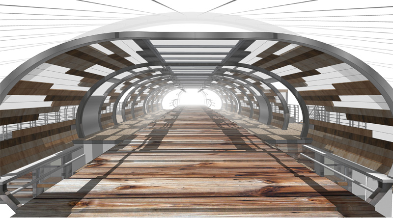
Heres some more pics


-
very impressive, Archi Rag.
thanks for the sample. I perfectly understand, why you hat to divide...

I especially like the last image. it has this wonderful science fiction gangway flair. would love to see the London Barbican renovated in that style
-
thanks archi rag for the skp file and more pics! ive been actually waiting for it!

i'm assuming that the facade system is movable? and are the grills below and above for something like a stack effect? its really good

more pics please!


-
Excellent detail!
-
WOWzerPlus!
-
Opening that skp, I can see why it slowed your machine down, mine struggled slightly with that.
I love the design Archi, fantastic work
Hello! It looks like you're interested in this conversation, but you don't have an account yet.
Getting fed up of having to scroll through the same posts each visit? When you register for an account, you'll always come back to exactly where you were before, and choose to be notified of new replies (either via email, or push notification). You'll also be able to save bookmarks and upvote posts to show your appreciation to other community members.
With your input, this post could be even better 💗
Register LoginAdvertisement


