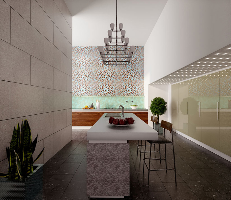
Latest Kerkythea Render
-
HI All,
Thanks for your feedback tomsdesk

Latest attempt on this render
Kind regards

-
.
-
nice renders . (the second one is the most appealing for me .)

-
exceptional renders. My only comment would be on the stools being used. I think the frame should be chrome by design and the seat looks to "hard" maybe make it a fabric or something softer. Even that is a stretch, I looked at the last render for quite some time and it is very very nice.
Scott
-
Thanks for the feedback guys

Kind regards
Darren
-
The second one's very nice indeed.

-
This looks AWESOME, Darren..!!

The materials used in this scene is really great..!!
-
looks gorgeous. i like the 2nd image. the lighting is very impressive. i am usign podium and vray su but havent tried kerkythea yet. from your output i already downloaded it to try.
-
@unknownuser said:
This looks AWESOME, Darren..!!
The materials used in this scene is really great..!!Thanks Fred

@nomeradona said:
looks gorgeous. i like the 2nd image. the lighting is very impressive. i am usign podium and vray su but havent tried kerkythea yet. from your output i already downloaded it to try.
I am glad you like the quality, see you over at the KT forum then

-
I like the natural lighting of the second one better. first looks like it's lit with a camera flash. though the second makes me feel like I'm in a dark back hallway - maybe some natural light from a skylight... or a window behind the camera...
Nice work!
Hello! It looks like you're interested in this conversation, but you don't have an account yet.
Getting fed up of having to scroll through the same posts each visit? When you register for an account, you'll always come back to exactly where you were before, and choose to be notified of new replies (either via email, or push notification). You'll also be able to save bookmarks and upvote posts to show your appreciation to other community members.
With your input, this post could be even better 💗
Register LoginAdvertisement


