New stuff
-
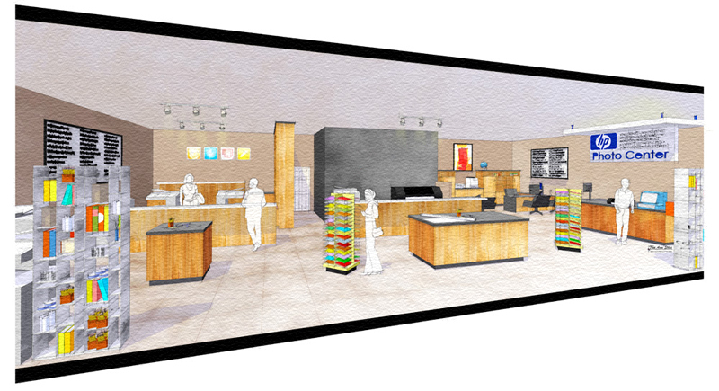
New work, just finished.
The business logo is quite large on the charcoal wall. {removed}

-
I dig the dynamic/angular presentation. The black lines frame it nicely. Nice presentation - nice flashes of color here and there - and the logo probably adds some life too.
If I had to stretch for a suggestion... something is ambiguously not pleasing about the colors/lighting... Maybe it's the color of the walls or the dead ceiling. The upper left hand corner seems dim. Sorry for being so vague. And who knows what it looks like on your monitor as compared to mine...
Nice work, thanks for sharing.
-
yes, lighting
 I am having a real thing about lighting.... can't seem to get it. I just quoted another interior and I'm thinking...???? What am I thinking?
Thanks for your suggestions Nick
 Hey if anyone wants to grab it and play with some lighting to show me what I'm doing wrong, I would certainly welcome it, especially with this one... http://www.sketchucation.com/forums/scf/viewtopic.php?f=126&t=5804
 -
Nice project, Tinanne. My experience is limited to SU and very little Podium, so don't know how to help you. But to me most of the surfaces seem to be in the same tonal range. You might look at increasing the contrast between shadow and light areas, if possible. Also, I'm not sure about the black borders - it's such a strong color compared to allt he others, that it's fighting for attention (IMHO).
-
Tina, as evidenced by my inability to articulate in my last post, I too have a lot to learn about lighting. I'm also interested to learn about this from anyone who may have some more experience and specific analysis/suggestions.
-
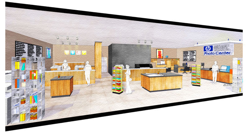
added a little colorful picture in the corner in question. lightened the ceiling and added some lines to break up the vastness (a little trick I learned from someone regarding a parking lot:). lightened the wall on the left a little too - could maybe use more lightening... and bumped the contrast a bit via curves - similar effect to levels tool but a little more control, I think - I get a better result this way imo.
I was thinking too that adding some texture (i.e. tiles) on the ceiling could break it up a bit too...

-
btw, to paint in the light, a useful PS (Windows) method I use often is as follows:
hold Alt while clicking the "new layer" button (or file menu>layer>new layer, or Ctrl+Shift+N), select "soft light" mode and check the 50% gray box. then you can use your brush tool on this layer with black to darken or white to lighten. in this case, I used white at about 20% opacity to paint in the light streaks.
-
Hey Nick, that is awesome! Thanks!
Duh, on the lines for the ceiling.... why didn't I think of that!
I've been working on my animation all week, so I haven't gotten back to this one, but I will try what you've suggested.

James, thanks to you also, that really does, make things POP!
-
The colors were all chosen by the designer. I didn't have a say in it

The company logo does fill up the wall quite a bit, tho.
Thanks James!
Hello! It looks like you're interested in this conversation, but you don't have an account yet.
Getting fed up of having to scroll through the same posts each visit? When you register for an account, you'll always come back to exactly where you were before, and choose to be notified of new replies (either via email, or push notification). You'll also be able to save bookmarks and upvote posts to show your appreciation to other community members.
With your input, this post could be even better 💗
Register LoginAdvertisement


